4. Consumer surplus for an individual and a market The following graph shows Jacques's weekly demand for apple pie, represented by the blue line. Point A represents a point along his weekly demand curve. The market price of apple pie is $3.00 per slice, as shown by the horizontal black line. Jacques's Weekly Demand 7.50 6.75 6.00 5.25 Demand 4.50 Y-Intercept: 3 3.75 Price 3.00 225 1.50 0.75 10 12 14 16 18 20 QUANTITY (Slices of apple pie) From the previous graph, you can tell that Jacques is willing to pay s for his 8th slice of apple pie each week. Because he has to pay only $3.00 per slice, the consumer surplus he gains from the 8th slice of apple pie is s PRICE (Dollars per slice) Suppose the price of apple pie were to fall to $2.25 per slice. At this lower price, Jacques would receive a consumer surplus of $ from the 8th slice of apple pie he buys. The following graph shows the weekly market demand for apple pie in a small economy. Use the purple point (diamond symbol) to shade the area representing consumer surplus when the price (P) of apple pie is $3.00 per slice. Then, use the green point (triangle symbol) to shade the area representing additional consumer surplus when the price falls to $2.25 per slice. Small Economy's Weekly Demand 7.50 6.75 Initial Consumer Surplus (P = $3.00) 6.00 5.25 Demand 4.50 Additional Consumer Surplus (P = $2.25) 3.75 P= $3.00 3.00 2.25 P = $2.25 1.50 0.75 20 40 60 100 120 140 160 180 200 QUANTITY (Thousands of slices of apple pie) PRICE (Dollars per slice)
4. Consumer surplus for an individual and a market The following graph shows Jacques's weekly demand for apple pie, represented by the blue line. Point A represents a point along his weekly demand curve. The market price of apple pie is $3.00 per slice, as shown by the horizontal black line. Jacques's Weekly Demand 7.50 6.75 6.00 5.25 Demand 4.50 Y-Intercept: 3 3.75 Price 3.00 225 1.50 0.75 10 12 14 16 18 20 QUANTITY (Slices of apple pie) From the previous graph, you can tell that Jacques is willing to pay s for his 8th slice of apple pie each week. Because he has to pay only $3.00 per slice, the consumer surplus he gains from the 8th slice of apple pie is s PRICE (Dollars per slice) Suppose the price of apple pie were to fall to $2.25 per slice. At this lower price, Jacques would receive a consumer surplus of $ from the 8th slice of apple pie he buys. The following graph shows the weekly market demand for apple pie in a small economy. Use the purple point (diamond symbol) to shade the area representing consumer surplus when the price (P) of apple pie is $3.00 per slice. Then, use the green point (triangle symbol) to shade the area representing additional consumer surplus when the price falls to $2.25 per slice. Small Economy's Weekly Demand 7.50 6.75 Initial Consumer Surplus (P = $3.00) 6.00 5.25 Demand 4.50 Additional Consumer Surplus (P = $2.25) 3.75 P= $3.00 3.00 2.25 P = $2.25 1.50 0.75 20 40 60 100 120 140 160 180 200 QUANTITY (Thousands of slices of apple pie) PRICE (Dollars per slice)

Chapter6: Consumer Choice And Demand
Section: Chapter Questions
Problem 3.7P

Related questions
Question
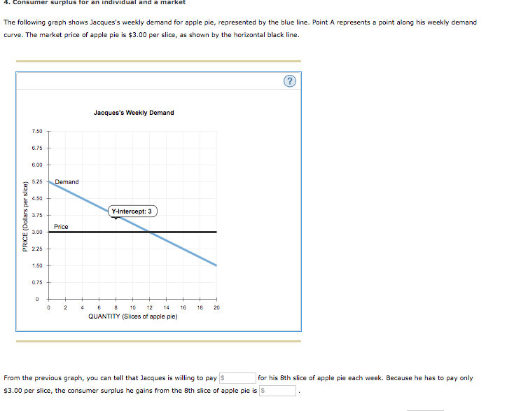
Transcribed Image Text:4. Consumer surplus for an individual and a market
The following graph shows Jacques's weekly demand for apple pie, represented by the blue line. Point A represents a point along his weekly demand
curve. The market price of apple pie is $3.00 per slice, as shown by the horizontal black line.
Jacques's Weekly Demand
7.50
6.75
6.00
5.25
Demand
4.50
Y-Intercept: 3
3.75
Price
3.00
225
1.50
0.75
10
12
14
16
18
20
QUANTITY (Slices of apple pie)
From the previous graph, you can tell that Jacques is willing to pay s
for his 8th slice of apple pie each week. Because he has to pay only
$3.00 per slice, the consumer surplus he gains from the 8th slice of apple pie is s
PRICE (Dollars per slice)
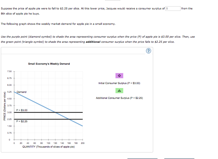
Transcribed Image Text:Suppose the price of apple pie were to fall to $2.25 per slice. At this lower price, Jacques would receive a consumer surplus of $
from the
8th slice of apple pie he buys.
The following graph shows the weekly market demand for apple pie in a small economy.
Use the purple point (diamond symbol) to shade the area representing consumer surplus when the price (P) of apple pie is $3.00 per slice. Then, use
the green point (triangle symbol) to shade the area representing additional consumer surplus when the price falls to $2.25 per slice.
Small Economy's Weekly Demand
7.50
6.75
Initial Consumer Surplus (P = $3.00)
6.00
5.25
Demand
4.50
Additional Consumer Surplus (P = $2.25)
3.75
P= $3.00
3.00
2.25
P = $2.25
1.50
0.75
20
40
60
100
120
140
160
180
200
QUANTITY (Thousands of slices of apple pie)
PRICE (Dollars per slice)
Expert Solution
This question has been solved!
Explore an expertly crafted, step-by-step solution for a thorough understanding of key concepts.

This is a popular solution!

Trending now
This is a popular solution!

Step by step
Solved in 3 steps with 4 images

Recommended textbooks for you


Essentials of Economics (MindTap Course List)
Economics
ISBN:
9781337091992
Author:
N. Gregory Mankiw
Publisher:
Cengage Learning
Essentials of Economics (MindTap Course List)
Economics
ISBN:
9781337091992
Author:
N. Gregory Mankiw
Publisher:
Cengage Learning