
Subpart (a):
Graphical illustration of changes in quantity demanded of tablet.
Subpart (a):
Explanation of Solution
Figure 1 shows the changes in quantity demanded of tablet.
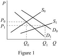
In Figure 1, the vertical axis measures the price of tablet and horizontal axis measures the quantity
Concept introduction:
Supply: The term supply represent how much an seller or a market can offer.
Demand: Consumer's desire and willingness to pay a price for a specific good or service which satisfies his wants.
Supply curve: Supply curve shows the relationship between product price and quantity that a seller is willing to supply.
Demand curve: Demand curve shows the demand for goods and services varies with changes in its price.
Subpart (b):
Graphical illustration of changes in Cranberry production.
Subpart (b):
Explanation of Solution
Figure 2 shows the changes in quantity demanded of Cranberry.
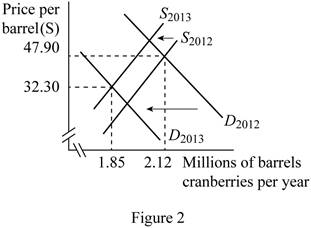
In Figure 2, the vertical axis measures cranberries price per barrel and horizontal axis measures millions of barrels cranberries per year. The upward sloping curve is the supply curve and downward sloping curve is the demand curve. The demand is decreased by even more than the supply decreases due to the changes in price.
Concept introduction:
Supply: The term supply represent how much a seller or a market can offer at the given price level during the period of time.
Demand: Consumer's desire and willingness to pay a price for a specific good or service which satisfies his wants.
Supply curve: Supply curve shows the relationship between product price and quantity that a seller is willing to supply.
Demand curve: Demand curve shows the demand for goods and services varies with changes in its price.
Subpart (c):
Graphical illustration of changes in demand of San Jose office space.
Subpart (c):
Explanation of Solution
Figure 3 shows the changes in demanded of San Jose office space.
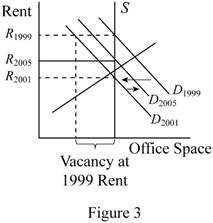
In Figure 3, the vertical axis measures the rent of San Jose office space and horizontal axis measures the demand of office space. Downward sloping curve is the demand curve at different t rate of rate. After high tech boom, the demand and rent were high (D1999). In 2001 march, the economy face a recession. After that, the demand for San Jose office space reduces. Thus, the demand curve is shifted to backward from D1999 to D2001.in 2005 the employment level from San Jose were rising slowly and rents began to rise again. This change may shift the demand curve from D2001 to D2005.
Concept introduction:
Supply: The term supply represent how much an seller or a market can offer.
Demand: Consumer's desire and willingness to pay a price for a specific good or service which satisfies his wants.
Supply curve: Supply curve shows the relationship between product price and quantity that a seller is willing to supply.
Demand curve: Demand curve shows the demand for goods and services varies with changes in its price.
Subpart (d):
Graphical illustration of changes in demand of bread.
Subpart (d):
Explanation of Solution
Figure 4 shows the changes in demanded curve of bread.
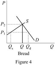
In Figure 4, the vertical axis measures the price of bread and horizontal axis measures the quantity demanded of bread. Downward sloping curve is the demand curve of bread and upward sloping curve is the supply curve of the bread. P1 is eth regulated price and P2 is the unregulated price. Before economic reform, the price of bread is below the equilibrium level. After the implementation of economic reform, the quantity demanded of bread fell down.
Concept introduction:
Supply: The term supply represent how much an seller or a market can offer.
Demand: Consumer's desire and willingness to pay a price for a specific good or service which satisfies his wants.
Supply curve: Supply curve shows the relationship between product price and quantity that a seller is willing to supply.
Demand curve: Demand curve shows the demand for goods and services varies with changes in its price.
Subpart (e):
Graphical illustration of changes in equilibrium.
Subpart (e):
Explanation of Solution
Figure 5 shows the changes in equilibrium point.
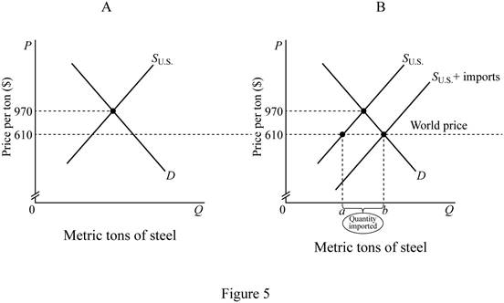
In Figure 5, the vertical axis of both part of figure measures the price of steel per tons and horizontal axis measure metric tons of steel. Upward sloping curve shows the supply curve of the steel and downward sloping curve is the demand curve of the steel. The part “A” of the figure shows the equilibrium without any import of steel. Decrease in import duty increases the import of steel. It shifts the supply curve to rightward. Thus, the equilibrium point is shifted (shown in part “B” of the figure). The gap between “a” and “b” is the quantity imported.
Concept introduction:
Supply curve: Supply curve shows the relationship between product price and quantity that a seller is willing to supply.
Demand curve: Demand curve shows the demand for goods and services varies with changes in its price.
Want to see more full solutions like this?
Chapter 3 Solutions
Principles of Micoroeconomics, Student Value Edition

- Use the four-step process to analyze the impact of a Deduction in tariffs on imports of iPods on the equilibrium price and quantity of Sony Walkman-type products.arrow_forwardConsider the market for minivans. For each of the events listed here, identify which of the determinants of demand or supply are affected. Also indicate whether demand or supply increases or decreases. Then draw a diagram to show the effect on the price and quantity of minivans. a. People decide to have more children. b. A strike by steelworkers raises steel prices. c. Engineers develop new automated machinery for the production of minivans. d. The price of sports utility vehicles rises. e. A stock market crash lowers peoples wealth.arrow_forward
 Exploring EconomicsEconomicsISBN:9781544336329Author:Robert L. SextonPublisher:SAGE Publications, Inc
 Brief Principles of Macroeconomics (MindTap Cours...EconomicsISBN:9781337091985Author:N. Gregory MankiwPublisher:Cengage Learning
 Essentials of Economics (MindTap Course List)EconomicsISBN:9781337091992Author:N. Gregory MankiwPublisher:Cengage Learning