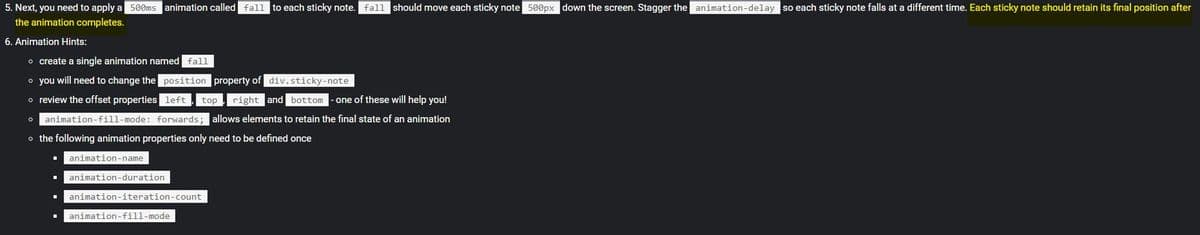
5. Next, you need to apply a seens animation called fall to each sticky note. fall should move each sticky note s00px down the screen. Stagger the animation-delay so each sticky note falls at a different time. Each sticky note should retain its final position after the animation completes. 6. Animation Hints: o create a single animation named fall • you will need to change the position property of div.sticky-note o review the offset properties left top right and bottom -one of these will help you! Oanimation-fill-mode: forwards; allows elements to retain the final state of an animation • the following animation properties only need to be defined once animation-name animation-duration . animation-iteration-count animation-fill-mode

Computer Networking: A Top-Down Approach (7th Edition)
7th Edition
ISBN:9780133594140
Author:James Kurose, Keith Ross
Publisher:James Kurose, Keith Ross
Chapter1: Computer Networks And The Internet
Section: Chapter Questions
Problem R1RQ: What is the difference between a host and an end system? List several different types of end...
icon
Related questions
Question

I almost have it done but I don't know how to get them to stay in their final position after the animation like in the gif

<!DOCTYPE html>
<html lang="en">
<head>
    <meta charset="UTF-8">
    <meta name="viewport" content="width=device-width, initial-scale=1.0">
    <title>Lab 14</title>
</head>
<body>
    <div id="backgd">
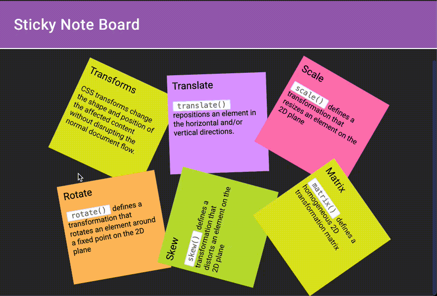
        <h2 id="heading-color">Sticky Note Board</h2>
        <div class="sticky-board">
            <div style="display: relative;">
            <div class="sticky-note" id="first">
                <div class="sticky-note-title">
                    Transforms
                </div>
                <div class="sticky-note-body">CSS transforms change the shape and position of the affected content without disrupting the normal document flow.</div>
            </div>
            </div>
            <div class="sticky-note" id="second">
                <div class="sticky-note-title">
                    Translate
                </div>
                <div class="sticky-note-body"><code>translate()</code> repositions an element in the horizontal and/or vertical directions.</div>
            </div>
            <div class="sticky-note" id="third">
                <div class="sticky-note-title">
                    Scale
                </div>
                <div class="sticky-note-body"><code>scale()</code> defines a transformation that resizes an element on the 2D plane</div>
            </div>
            <div class="sticky-note" id="fourth">
                <div class="sticky-note-title">
                    Rotate
                </div>
                <div class="sticky-note-body"><code>rotate()</code> defines a transformation that rotates an element around a fixed point on the 2D plane</div>
            </div>
            <div class="sticky-note" id="fifth">
                <div class="sticky-note-title">
                    Skew
                </div>
                <div class="sticky-note-body"><code>skew()</code> defines a transformation that distorts an element on the 2D plane</div>
            </div>
            <div class="sticky-note" id="sixth">
                <div class="sticky-note-title">
                    Matrix
                </div>
                <div class="sticky-note-body"><code>matrix()</code> defines a homogeneous 2D transformation matrix</div>
            </div>
        </div>
    </div>
</body>
</html>

<style>
/* colors.css */

.sticky-note {
    color: black;
    background: #D29DE9;
}
.sticky-note-title {
    color: inherit;
}
.sticky-note-body {
    color: inherit;
}
#backgd{
    background-color: rgb(245, 192, 220);
}
.sticky-board{
    background-color: rgb(245, 236, 114);
   
}
#heading-color{
    color: rgb(241, 122, 11);
    margin-left: 40%;
}
#first {
    background-color:#9857B4;
}
#second {
    background-color:#D29DE9;
}
#third {
    background-color:#FA66BC;
}
#fourth {
    background-color:#F6B744;
}
#fifth {
    background-color:#C3E129;
}
#sixth {
    background-color:#E6E921;
}


/* formatting.css*/

.sticky-note-title {
    padding: 1rem;
    font-size: 2rem;
}
.sticky-note-body {
    transform: rotate(0);
    padding: 1rem;
    font-size: 1.5rem;
}
.sticky-board {
    margin-top: 2em;
    display: flex;
    padding: 3em;
    flex-wrap: wrap;
    gap: 1em;
    justify-content: center;
}
.sticky-note {
    flex-shrink: 0;
    width: 20em;
    height: 20em;
   
}

#first {
     transform: rotate(75deg);
     transition: transform 500ms;    

     animation-name: fall;
     animation-delay: 1s;
     position: relative;
}
#second {
     transform: rotate(75deg);
     transition: transform 500ms;

     animation-name: fall;
     animation-delay: 2s;
     position: relative;
    }

#third {
     transform: rotate(75deg);
     transition: transform 500ms;

     animation-name: fall;
     animation-delay: 3s;
     position: relative;
}
#fourth {
     transform: rotate(75deg);
     transition: transform 500ms;

     animation-name: fall;
     animation-delay: 4s;
     position: relative;
}
#fifth {
     transform: rotate(75deg);
      transition: transform 500ms;
     
      animation-name: fall;
     animation-delay: 5s;
     position: relative;
}
#sixth {
     transform: rotate(75deg);
     transition: transform 500ms;

     animation-name: fall;
     animation-delay: 6s;
     position: relative;
}


/* animations-transitions.css*/

.sticky-note {
    width: 20em;
    height: 20em;
  transition: width 20em, height 20ems, transform 500ms;
 

  animation-name: fall;
  animation-duration: 500ms;
  animation-iteration-count: 1;
  animation-fill-mode: forwards;
}

#first:hover{
     transform: rotate(0deg);
     transform: scale(1.25);
}
#second:hover {
 
    transform: rotate(0deg);
    transform: scale(1.25);

}
#third:hover {

    transform: rotate(0deg);
    transform: scale(1.25);
}
#fourth:hover {

    transform: rotate(0deg);
    transform: scale(1.25);
}
#fifth:hover {
 
    transform: rotate(0deg);
    transform: scale(1.25);
}
#sixth:hover {
    transform: rotate(0deg);
    transform: scale(1.25);
}        


@keyframes fall {
    0%   { left:0px; top:500px;}  //
}
</style>

5. Next, you need to apply a 500ms animation called fall to each sticky note. fall should move each sticky note 500px down the screen. Stagger the animation-delay so each sticky note falls at a different time. Each sticky note should retain its final position after
the animation completes.
6. Animation Hints:
o create a single animation named fall
o you will need to change the position property of div.sticky-note
o review the offset properties left
top , right and bottom
one of these will help you!
o animation-fill-mode: forwards; allows elements to retain the final state of an animation
o the following animation properties only need to be defined once
animation-name
animation-duration
animation-iteration-count
animation-fill-mode
Transcribed Image Text:5. Next, you need to apply a 500ms animation called fall to each sticky note. fall should move each sticky note 500px down the screen. Stagger the animation-delay so each sticky note falls at a different time. Each sticky note should retain its final position after the animation completes. 6. Animation Hints: o create a single animation named fall o you will need to change the position property of div.sticky-note o review the offset properties left top , right and bottom one of these will help you! o animation-fill-mode: forwards; allows elements to retain the final state of an animation o the following animation properties only need to be defined once animation-name animation-duration animation-iteration-count animation-fill-mode
Scale
Sticky Note Board
scale() defines a
transformation that
resizes an element on the
2D plane
Transforms
Translate
CsS transforms change
the shape and position of
the affected content
translate()
repositions an element in
the horizontal and/or
vertical directions.
without disrupting the
normal document flow.
Rotate
transformation that
rotates an element around
a fixed point on the 2D
plane
rotate() defines a
skew() defines a
transformation that
distorts an element on the
2D plane
homogeneous 2D
transformation matrix
Matrix
matrix() defines a
Skew
Transcribed Image Text:Scale Sticky Note Board scale() defines a transformation that resizes an element on the 2D plane Transforms Translate CsS transforms change the shape and position of the affected content translate() repositions an element in the horizontal and/or vertical directions. without disrupting the normal document flow. Rotate transformation that rotates an element around a fixed point on the 2D plane rotate() defines a skew() defines a transformation that distorts an element on the 2D plane homogeneous 2D transformation matrix Matrix matrix() defines a Skew
Expert Solution
steps

Step by step

Solved in 2 steps

Blurred answer
Recommended textbooks for you
Computer Networking: A Top-Down Approach (7th Edi…
Computer Engineering
ISBN:
9780133594140
Author:
James Kurose, Keith Ross
Publisher:
PEARSON
Computer Organization and Design MIPS Edition, Fi…
Computer Engineering
ISBN:
9780124077263
Author:
David A. Patterson, John L. Hennessy
Publisher:
Elsevier Science
Network+ Guide to Networks (MindTap Course List)
Computer Engineering
ISBN:
9781337569330
Author:
Jill West, Tamara Dean, Jean Andrews
Publisher:
Cengage Learning
Concepts of Database Management
Computer Engineering
ISBN:
9781337093422
Author:
Joy L. Starks, Philip J. Pratt, Mary Z. Last
Publisher:
Cengage Learning
Prelude to Programming
Computer Engineering
ISBN:
9780133750423
Author:
VENIT, Stewart
Publisher:
Pearson Education
Sc Business Data Communications and Networking, T…
Computer Engineering
ISBN:
9781119368830
Author:
FITZGERALD
Publisher:
WILEY