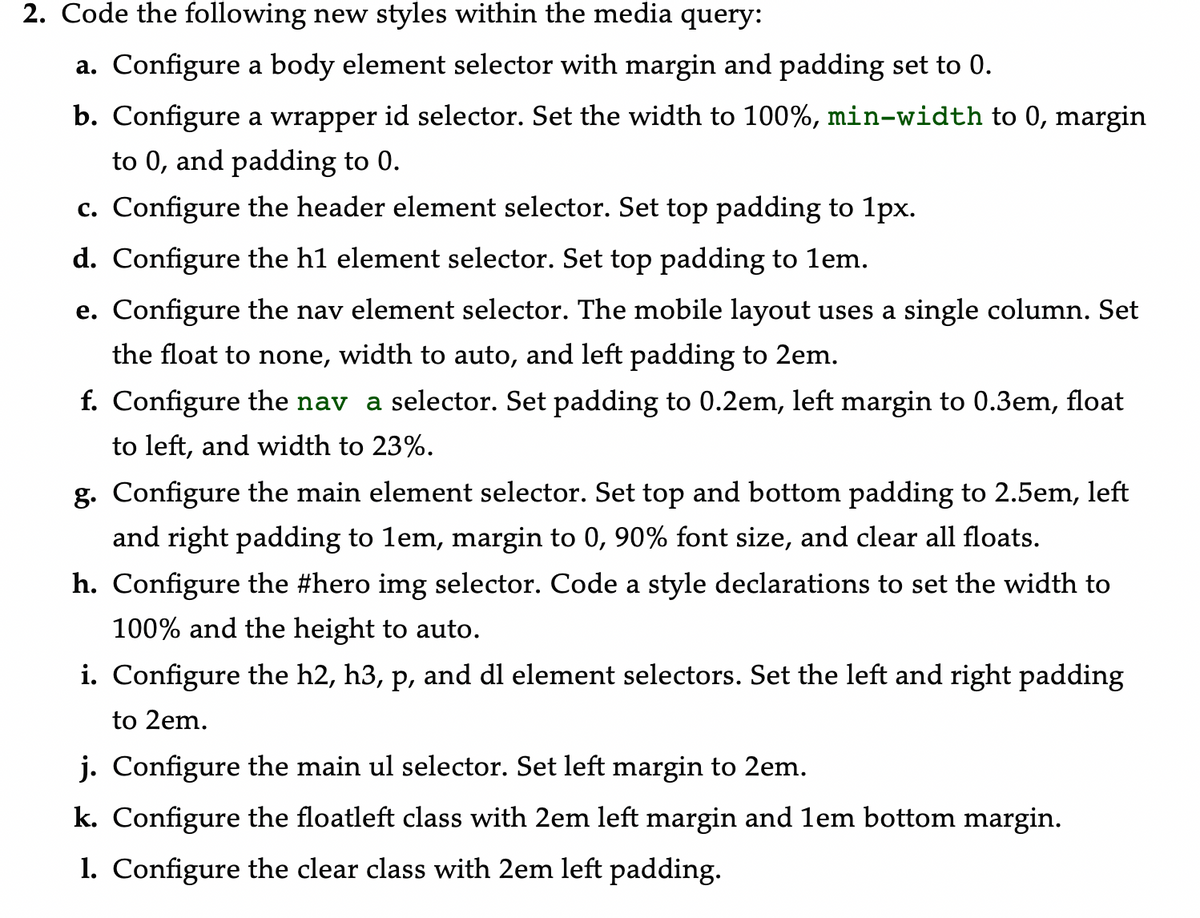
Code the following new styles within the media query: a. Configure a body element selector with margin and padding set to 0. b. Configure a wrapper id selector. Set the width to 100%, min-width to 0, margin to 0, and padding to 0. c. Configure the header element selector. Set top padding to 1px. d. Configure the h1 element selector. Set top padding to lem. e. Configure the nav element selector. The mobile layout uses a single column. Set the float to none, width to auto, and left padding to 2em. f. Configure the nav a selector. Set padding to 0.2em, left margin to 0.3em, float to left, and width to 23%. g. Configure the main element selector. Set top and bottom padding to 2.5em, left and right padding to lem, margin to 0, 90% font size, and clear all floats. h. Configure the #hero img selector. Code a style declarations to set the width to 100% and the height to auto.


How do I code my CSS with the requirements listed in the picture?
CSS
* {box-sizing: border-box;}
body {background-color: #3F2860;
font-family: Verdana,Arial, sans-serif;
color:#3F2860;}
#wrapper {background-color:#F5F5F5;
width:80%;
min-width:1200px;
max-width : 1480px;
margin-left : auto;
margin-right : auto;
color:#3F2860;}
#main {margin-left:170px;
padding-top:1em;
padding-right:2em;
Padding-left:1em;
background-color:#F5F5F5;
height: 500px;}
h2
{
margin-top:0px;
text-align: center;
}
p,h3{
text-align: center;
}
#nav{ float:left;
height:500px;
width:25%;
position:relative;
width:160px;
padding:1em;}
#hero {
text-align: left;
margin-left: 10%;
}
#ylp {
float: center;
background-repeat: no-repeat;
background-position: right;
height: 300px;
width: 90%;
margin-left: 1%;
}
#image {float:left;
width:30%;
position:relative;}
span{
margin-left: 40px;
font-size: small;
}
#des{
float: right;
width: 70%;
position: relative;
}
#mathero { height: 300px;
background-image: url("yogamat.jpeg");
background-size: 100% 100%;
background-repeat: no-repeat;}
#loungehero { height: 300px;
background-image: url("yogalounge.jpeg");
background-size: 100% 100%;
background-repeat: no-repeat;}
header {background-color: #9BC1C2;
background-image: url("lilyheader.jpeg");
background-repeat: no-repeat;
background-position: right;
height: 150px;}
h1 {line-height:200%;
padding-top: 50px;
padding-left: 2em;}
nav {font-weight: bold;
text-align:center;
Padding: 1em;
float:Left;
width:190px}
nav ul {list-style-type:none;
padding-left:0;
font-size:1.2em;}
nav a {text-decoration: none ;
display: block;
text-align:center;
font-weight:bold;
border: inset 3px #CCCCCC;
padding:1em;
margin-bottom:1em;}
#yogamat { float: center;
margin: 0 0 5px 5px;
border: 1px solid #000000;
}
nav a:link {color:#3F2860;}
nav a:visited {color:#497777;}
nav a:hover {color:#A26100;
border:3px inset #333333;}
clear { clear:both;}
footer {background-color: #9BC1C2;
font-size: .60em;
font-style: italic;
text-align: center;
padding: 1em;}
#mobile { display: none; }
#desktop { display: inline; }
@media only screen and (max-width: 1024px) {
}
li {line-height: 90%;
padding-left: 0;
font size: 1.2em}
header, nav, main, footer { display: block; }
Floatleft {float:left;
margin-right:4em;}


Trending now
This is a popular solution!

Step by step
Solved in 3 steps with 3 images