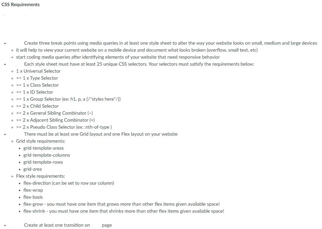
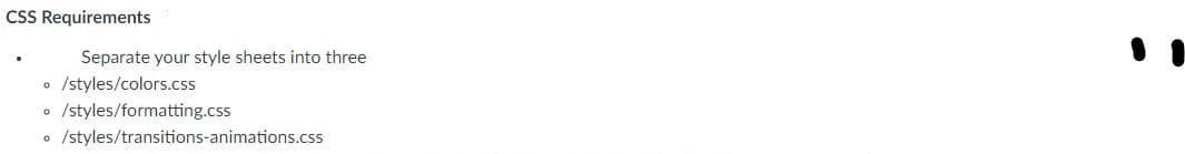
CSS Requirements Create three break points using media queries in at least one style sheet to alter the way your website looks on small, medium and large devices • it will help to view your current website on a mobile device and document what looks broken (overflow, small text, etc) • start coding media queries after identifying elements of your website that need responsive behavior Each style sheet must have at least 25 unique CSS selectors. Your selectors must satisfy the requirements below: • 1x Universal Selector >= 1 x Type Selector • >= 1 x Class Selector >= 1 x ID Selector • >= 1x Group Selector (ex: h1, p, a {/*styles here*/}) • >= 2 x Child Selector • >= 2 x General Sibling Combinator (-) • >= 2 x Adjacent Sibling Combinator (+) • >= 2 x Pseudo Class Selector (ex: :nth-of-type) There must be at least one Grid layout and one Flex layout on your website • Grid style requirements: grid-template-areas • grid-template-columns grid-template-rows • grid-area • Flex style requirements: • flex-direction (can be set to row our column) • flex-wrap • flex-basis • flex-grow - you must have one item that grows more than other flex items given available space! • flex-shrink - you must have one item that shrinks more than other flex items given available space! Create at least one transition on page


this is what I have so far please help and please use my code don't just post some random other persons code in and say it's mine becase that does not help me
MY html below MY CODE
<!DOCTYPE html>
<html>
<head>
<title>Home Page</title>
</head>
<body>
<!--Added main tag-->
<main>
<!--Added nav tag-->
<nav>
<a href="index.html">Home</a>
<a href="contact.html">Contact</a>
<a href="about.html">About</a>
</nav>
<h1>Welcome to my (about me) site</h1>
<picture>
<source media="(min-width:650px)" srcset="./images/me3-650.jpg">
<source media="(min-width:465px)" srcset="./images/me3-465.jpg">
<img src="./images/me3.JPG" alt="ME" style="width:auto;">
</picture>
<h3>HI there this is one of my favorite songs down below.</h3>
<iframe width="420" height="345"
src="https://www.bing.com/search?q=Nirvana%20-%20The%20Man%20Who%20Sold%20The %20World&pc=0TTE&ptag=C1N2A04173C0C08&form=CONBNT&conlogo=CT3210127&shtp=GetUrl&shid=38702244-8c35-477e-a042- 805b2b2d81bc&shtk=TmlydmFuYSAtIFRoZSBNYW4gV2hvIFNvbGQgVGhlIFdvcmxkIChNVFYgVW5wbHVnZ2VkKQ%3D %3D&shdk=UkVNQVNURVJFRCBJTiBIRCEgVGFrZW4gZnJvbSB0aGUgMjV0aCBBbm5pdmVyc2FyeSBFZGl0aW9ucyBvZiBOaXJ2YW5hIGI%3D&shhk=7xVtP%2FaZHQw%2B31lGYV%2F3cJukwLOZgUcFMDTYwdmuLsA %3D&shth=OVP.2ZxeDKLNemtX7dQ99X3ETQHgFo">
</iframe>
<footer>
<div class="foot">
<p>Author: Josiah McSweeney<br>
<p>Copyright Reserved</p>
</div>
</footer>
</main>
</body>
</html>

Step by step
Solved in 5 steps