This is a solution I got earlier from one of your people it is almost perfect except for some reason they skip the part where they were supposed to divide that one stylesheet into three separate smaller style sheets so I'm reposting their solution so that this can be fixed The part they missed is highlighted once this has been fixed I will be completely done asking about this problem thank you very much index.html: Home Page Home Contact About Welcome to my (about me) site HI there this is one of my favorite songs down below. Author: Josiah McSweeney Copyright Reserved style.css: *{ margin: 0; padding: 0; } @media (min-width:1224px){ body{ background-color: darkblue; color: white; } main{ display: grid; grid-template-areas: "nav" "h1" "picture" "h3" "iframe" "footer"; grid-template-columns: auto; grid-template-rows: auto; } nav{ display: flex; flex-direction: row; justify-content: end; background-color: lightcoral; } picture{ text-align: center; } nav>a{ padding: 10px; margin: 10px; } main>h1, h3{ text-align: center; } iframe{ margin: auto; } footer{ position: fixed; left: 0; bottom: 0; width: 100%; background-color:antiquewhite; color: black; } footer>.foot{ padding: 10px; display: flex; flex-direction: row; justify-content: space-evenly; } .foot:nth-of-type(1) { flex-shrink: 1; } .foot:nth-of-type(2) { flex-grow: 1; } } @media (min-width:726px){ body{ background-color: darkblue; color: white; } main{ display: grid; grid-template-areas: "nav" "h1" "picture" "h3" "iframe" "footer"; grid-template-columns: auto; grid-template-rows: auto; } nav{ display: flex; flex-direction: row; justify-content: end; background-color: lightcoral; } picture{ text-align: center; } nav>a{ padding: 10px; margin: 10px; } main>h1, h3{ text-align: center; } iframe{ margin: auto; } footer{ position: fixed; left: 0; bottom: 0; width: 100%; background-color:antiquewhite; color: black; } footer>.foot{ padding: 10px; display: flex; flex-direction: row; justify-content: space-evenly; } .foot:nth-of-type(1) { flex-grow: 1; } .foot:nth-of-type(2) { flex-shrink: 1; } } @media (min-width:320px) and (max-width:726px){ body{ background-color: darkblue; color: white; } main{ display: grid; grid-template-areas: "nav" "h1" "picture" "h3" "iframe" "footer"; grid-template-columns: auto; grid-template-rows: auto; } nav{ display: flex; flex-direction: row; justify-content: center; background-color: lightcoral; } picture{ text-align: center; } nav>a{ padding: 10px; margin: 10px; } main>h1, h3{ font-size: 16px; text-align: center; } iframe{ margin: auto; width: 300px; } footer{ position: fixed; left: 0; bottom: 0; width: 100%; background-color:antiquewhite; color: black; } footer>.foot{ padding: 10px; display: flex; flex-direction: column; text-align: center; } }


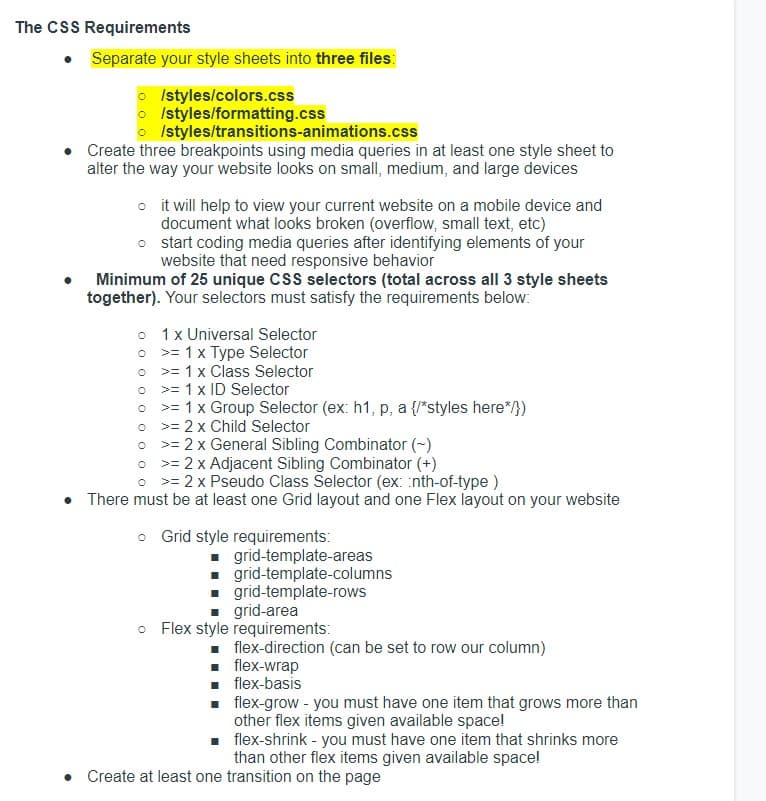
This is a solution I got earlier from one of your people it is almost perfect except for some reason they skip the part where they were supposed to divide that one stylesheet into three separate smaller style sheets so I'm reposting their solution so that this can be fixed
The part they missed is highlighted once this has been fixed I will be completely done asking about this problem thank you very much
index.html:
<!DOCTYPE html>
<html>
<head>
<title>Home Page</title>
<link rel="stylesheet" href="style.css">
</head>
<body>
<!--Added main tag-->
<main>
<!--Added nav tag-->
<nav>
<a href="index.html">Home</a>
<a href="contact.html">Contact</a>
<a href="about.html">About</a>
</nav>
<h1>Welcome to my (about me) site</h1>
<picture>
<source media="(min-width:650px)" srcset="./images/me3-650.jpg">
<source media="(min-width:465px)" srcset="./images/me3-465.jpg">
<img src="./images/me3.JPG" alt="ME" style="width:auto;">
</picture>
<h3>HI there this is one of my favorite songs down below.</h3>
<iframe width="420" height="345"
src="https://www.bing.com/search?q=Nirvana%20-%20The%20Man%20Who%20Sold%20The %20World&pc=0TTE&ptag=C1N2A04173C0C08&form=CONBNT&conlogo=CT3210127&shtp=GetUrl&shid=38702244-8c35-477e-a042- 805b2b2d81bc&shtk=TmlydmFuYSAtIFRoZSBNYW4gV2hvIFNvbGQgVGhlIFdvcmxkIChNVFYgVW5wbHVnZ2VkKQ%3D %3D&shdk=UkVNQVNURVJFRCBJTiBIRCEgVGFrZW4gZnJvbSB0aGUgMjV0aCBBbm5pdmVyc2FyeSBFZGl0aW9ucyBvZiBOaXJ2YW5hIGI%3D&shhk=7xVtP%2FaZHQw%2B31lGYV%2F3cJukwLOZgUcFMDTYwdmuLsA %3D&shth=OVP.2ZxeDKLNemtX7dQ99X3ETQHgFo">
</iframe>
<footer>
<div class="foot">
<p>Author: Josiah McSweeney<br>
<p>Copyright Reserved</p>
</div>
</footer>
</main>
</body>
</html>
style.css:
*{
margin: 0;
padding: 0;
}
@media (min-width:1224px){
body{
background-color: darkblue;
color: white;
}
main{
display: grid;
grid-template-areas: "nav"
"h1"
"picture"
"h3"
"iframe"
"footer";
grid-template-columns: auto;
grid-template-rows: auto;
}
nav{
display: flex;
flex-direction: row;
justify-content: end;
background-color: lightcoral;
}
picture{
text-align: center;
}
nav>a{
padding: 10px;
margin: 10px;
}
main>h1, h3{
text-align: center;
}
iframe{
margin: auto;
}
footer{
position: fixed;
left: 0;
bottom: 0;
width: 100%;
background-color:antiquewhite;
color: black;
}
footer>.foot{
padding: 10px;
display: flex;
flex-direction: row;
justify-content: space-evenly;
}
.foot:nth-of-type(1) {
flex-shrink: 1;
}
.foot:nth-of-type(2) {
flex-grow: 1;
}
}
@media (min-width:726px){
body{
background-color: darkblue;
color: white;
}
main{
display: grid;
grid-template-areas: "nav"
"h1"
"picture"
"h3"
"iframe"
"footer";
grid-template-columns: auto;
grid-template-rows: auto;
}
nav{
display: flex;
flex-direction: row;
justify-content: end;
background-color: lightcoral;
}
picture{
text-align: center;
}
nav>a{
padding: 10px;
margin: 10px;
}
main>h1, h3{
text-align: center;
}
iframe{
margin: auto;
}
footer{
position: fixed;
left: 0;
bottom: 0;
width: 100%;
background-color:antiquewhite;
color: black;
}
footer>.foot{
padding: 10px;
display: flex;
flex-direction: row;
justify-content: space-evenly;
}
.foot:nth-of-type(1) {
flex-grow: 1;
}
.foot:nth-of-type(2) {
flex-shrink: 1;
}
}
@media (min-width:320px) and (max-width:726px){
body{
background-color: darkblue;
color: white;
}
main{
display: grid;
grid-template-areas: "nav"
"h1"
"picture"
"h3"
"iframe"
"footer";
grid-template-columns: auto;
grid-template-rows: auto;
}
nav{
display: flex;
flex-direction: row;
justify-content: center;
background-color: lightcoral;
}
picture{
text-align: center;
}
nav>a{
padding: 10px;
margin: 10px;
}
main>h1, h3{
font-size: 16px;
text-align: center;
}
iframe{
margin: auto;
width: 300px;
}
footer{
position: fixed;
left: 0;
bottom: 0;
width: 100%;
background-color:antiquewhite;
color: black;
}
footer>.foot{
padding: 10px;
display: flex;
flex-direction: column;
text-align: center;
}
}

Step by step
Solved in 3 steps