can you please analyis this for meit is rlated to corona virose in one week in OMAN


can you please analyis this for meit is rlated to corona virose in one week in OMAN
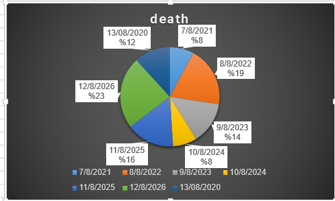

Let us try to analyse each chart separately.
Let us start with the bar graph titled “new cases”. This chart tells us the number of people who reported positive for COVID-19 on the date given beside the bar. The length of the bar is equal to the number of new cases on the date. This chart can tell us, by just a glance, that the highest number of new cases were seen on the 7th of August.
Another point to notice is that the 11th of August had the fewest number of new cases.
Additionally, we can say that as the week progressed the height of the bars started to reduce indicating a reduction in the number of new cases till the 11th of August and we then see a slight increase. We can further investigate what caused the spike on the 12th.

Step by step
Solved in 2 steps


