I need help with adding the changes I have added everything I have so far below you simply need to cut and paste it into an HTML/CSS Compiler


I need help with adding the changes I have added everything I have so far below you simply need to cut and paste it into an HTML/CSS Compiler
<!DOCTYPE html>
<html lang="en">
<style>
/* colors.css */
.sticky-note {
/* DON'T EDIT ME */
color: black;
background: #D29DE9;
}
.sticky-note-title {
/* DON'T EDIT ME */
color: inherit;
}
.sticky-note-body {
/* DON'T EDIT ME */
color: inherit;
}
/* formatting.css*/
.sticky-note-title {
/* DON'T EDIT ME */
padding: 1rem;
font-size: 2rem;
}
.sticky-note-body {
/* DON'T EDIT ME */
transform: rotate(0);
padding: 1rem;
font-size: 1.5rem;
}
.sticky-board {
/* DON'T EDIT ME */
margin-top: 2em;
display: flex;
padding: 3em;
flex-wrap: wrap;
gap: 1em;
justify-content: center;
}
.sticky-note {
flex-shrink: 0;
width: 20em;
height: 20em;
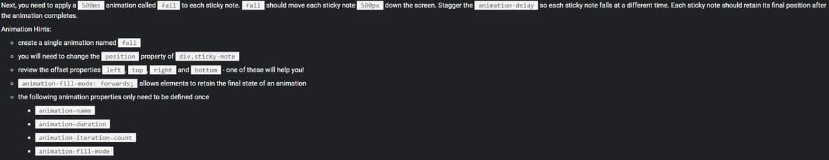
/* Add styles here */
}
#first {
transform: rotate(75deg);
transition: transform 500ms;
}
#second {
transform: rotate(75deg);
transition: transform 500ms;
}
#third {
transform: rotate(75deg);
transition: transform 500ms;
}
#fourth {
transform: rotate(75deg);
transition: transform 500ms;
}
#fifth {
transform: rotate(75deg);
transition: transform 500ms;
}
#sixth {
transform: rotate(75deg);
transition: transform 500ms;
}
/* animations-transitions.css*/
.sticky-note {
/* Add styles here */
/* transition properties here! */
/* global animation properties here! */
}
#first:hover{
transform: rotate(0deg);
transform: scale(1.25);
}
#second:hover {
transform: rotate(0deg);
transform: scale(1.25);
}
#third:hover {
transform: rotate(0deg);
transform: scale(1.25);
}
#fourth:hover {
transform: rotate(0deg);
transform: scale(1.25);
}
#fifth:hover {
transform: rotate(0deg);
transform: scale(1.25);
}
#sixth:hover {
transform: rotate(0deg);
transform: scale(1.25);
}
/* add hover selectors for the each id selector */
/* create a keyframe animation "fall" below */
</style>
<head>
<meta charset="UTF-8">
<meta name="viewport" content="width=device-width, initial-scale=1.0">
<title>homework 14</title>
</head>
<body>
<div>
<h2>Sticky Note Board</h2>
<div class="sticky-board">
<div style="display: relative;">
<div class="sticky-note" id="first">
<div class="sticky-note-title">
Transforms
</div>
<div class="sticky-note-body">CSS transforms change the shape and position of the affected content without disrupting the normal document flow.</div>
</div>
</div>
<div class="sticky-note" id="second">
<div class="sticky-note-title">
Translate
</div>
<div class="sticky-note-body"><code>translate()</code> repositions an element in the horizontal and/or vertical directions.</div>
</div>
<div class="sticky-note" id="third">
<div class="sticky-note-title">
Scale
</div>
<div class="sticky-note-body"><code>scale()</code> defines a transformation that resizes an element on the 2D plane</div>
</div>
<div class="sticky-note" id="fourth">
<div class="sticky-note-title">
Rotate
</div>
<div class="sticky-note-body"><code>rotate()</code> defines a transformation that rotates an element around a fixed point on the 2D plane</div>
</div>
<div class="sticky-note" id="fifth">
<div class="sticky-note-title">
Skew
</div>
<div class="sticky-note-body"><code>skew()</code> defines a transformation that distorts an element on the 2D plane</div>
</div>
<div class="sticky-note" id="sixth">
<div class="sticky-note-title">
Matrix
</div>
<div class="sticky-note-body"><code>matrix()</code> defines a homogeneous 2D transformation matrix</div>
</div>
</div>
</div>
</body>
</html>

Step by step
Solved in 2 steps