In 2012 in the United States, most electricity was generated from coal (37%), natural gas (30%), or nuclear power plants (19%). Hydropower accounted for 7% of the total electricity produced; other renewable sources such as wind or solar p for 5%. Other nonrenewable sources (such as petroleum) made up the remaining 2%. Complete parts a through d below. a. Display the information in a bar graph. The bars, from left to right, represent coal, natural gas, nuclear power, hydropower, wind or solar, and other nonrenewable sources. Choose the correct graph below. OA. Q O B. Q 40 30- 20- LI 20- Q 10- 10- 0- 0- Electricity Source Electricity Source OC. Q Q 40 40 Q ..... 20- Electricity Source Electricity Source b. Which is easier to sketch relatively accurately, a pie chart or a bar chart? OA. A bar chart easier because the bars are always in decreasing order of category percentages, which makes comparisons of categories easier. OD.
In 2012 in the United States, most electricity was generated from coal (37%), natural gas (30%), or nuclear power plants (19%). Hydropower accounted for 7% of the total electricity produced; other renewable sources such as wind or solar p for 5%. Other nonrenewable sources (such as petroleum) made up the remaining 2%. Complete parts a through d below. a. Display the information in a bar graph. The bars, from left to right, represent coal, natural gas, nuclear power, hydropower, wind or solar, and other nonrenewable sources. Choose the correct graph below. OA. Q O B. Q 40 30- 20- LI 20- Q 10- 10- 0- 0- Electricity Source Electricity Source OC. Q Q 40 40 Q ..... 20- Electricity Source Electricity Source b. Which is easier to sketch relatively accurately, a pie chart or a bar chart? OA. A bar chart easier because the bars are always in decreasing order of category percentages, which makes comparisons of categories easier. OD.

Holt Mcdougal Larson Pre-algebra: Student Edition 2012
1st Edition
ISBN:9780547587776
Author:HOLT MCDOUGAL
Publisher:HOLT MCDOUGAL
Chapter7: Percents
Section: Chapter Questions
Problem 4CST

Related questions
Question
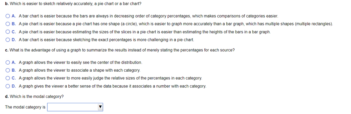
Transcribed Image Text:b. Which is easier to sketch relatively accurately, a pie chart or a bar chart?
O A. A bar chart is easier because the bars are always in decreasing order of category percentages, which makes comparisons of categories easier.
OB. A pie chart is easier because a pie chart has one shape (a circle), which is easier to graph more accurately than a bar graph, which has multiple shapes (multiple rectangles).
OC. A pie chart is easier because estimating the sizes of the slices in a pie chart is easier than estimating the heights of the bars in a bar graph.
O D. A bar chart is easier because sketching the exact percentages is more challenging in a pie chart.
c. What is the advantage of using a graph to summarize the results instead of merely stating the percentages for each source?
OA. A graph allows the viewer to easily see the center of the distribution.
B. A graph allows the viewer to associate a shape with each category.
O C. A graph allows the viewer to more easily judge the relative sizes of the percentages in each category.
O D. A graph gives the viewer a better sense of the data because it associates a number with each category.
d. Which is the modal category?
The modal category is
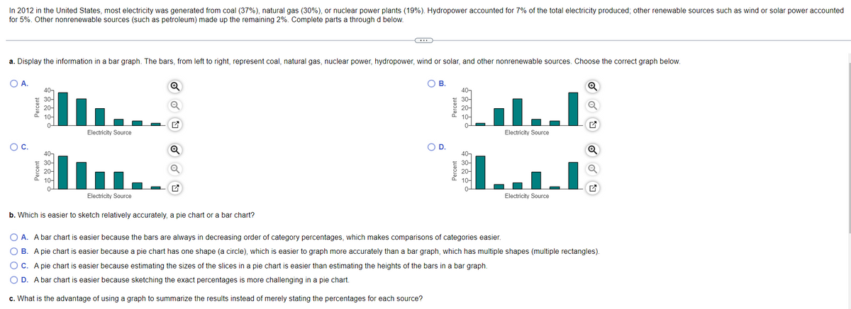
Transcribed Image Text:In 2012 in the United States, most electricity was generated from coal (37%), natural gas (30%), or nuclear power plants (19%). Hydropower accounted for 7% of the total electricity produced; other renewable sources such as wind or solar power accounted
for 5%. Other nonrenewable sources (such as petroleum) made up the remaining 2%. Complete parts a through d below.
a. Display the information in a bar graph. The bars, from left to right, represent coal, natural gas, nuclear power, hydropower, wind or solar, and other nonrenewable sources. Choose the correct graph below.
O B.
O A.
Q
40-
40-
30-
30-
Q
20-
20-
10-
10-
G
0-
Electricity Source
Electricity Source
Q
40
40-
Q
Q
30-
30-
20-
20-
10-
10-
0-
0-
Electricity Source
Electricity Source
b. Which is easier to sketch relatively accurately, a pie chart or a bar chart?
O A. A bar chart is easier because the bars are always in decreasing order of category percentages, which makes comparisons of categories easier.
OB. A pie chart is easier because a pie chart has one shape (a circle), which is easier to graph more accurately than a bar graph, which has multiple shapes (multiple rectangles).
OC. A pie chart is easier because estimating the sizes of the slices in a pie chart is easier than estimating the heights of the bars in a bar graph.
O D. A bar chart is easier because sketching the exact percentages is more challenging in a pie chart.
c. What is the advantage of using a graph to summarize the results instead of merely stating the percentages for each source?
O C.
Percent
Percent
O D.
Percent
Percent
0-
Expert Solution
This question has been solved!
Explore an expertly crafted, step-by-step solution for a thorough understanding of key concepts.

This is a popular solution!

Trending now
This is a popular solution!

Step by step
Solved in 2 steps

Recommended textbooks for you
Holt Mcdougal Larson Pre-algebra: Student Edition…
Algebra
ISBN:
9780547587776
Author:
HOLT MCDOUGAL
Publisher:
HOLT MCDOUGAL

Glencoe Algebra 1, Student Edition, 9780079039897…
Algebra
ISBN:
9780079039897
Author:
Carter
Publisher:
McGraw Hill

Algebra: Structure And Method, Book 1
Algebra
ISBN:
9780395977224
Author:
Richard G. Brown, Mary P. Dolciani, Robert H. Sorgenfrey, William L. Cole
Publisher:
McDougal Littell
Holt Mcdougal Larson Pre-algebra: Student Edition…
Algebra
ISBN:
9780547587776
Author:
HOLT MCDOUGAL
Publisher:
HOLT MCDOUGAL
Glencoe Algebra 1, Student Edition, 9780079039897…
Algebra
ISBN:
9780079039897
Author:
Carter
Publisher:
McGraw Hill
Algebra: Structure And Method, Book 1
Algebra
ISBN:
9780395977224
Author:
Richard G. Brown, Mary P. Dolciani, Robert H. Sorgenfrey, William L. Cole
Publisher:
McDougal Littell