The graph of the waiting time (in seconds) at a red light is shown below on the left with its mean and standard deviation. Assume that a sample size of 100 is drawn from the population. Decide which of the graphs labeled (a)-(c) would most closely resemble the sampling distribution of the sample means. Explain your reasoning. AP(X) 0.04- 8.04P() G 11.7 =11.7 1.17 iu = 9 = 18,9 d: = 11.7 A- 18.9 H: 18.9 50 Time (in sec.) -20 50 Time (in sec.) 50 Time (in sec.) Time (in sec.) Graph most closely resembles the sampling distribution of the sample means, because p; =. 0; =. and the graph (Type an integer or a decimal.) approximates a normal curve Aouanbo jo
The graph of the waiting time (in seconds) at a red light is shown below on the left with its mean and standard deviation. Assume that a sample size of 100 is drawn from the population. Decide which of the graphs labeled (a)-(c) would most closely resemble the sampling distribution of the sample means. Explain your reasoning. AP(X) 0.04- 8.04P() G 11.7 =11.7 1.17 iu = 9 = 18,9 d: = 11.7 A- 18.9 H: 18.9 50 Time (in sec.) -20 50 Time (in sec.) 50 Time (in sec.) Time (in sec.) Graph most closely resembles the sampling distribution of the sample means, because p; =. 0; =. and the graph (Type an integer or a decimal.) approximates a normal curve Aouanbo jo

Glencoe Algebra 1, Student Edition, 9780079039897, 0079039898, 2018
18th Edition
ISBN:9780079039897
Author:Carter
Publisher:Carter
Chapter10: Statistics
Section10.4: Distributions Of Data
Problem 19PFA

Related questions

Question
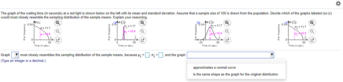
Transcribed Image Text:The graph of the waiting time (in seconds) at a red light is shown below on the left with its mean and standard deviation. Assume that a sample size of 100 is drawn from the population. Decide which of the graphs labeled (a)-(c)
would most closely resemble the sampling distribution of the sample means. Explain your reasoning.
oP ()
8.04P()
G: = 11.7
0.04-
O = 11.7
= 1.17
0.04
0: = 11.7
IH = N.9
:= 18,9
- 18.9
H: 18.9
50
20
Time (in sec.)
Time (in sec.)
50
Time (in sec.)
50
Time (in sec.)
Graph most closely resembles the sampling distribution of the sample means, because = | 0; =|
and the graph
(Type an integer or a decimal.)
approximates a normal curve
is the same shape as the graph for the original distribution
Rel. frequency
kouanbay ja
Rel. frequency
Expert Solution
This question has been solved!
Explore an expertly crafted, step-by-step solution for a thorough understanding of key concepts.

This is a popular solution!

Trending now
This is a popular solution!

Step by step
Solved in 2 steps

Knowledge Booster


Learn more about
Need a deep-dive on the concept behind this application? Look no further. Learn more about this topic, statistics and related others by exploring similar questions and additional content below.Recommended textbooks for you
Glencoe Algebra 1, Student Edition, 9780079039897…
Algebra
ISBN:
9780079039897
Author:
Carter
Publisher:
McGraw Hill

Big Ideas Math A Bridge To Success Algebra 1: Stu…
Algebra
ISBN:
9781680331141
Author:
HOUGHTON MIFFLIN HARCOURT
Publisher:
Houghton Mifflin Harcourt
Glencoe Algebra 1, Student Edition, 9780079039897…
Algebra
ISBN:
9780079039897
Author:
Carter
Publisher:
McGraw Hill
Big Ideas Math A Bridge To Success Algebra 1: Stu…
Algebra
ISBN:
9781680331141
Author:
HOUGHTON MIFFLIN HARCOURT
Publisher:
Houghton Mifflin Harcourt