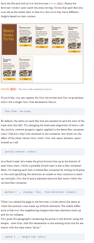
Whan you are done experimenting, set align-items back to stretch. Instead of having all the items on one line and gatting cropped by the edga of the browser, let's have them wrap onto multiple lines by using the flex-wrap property on the menu container:


<!doctype html>
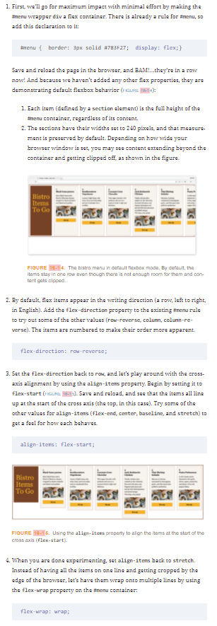
<html>
<head>
<meta charset="UTF-8">
<title>Flexbox Product Listing Exercise</title>
<style>
html {
box-sizing: border-box;
}
*, *:before, *:after {
box-sizing: inherit;
}
body {
font-family: Georgia, serif;
line-height: 1.5em;
}
h1 {
font-size: 4em;
font-weight: normal;
}
h2 {
font-size: 1.2em;
margin-top: 0;
}
#menu {
border: 3px solid #783F27;
}
section {
background: #F6F3ED;
margin: 10px;
padding: 20px;
border: 1px dotted maroon;
width: 240px;
}
.title {
background-color: #783F27;
color: #F9AB33;
line-height: 4em;
}
.price {
font-weight: bold;
background: #F9AB33;
padding: 5px;
width: 100%;
text-align: center;
}
</style>
</head>
<body>
<div id="menu">
<section class="title">
<h1>Bistro Items To Go</h1>
</section>
<section class="dish">
<h2>1<br>Black bean purses</h2>
<p class="info">Spicy black bean and a blend of Mexican cheeses wrapped in sheets of phyllo and baked until golden.</p>
<p class="photo"><img src="table.jpg" alt=""></p>
<p class="price">$3.95</p>
</section>
<section class="dish">
<h2>2<br>Southwestern Napoleons</h2>
<p class="info">Layers of light lump crab meat, bean, and corn salsa, and our handmade flour tortillas.</p>
<p class="photo"><img src="table.jpg" alt=""></p>
<p class="price">$7.95</p>
</section>
<section class="dish">
<h2>3<br>Coconut-Corn Chowder</h2>
<p class="info">This vegan chowder with potatoes and corn in a coconut broth is light and delicious.</p>
<p class="photo"><img src="table.jpg" alt=""></p>
<p class="price">$3.95</p>
</section>
<section class="dish">
<h2>4<br>Jerk Rotisserie Chicken</h2>
<p class="info">Tender chicken slow roasted on the rotisserie, flavored with spicy and fragrant jerk sauce and served with fried plantains and sliced mango. <em>Warning, very spicy!</em></p>
<p class="photo"><img src="table.jpg" alt=""></p>
<p class="price">$12.95</p>
</section>
<section class="dish">
<h2>5<br>Thai Shrimp Kebabs</h2>
<p class="info">Skewers of shrimp marinated in lemongrass, garlic, and fish sauce then grilled to perfection.</p>
<p class="photo"><img src="table.jpg" alt=""></p>
<p class="price">$12.95</p>
</section>
<section class="dish">
<h2>6<br>Pasta Puttanesca</h2>
<p class="info">A rich tomato sauce simmered with garlic, olives, capers, anchovies, and plenty of hot red pepper flakes.</p>
<p class="photo"><img src="table.jpg" width="200" height="100" alt=""></p>
<p class="price">$12.95</p>
</section>
</div>
</body>
</html>

Step by step
Solved in 2 steps