Below is a dot-plot of voter turnout (as a percentage of voting-age population) for the 50 state. plus the District of Columbia-in a recent presidential election. Voter Turnout for Fifty States and the District of Columbia 45 50 55 60 65 70 75 Percentage of Voting-Age Population 1. Which of the following best describes this distribution? A. Skewed slightly left, centered at about 62%, with a range of 24 percentage points. B. Roughly symmetric, centered at about 60%, with a range of 30 percentage points. C. Skewed slightly right, centered at about 62%, with a range of 24 percentage points. 2. Approximately what percentage of the states had a turnout above 65%?
Below is a dot-plot of voter turnout (as a percentage of voting-age population) for the 50 state. plus the District of Columbia-in a recent presidential election. Voter Turnout for Fifty States and the District of Columbia 45 50 55 60 65 70 75 Percentage of Voting-Age Population 1. Which of the following best describes this distribution? A. Skewed slightly left, centered at about 62%, with a range of 24 percentage points. B. Roughly symmetric, centered at about 60%, with a range of 30 percentage points. C. Skewed slightly right, centered at about 62%, with a range of 24 percentage points. 2. Approximately what percentage of the states had a turnout above 65%?

Glencoe Algebra 1, Student Edition, 9780079039897, 0079039898, 2018
18th Edition
ISBN:9780079039897
Author:Carter
Publisher:Carter
Chapter10: Statistics
Section10.4: Distributions Of Data
Problem 19PFA

Related questions

Question
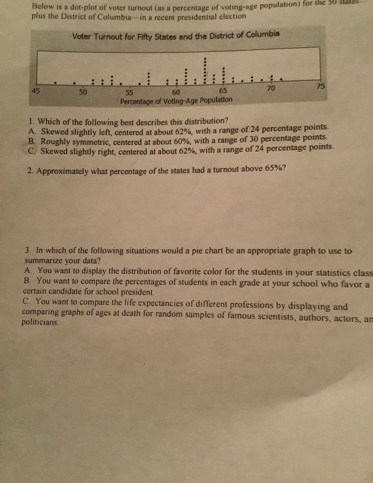
Transcribed Image Text:Below is a dot-plot of voter turnout (as a percentage of voting-age population) for the 30 states
plus the District of Columbia-in a recent presidential election.
Voter Turnout for Fifty States and the District of Columbia
:: :.
70
75
45
50
55
60
65
Percentage of Voting-Age Population
1. Which of the following best describes this distribution?
A. Skewed slightly left, centered at about 62%, with a range of 24 percentage points.
B. Roughly symmetric, centered at about 60%, with a range of 30 percentage points.
C. Skewed slightly right, centered at about 62%, with a range of 24 percentage points.
2. Approximately what percentage of the states had a turnout above 65%?
3. In which of the following situations would a pie chart be an appropriate graph to use to
summarize your data?
A. You want to display the distribution of favorite color for the students in your statistics class
B. You want to compare the percentages of students in each grade at your school who favor a
certain candidate for school president.
C. You want to compare the life expectancies of different professions by displaying and
comparing graphs of ages at death for random samples of famous scientists, authors, actors, am
politicians.
Expert Solution
This question has been solved!
Explore an expertly crafted, step-by-step solution for a thorough understanding of key concepts.

This is a popular solution!

Trending now
This is a popular solution!

Step by step
Solved in 5 steps

Knowledge Booster


Learn more about
Need a deep-dive on the concept behind this application? Look no further. Learn more about this topic, statistics and related others by exploring similar questions and additional content below.Recommended textbooks for you
Glencoe Algebra 1, Student Edition, 9780079039897…
Algebra
ISBN:
9780079039897
Author:
Carter
Publisher:
McGraw Hill
Glencoe Algebra 1, Student Edition, 9780079039897…
Algebra
ISBN:
9780079039897
Author:
Carter
Publisher:
McGraw Hill