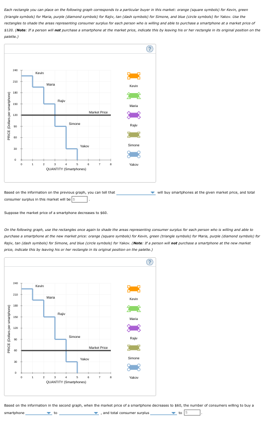
Consumer surplus for a group of consumers The following graph shows the demand curve for a group of consumers in the U.S. market (blue line) for smartphones. The market price of a smartphone is shown by the black horizontal line at $120. Each rectangle you can place on the following graph corresponds to a particular buyer in this market: orange (square symbols) for Kevin, green (triangle symbols) for Maria, purple (diamond symbols) for Rajiv, tan (dash symbols) for Simone, and blue (circle symbols) for Yakov. Use the rectangles to shade the areas representing consumer surplus for each person who is willing and able to purchase a smartphone at a market price of $120. (Note: If a person will not purchase a smartphone at the market price, indicate this by leaving his or her rectangle in its original position on the palette.)
Consumer surplus for a group of consumers The following graph shows the demand curve for a group of consumers in the U.S. market (blue line) for smartphones. The market price of a smartphone is shown by the black horizontal line at $120. Each rectangle you can place on the following graph corresponds to a particular buyer in this market: orange (square symbols) for Kevin, green (triangle symbols) for Maria, purple (diamond symbols) for Rajiv, tan (dash symbols) for Simone, and blue (circle symbols) for Yakov. Use the rectangles to shade the areas representing consumer surplus for each person who is willing and able to purchase a smartphone at a market price of $120. (Note: If a person will not purchase a smartphone at the market price, indicate this by leaving his or her rectangle in its original position on the palette.)

Chapter4: Demand, Supply, And Market Equilibrium
Section: Chapter Questions
Problem 4P

Related questions
Question
3. Consumer surplus for a group of consumers
The following graph shows the demand curve for a group of consumers in the U.S. market (blue line) for smartphones. The market price of a smartphone is shown by the black horizontal line at $120.
Each rectangle you can place on the following graph corresponds to a particular buyer in this market: orange (square symbols) for Kevin, green (triangle symbols) for Maria, purple (diamond symbols) for Rajiv, tan (dash symbols) for Simone, and blue (circle symbols) for Yakov. Use the rectangles to shade the areas representing consumer surplus for each person who is willing and able to purchase a smartphone at a market price of $120. (Note: If a person will not purchase a smartphone at the market price, indicate this by leaving his or her rectangle in its original position on the palette.)
Transcribed Image Text:Each rectangie you can place on the following graph corresponds to a particular buyer in this market: arange (square symbols) for Kevin, green
(triangle symbols) for Maria, purpie (dlamand symbols) for Rajv, tan (dash symbals) for Simone, and blue (crcie symbols) for Yakov. Use the
rectangles to shade the areas representing consumer surplus for each person who is wiWing and abie to purchase a smartphane at a market price of
$120. (Note: If a persan will not purchase a smartphone at the market price, indicate this by leaving his or her rectangle in its ariginal pasitian on the
palette.)
240
Kevin
210
Maria
Kevin
180
Rajiv
190
Maria
Market Price
120
Simone
Rajv
Yakov
Simone
30
1
2
4
Yakov
QUANTITY (Smarphones)
Based on the information on the previous graph, you can tell that
will buy smartphones at the given market price, and total
consumer surplus in this market will be
Suppose the market price of a smartphone decreases to $60.
On the following graph, use the rectangies ance again to shade the areas representing consumer surplus for each persan who is willing and able to
purchase a smartphone at the new mavket price: orange (square symbais) for Kevin, green (triangie symbols) for Maria, purpie (diamand symbols) for
Rajiv, tan (dash symbals) for Simone, and blue (circie symbols) for Yakov. (Note: If a person wi not purchase a smartphone at the new market
price, indicate this by leaving his or her rectangle in its original position an the palette.)
240
Kevin
210
Maria
Kevin
Rajiv
150
Maria
120
Simone
Rajv
Market Price
Yakov
Simone
30
D
Yakov
QUANTITY (Smarphones)
Based on the information in the second graph, when the market price of a smartphone decreases to $60, the number of consumers willing to buy a
smartphone
v to
, and total consumer surplus
to
PRICE (Dolars per smartphone)
PRICE (Dollars per smartphone)
Expert Solution
This question has been solved!
Explore an expertly crafted, step-by-step solution for a thorough understanding of key concepts.

This is a popular solution!

Trending now
This is a popular solution!

Step by step
Solved in 2 steps with 2 images

Knowledge Booster


Learn more about
Need a deep-dive on the concept behind this application? Look no further. Learn more about this topic, economics and related others by exploring similar questions and additional content below.Recommended textbooks for you
Exploring Economics
Economics
ISBN:
9781544336329
Author:
Robert L. Sexton
Publisher:
SAGE Publications, Inc


Economics (MindTap Course List)
Economics
ISBN:
9781337617383
Author:
Roger A. Arnold
Publisher:
Cengage Learning
Exploring Economics
Economics
ISBN:
9781544336329
Author:
Robert L. Sexton
Publisher:
SAGE Publications, Inc
Economics (MindTap Course List)
Economics
ISBN:
9781337617383
Author:
Roger A. Arnold
Publisher:
Cengage Learning
