Read the pages and make a brief summary of them with your own words, please. It is what you understand. Don't make copy-paste, please. Mention important parts only. Also, you will put your comments and ideas about the topic. Please don't write item by item. Write the summary in paragraph form.
Read the pages and make a brief summary of them with your own words, please. It is what you understand. Don't make copy-paste, please. Mention important parts only. Also, you will put your comments and ideas about the topic. Please don't write item by item. Write the summary in paragraph form.

MATLAB: An Introduction with Applications
6th Edition
ISBN:9781119256830
Author:Amos Gilat
Publisher:Amos Gilat
Chapter1: Starting With Matlab
Section: Chapter Questions
Problem 1P

Related questions
Question
Read the pages and make a brief summary of them with your own words, please. It is what you understand. Don't make copy-paste, please. Mention important parts only. Also, you will put your comments and ideas about the topic. Please don't write item by item. Write the summary in paragraph form.
Transcribed Image Text:Or, you may use the formula
for example. One batch produces the left bell curve, and
the second batch the curve on the right. The two curves
may be separated for a better view of what is going on by
stratifying the data by batch. (See the "Stratification" sec-
tion later in this chapter.)
Histogram F suggests that someone is discarding the
samples below and above a set of limits. This typically happens
when there is a 100% inspection and only data that are within
limits are recorded. The strange Histogram G might have used
data from incoming inspection. The message here is that the
vendor is screening the parts and someone else is getting the
best ones. A typical case might be electrical resistors that are
graded as 1,5, and 10% tolerance. The resistors that met 1 and
30
25
k = VN
20
It is not necessary to be very precise with this. These
methods are used to get close and adjust one way or the
other for a fit with your data.
Suppose we are using steel balls in one of our prod-
ucts and the weight of the ball is critical. The specification
is 5 ± 0.2 grams. The balls are purchased from a vendor,
and because our tolerance is tighter than the vendor's, we
weigh the balls and use only those that meet our specifi-
cation. The vendor is trying to tighten its tolerance and
has asked for assistance in the form of data, Today 60 balls
were received and weighed. The data were plotted on a
histogram. To give the vendor the complete information,
a histogram with intervals every 0.02 gram is established.
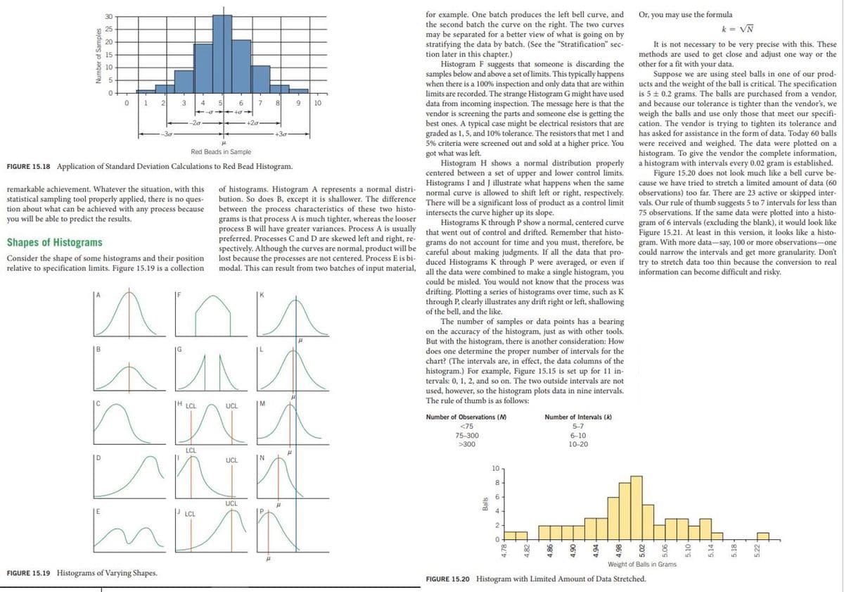
Figure 15.20 does not look much like a bell curve be-
cause we have tried to stretch a limited amount of data (60
observations) too far. There are 23 active or skipped inter-
vals. Our rule of thumb suggests 5 to 7 intervals for less than
75 observations. If the same data were plotted into a histo-
gram of 6 intervals (excluding the blank), it would look like
Figure 15.21. At least in this version, it looks like a histo-
gram. With more data-say, 100 or more observations-one
could narrow the intervals and get more granularity. Don't
try to stretch data too thin because the conversion to real
information can become difficult and risky.
5 15
10
1.
3
4
6
8
10
-20
+20
+30
5% criteria were screened
and sold at a higher price. You
Red Beads in Sample
got what was
Histogram H shows a normal distribution properly
centered between a set of upper and lower control limits.
Histograms I and J illustrate what happens when the same
normal curve is allowed to shift left or right, respectively.
There will be a significant loss of product as a control limit
intersects the curve higher up its slope.
Histograms K through P show a normal, centered curve
that went out of control and drifted. Remember that histo-
left.
FIGURE 15.18 Application of Standard Deviation Calculations to Red Bead Histogram.
of histograms. Histogram A represents a normal distri-
bution. So does B, except it is shallower. The difference
between the process characteristics of these two histo-
grams is that process A is much tighter, whereas the looser
process B will have greater variances. Process A is usually
preferred. Processes C and D are skewed left and right, re-
spectively. Although the curves are normal, product will be careful about making judgments. If all the data that pro-
lost because the processes are not centered. Process E is bi-
modal. This can result from two batches of input material, all the data were combined to make a single histogram, you
remarkable achievement. Whatever the situation, with this
statistical sampling tool properly applied, there is no ques-
tion about what can be achieved with any process because
you will be able to predict the results.
Shapes of Histograms
grams do not account for time and you must, therefore, be
Consider the shape of some histograms and their position
relative to specification limits. Figure 15.19 is a collection
duced Histograms K through P were averaged, or even if
could be misled. You would not know that the process was
drifting. Plotting a series of histograms over time, such as K
through P, clearly illustrates any drift right or left, shallowing
of the bell, and the like.
The number of samples or data points has a bearing
on the accuracy of the histogram, just as with other tools.
But with the histogram, there is another consideration: How
does one determine the proper number of intervals for the
chart? (The intervals are, in effect, the data columns of the
histogram.) For example, Figure 15.15 is set up for 11 in-
tervals: 0, 1, 2, and so on. The two outside intervals are not
used, however, so the histogram plots data in nine intervals.
The rule of thumb is as follows:
A
|H LCL
UCL
Number of Observations (M)
Number of Intervals (k)
<75
5-7
75-300
6-10
>300
10-20
LCL
UCL
N
10
8.
6 -
UCL
4-
LCL
2
Weight of Balls in Grams
FIGURE 15.19 Histograms of Varying Shapes.
FIGURE 15.20 Histogram with Limited Amount of Data Stretched
Number of Samples
5.18-
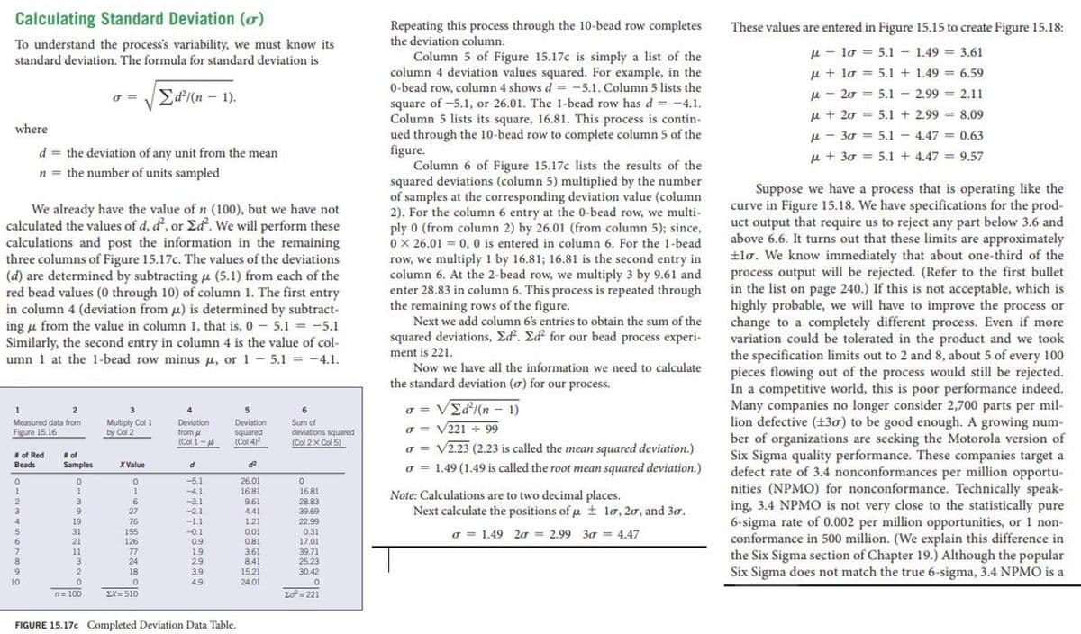
Transcribed Image Text:Calculating Standard Deviation (o)
Repeating this process through the 10-bead row completes
the deviation column.
These values are entered in Figure 15.15 to create Figure 15.18:
To understand the process's variability, we must know its
standard deviation. The formula for standard deviation is
u - lo = 5.1 - 1.49 = 3,61
Column 5 of Figure 15.17c is simply a list of the
column 4 deviation values squared. For example, in the
0-bead row, column 4 shows d = -5.1. Column 5 lists the
square of -5.1, or 26.01. The 1-bead row has d = -4.1.
Column 5 lists its square, 16.81. This process is contin-
ued through the 10-bead row to complete column 5 of the
figure.
Column 6 of Figure 15.17c lists the results of the
squared deviations (column 5) multiplied by the number
of samples at the corresponding deviation value (column
2). For the column 6 entry at the 0-bead row, we multi-
ply 0 (from column 2) by 26.01 (from column 5); since,
0 X 26.01 = 0, 0 is entered in column 6. For the 1-bead
row, we multiply 1 by 16.81; 16.81 is the second entry in
column 6. At the 2-bead row, we multiply 3 by 9.61 and
enter 28.83 in column 6. This process is repeated through
the remaining rows of the figure.
Next we add column 6's entries to obtain the sum of the
squared deviations, Ed. Ed for our bead process experi-
u + lo = 5.1 + 1.49 = 6.59
Ed/(n – 1).
u - 20 = 5.1 - 2.99 = 2.11
u + 20 = 5.1 + 2.99 = 8.09
where
u - 30 = 5.1 - 4.47 = 0.63
d = the deviation of any unit from the mean
u + 30 = 5.1 + 4.47 = 9.57
n = the number of units sampled
Suppose we have a process that is operating like the
curve in Figure 15.18. We have specifications for the prod-
uct output that require us to reject any part below 3.6 and
above 6.6. It turns out that these limits are approximately
+lo. We know immediately that about one-third of the
process output will be rejected. (Refer to the first bullet
in the list on page 240.) If this is not acceptable, which is
highly probable, we will have to improve the process or
change to a completely different process. Even if more
variation could be tolerated in the product and we took
the specification limits out to 2 and 8, about 5 of every 100
pieces flowing out of the process would still be rejected.
In a competitive world, this is poor performance indeed.
Many companies no longer consider 2,700 parts per mil-
lion defective (±30) to be good enough. A growing num-
ber of organizations are seeking the Motorola version of
Six Sigma quality performance. These companies target a
defect rate of 3.4 nonconformances per million opportu-
nities (NPMO) for nonconformance. Technically speak-
ing, 3.4 NPMO is not very close to the statistically pure
6-sigma rate of 0.002 per million opportunities, or 1 non-
conformance in 500 million. (We explain this difference in
the Six Sigma section of Chapter 19.) Although the popular
Six Sigma does not match the true 6-sigma, 3.4 NPMO is a
We already have the value of n (100), but we have not
calculated the values of d, d, or Ed. We will perform these
calculations and post the information in the remaining
three columns of Figure 15.17c. The values of the deviations
(d) are determined by subtracting µ (5.1) from each of the
red bead values (0 through 10) of column 1. The first entry
in column 4 (deviation from u) is determined by subtract-
ing u from the value in column 1, that is, 0 5.1 = -5.1
Similarly, the second entry in column 4 is the value of col-
umn 1 at the 1-bead row minus u, or 1 - 5.1 = -4.1.
ment is 221.
Now we have all the information we need to calculate
the standard deviation (o) for our process.
o = VEd/(n – 1)
2
4
Multiply Col 1
by Col 2
Measured data from
Deviation
Deviation
squared
(Col 4)
Sum of
deviations squared
(Col 2x Col 5)
Figure 15.16
from u
(Col 1-
o = V221+ 99
# of Red
Beads
# of
Samples
o = V2.23 (2.23 is called the mean squared deviation.)
o = 1.49 (1.49 is called the root mean squared deviation.)
X Value
26.01
16.81
9.61
4.41
-5.1
4.1
16.81
Note: Calculations are to two decimal places.
Next calculate the positions of u ± lo, 20, and 30.
3
-3.1
-2.1
28.83
39.69
3
27
19
76
-1.1
1.21
0.01
22.99
0.31
31
155
-0.1
o = 1.49 20 = 2.99 30 = 4.47
21
126
0.9
0.81
17.01
11
77
24
1.9
2.9
3.61
8.41
39.71
25.23
8.
9.
2
18
3.9
15.21
30.42
10
49
24.01
n= 100
EX= 510
Ed= 221
FIGURE 15.17c Completed Deviation Data Table.
Expert Solution
This question has been solved!
Explore an expertly crafted, step-by-step solution for a thorough understanding of key concepts.

Step by step
Solved in 2 steps

Recommended textbooks for you
MATLAB: An Introduction with Applications
Statistics
ISBN:
9781119256830
Author:
Amos Gilat
Publisher:
John Wiley & Sons Inc

Probability and Statistics for Engineering and th…
Statistics
ISBN:
9781305251809
Author:
Jay L. Devore
Publisher:
Cengage Learning

Statistics for The Behavioral Sciences (MindTap C…
Statistics
ISBN:
9781305504912
Author:
Frederick J Gravetter, Larry B. Wallnau
Publisher:
Cengage Learning
MATLAB: An Introduction with Applications
Statistics
ISBN:
9781119256830
Author:
Amos Gilat
Publisher:
John Wiley & Sons Inc
Probability and Statistics for Engineering and th…
Statistics
ISBN:
9781305251809
Author:
Jay L. Devore
Publisher:
Cengage Learning
Statistics for The Behavioral Sciences (MindTap C…
Statistics
ISBN:
9781305504912
Author:
Frederick J Gravetter, Larry B. Wallnau
Publisher:
Cengage Learning

Elementary Statistics: Picturing the World (7th E…
Statistics
ISBN:
9780134683416
Author:
Ron Larson, Betsy Farber
Publisher:
PEARSON

The Basic Practice of Statistics
Statistics
ISBN:
9781319042578
Author:
David S. Moore, William I. Notz, Michael A. Fligner
Publisher:
W. H. Freeman

Introduction to the Practice of Statistics
Statistics
ISBN:
9781319013387
Author:
David S. Moore, George P. McCabe, Bruce A. Craig
Publisher:
W. H. Freeman