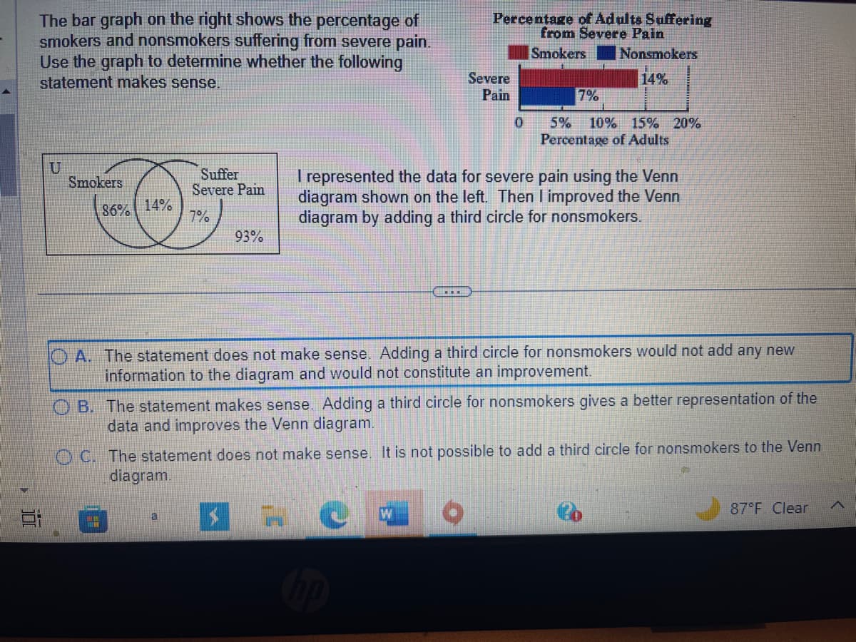
The bar graph on the right shows the percentage of smokers and nonsmokers suffering from severe pain. Use the graph to determine whether the following statement makes sense. U Smokers 86% 14% Suffer Severe Pain 7% 93% Percentage of Adults Suffering from Severe Pain Smokers Nonsmokers 14% Severe Pain 0 7% 5% 10% 15% 20% Percentage of Adults I represented the data for severe pain using the Venn diagram shown on the left. Then I improved the Venn diagram by adding a third circle for nonsmokers. A. The statement does not make sense. Adding a third circle for nonsmokers would not add any new information to the diagram and would not constitute an improvement. B. The statement makes sense. Adding a third circle for nonsmokers gives a better representation of the data and improves the Venn diagram. OC. The statement does not make sense. It is not possible to add a third circle for nonsmokers to the Venn diagram.
The bar graph on the right shows the percentage of smokers and nonsmokers suffering from severe pain. Use the graph to determine whether the following statement makes sense. U Smokers 86% 14% Suffer Severe Pain 7% 93% Percentage of Adults Suffering from Severe Pain Smokers Nonsmokers 14% Severe Pain 0 7% 5% 10% 15% 20% Percentage of Adults I represented the data for severe pain using the Venn diagram shown on the left. Then I improved the Venn diagram by adding a third circle for nonsmokers. A. The statement does not make sense. Adding a third circle for nonsmokers would not add any new information to the diagram and would not constitute an improvement. B. The statement makes sense. Adding a third circle for nonsmokers gives a better representation of the data and improves the Venn diagram. OC. The statement does not make sense. It is not possible to add a third circle for nonsmokers to the Venn diagram.

Glencoe Algebra 1, Student Edition, 9780079039897, 0079039898, 2018
18th Edition
ISBN:9780079039897
Author:Carter
Publisher:Carter
Chapter10: Statistics
Section10.2: Representing Data
Problem 14PPS

Related questions
Question
Answer this question
Transcribed Image Text:100
The bar graph on the right shows the percentage of
smokers and nonsmokers suffering from severe pain.
Use the graph to determine whether the following
statement makes sense.
U
Smokers
86% 14%
==
Suffer
Severe Pain
7%
93%
a
Percentage of Adults Suffering
from Severe Pain
Smokers Nonsmokers
14%
Severe
Pain
0
hp
7%
A. The statement does not make sense. Adding a third circle for nonsmokers would not add any new
information to the diagram and would not constitute an improvement.
5% 10% 15% 20%
Percentage of Adults
I represented the data for severe pain using the Venn
diagram shown on the left. Then I improved the Venn
diagram by adding a third circle for nonsmokers.
OB. The statement makes sense. Adding a third circle for nonsmokers gives a better representation of the
data and improves the Venn diagram.
OC. The statement does not make sense. It is not possible to add a third circle for nonsmokers to the Venn
diagram.
87°F Clear
Expert Solution
This question has been solved!
Explore an expertly crafted, step-by-step solution for a thorough understanding of key concepts.

This is a popular solution!

Trending now
This is a popular solution!

Step by step
Solved in 2 steps with 1 images

Recommended textbooks for you
Glencoe Algebra 1, Student Edition, 9780079039897…
Algebra
ISBN:
9780079039897
Author:
Carter
Publisher:
McGraw Hill

College Algebra (MindTap Course List)
Algebra
ISBN:
9781305652231
Author:
R. David Gustafson, Jeff Hughes
Publisher:
Cengage Learning

Holt Mcdougal Larson Pre-algebra: Student Edition…
Algebra
ISBN:
9780547587776
Author:
HOLT MCDOUGAL
Publisher:
HOLT MCDOUGAL
Glencoe Algebra 1, Student Edition, 9780079039897…
Algebra
ISBN:
9780079039897
Author:
Carter
Publisher:
McGraw Hill
College Algebra (MindTap Course List)
Algebra
ISBN:
9781305652231
Author:
R. David Gustafson, Jeff Hughes
Publisher:
Cengage Learning
Holt Mcdougal Larson Pre-algebra: Student Edition…
Algebra
ISBN:
9780547587776
Author:
HOLT MCDOUGAL
Publisher:
HOLT MCDOUGAL