The figure below shows a dotplot generated by Minitab for the number of licensed drivers per 1000 residents by state, including the District of Columbia (Source: U.S. Department of Transportation). (b) About what percentage of the states (out of 51) seem to have close to 800 licensed drivers per 1000 residents? (Round your answer to one decimal plac
The figure below shows a dotplot generated by Minitab for the number of licensed drivers per 1000 residents by state, including the District of Columbia (Source: U.S. Department of Transportation). (b) About what percentage of the states (out of 51) seem to have close to 800 licensed drivers per 1000 residents? (Round your answer to one decimal plac

Glencoe Algebra 1, Student Edition, 9780079039897, 0079039898, 2018
18th Edition
ISBN:9780079039897
Author:Carter
Publisher:Carter
Chapter1: Expressions And Functions
Section1.5: Descriptive Modeling And Accuracy
Problem 11PPS

Related questions
Question
The figure below shows a dotplot generated by Minitab for the number of licensed drivers per 1000 residents by state, including the District of Columbia (Source: U.S. Department of Transportation).
(b) About what percentage of the states (out of 51) seem to have close to 800 licensed drivers per 1000 residents? (Round your answer to one decimal place.)
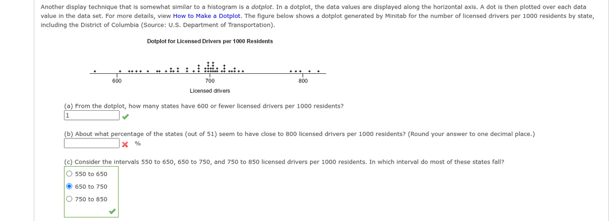
Transcribed Image Text:Another display technique that is somewhat similar to a histogram is a dotplot. In a dotplot, the data values are displayed along the horizontal axis. A dot is then plotted over each data
value in the data set. For more details, view How to Make a Dotplot. The figure below shows a dotplot generated by Minitab for the number of licensed drivers per 1000 residents by state,
including the District of Columbia (Source: U.S. Department of Transportation).
Dotplot for Licensed Drivers per 1000 Residents
600
700
800
Licensed drivers
(a) From the dotplot, how many states have 600 or fewer licensed drivers per 1000 residents?
1
(b) About what percentage of the states (out of 51) seem to have close to 800 licensed drivers per 1000 residents? (Round your answer to one decimal place.)
X %
(c) Consider the intervals 550 to 650, 650 to 750, and 750 to 850 licensed drivers per 1000 residents. In which interval do most of these states fall?
O 550 to 650
O 650 to 750
O 750 to 850
Expert Solution
This question has been solved!
Explore an expertly crafted, step-by-step solution for a thorough understanding of key concepts.

This is a popular solution!

Trending now
This is a popular solution!

Step by step
Solved in 2 steps with 1 images

Recommended textbooks for you
Glencoe Algebra 1, Student Edition, 9780079039897…
Algebra
ISBN:
9780079039897
Author:
Carter
Publisher:
McGraw Hill

Big Ideas Math A Bridge To Success Algebra 1: Stu…
Algebra
ISBN:
9781680331141
Author:
HOUGHTON MIFFLIN HARCOURT
Publisher:
Houghton Mifflin Harcourt

Holt Mcdougal Larson Pre-algebra: Student Edition…
Algebra
ISBN:
9780547587776
Author:
HOLT MCDOUGAL
Publisher:
HOLT MCDOUGAL
Glencoe Algebra 1, Student Edition, 9780079039897…
Algebra
ISBN:
9780079039897
Author:
Carter
Publisher:
McGraw Hill
Big Ideas Math A Bridge To Success Algebra 1: Stu…
Algebra
ISBN:
9781680331141
Author:
HOUGHTON MIFFLIN HARCOURT
Publisher:
Houghton Mifflin Harcourt
Holt Mcdougal Larson Pre-algebra: Student Edition…
Algebra
ISBN:
9780547587776
Author:
HOLT MCDOUGAL
Publisher:
HOLT MCDOUGAL

Functions and Change: A Modeling Approach to Coll…
Algebra
ISBN:
9781337111348
Author:
Bruce Crauder, Benny Evans, Alan Noell
Publisher:
Cengage Learning