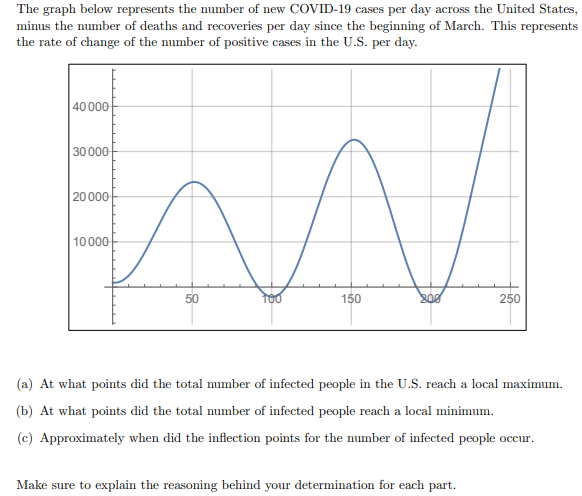
The graph below represents the number of new COVID-19 cases per day across the United States mimus the number of deaths and recoveries per day since the beginning of March. This represents the rate of change of the number of positive cases in the U.S. per day. | 40 000 30 000 20000 10000 50 100 150 250 (a) At what points did the total number of infected people in the U.S. reach a local maximum. (b) At what points did the total number of infected people reach a local minimum. (c) Approximately when did the inflection points for the number of infected people occur. Make sure to explain the reasoning behind your determination for each part.


Contingency Table
A contingency table can be defined as the visual representation of the relationship between two or more categorical variables that can be evaluated and registered. It is a categorical version of the scatterplot, which is used to investigate the linear relationship between two variables. A contingency table is indeed a type of frequency distribution table that displays two variables at the same time.
Binomial Distribution
Binomial is an algebraic expression of the sum or the difference of two terms. Before knowing about binomial distribution, we must know about the binomial theorem.
The graph only shows positive cases per day, but the questions are referring to the total number of infected people. How do I solve this?


Trending now
This is a popular solution!

Step by step
Solved in 3 steps with 3 images


