The graph shows the number of errors made over time by a pianist practicing a new piece. 60 50 40 30 20 10 © 2020 StrongMind. Created using GeoGebra. Why might the graph be considered misleading? The labels on the y-axis are not presented in order. The labels on the x-axis are not presented in order. The scale on the y-axis is too large. The scale on the x-axis is too large. Day 1 Day 3 Day 4 Day 5 Day 2 Day 6
The graph shows the number of errors made over time by a pianist practicing a new piece. 60 50 40 30 20 10 © 2020 StrongMind. Created using GeoGebra. Why might the graph be considered misleading? The labels on the y-axis are not presented in order. The labels on the x-axis are not presented in order. The scale on the y-axis is too large. The scale on the x-axis is too large. Day 1 Day 3 Day 4 Day 5 Day 2 Day 6

Algebra & Trigonometry with Analytic Geometry
13th Edition
ISBN:9781133382119
Author:Swokowski
Publisher:Swokowski
Chapter4: Polynomial And Rational Functions
Section4.3: Zeros Of Polynomials
Problem 64E

Related questions
Question
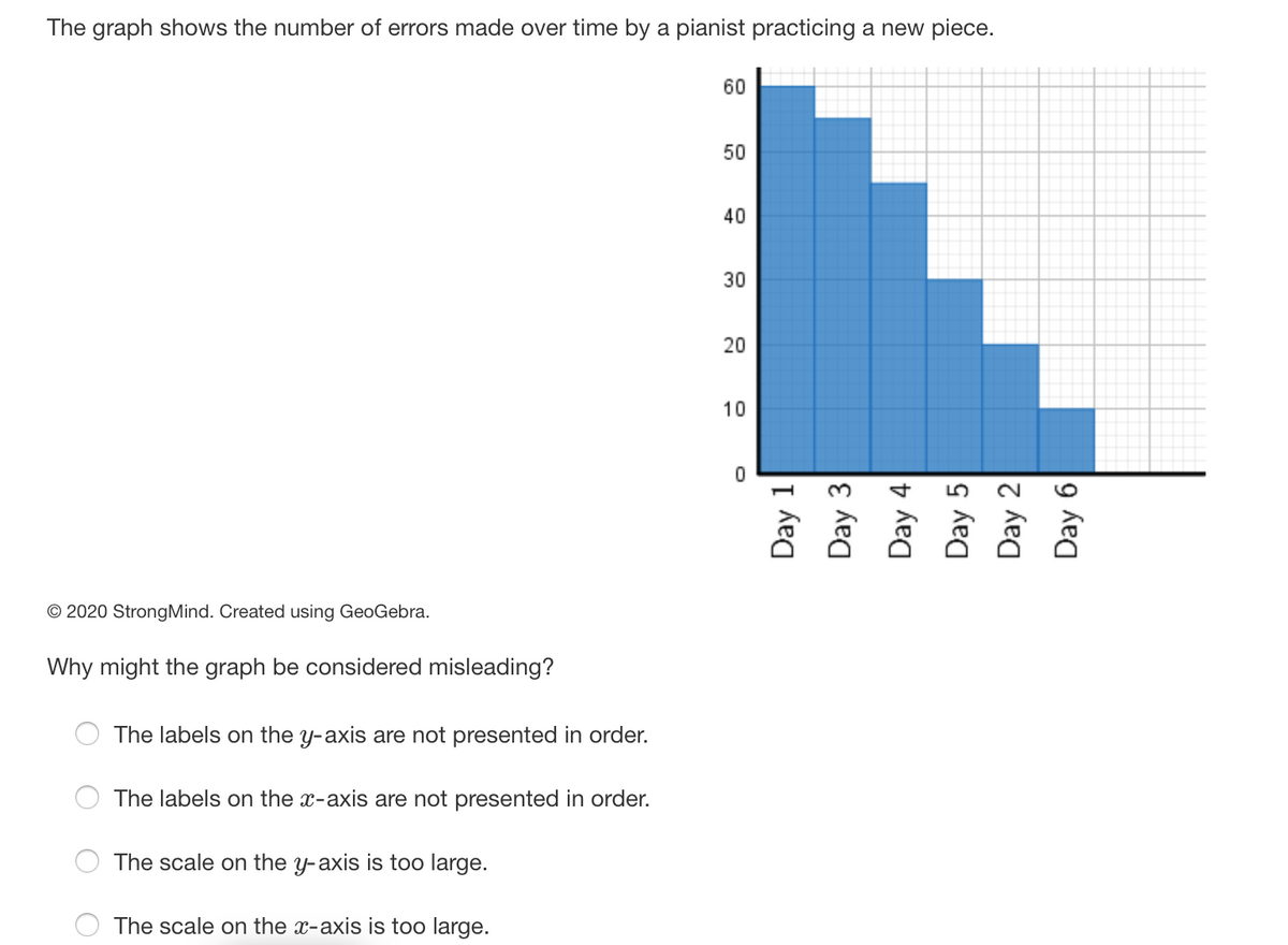
Transcribed Image Text:The graph shows the number of errors made over time by a pianist practicing a new piece.
60
50
40
30
20
10
© 2020 StrongMind. Created using GeoGebra.
Why might the graph be considered misleading?
The labels on the y-axis are not presented in order
The labels on the x-axis are not presented in order.
The scale on the y-axis is too large.
The scale on the x-axis is too large.
Day 1
Day 3
Day 4
Day 5
Day 2
Day 6
Expert Solution
This question has been solved!
Explore an expertly crafted, step-by-step solution for a thorough understanding of key concepts.

This is a popular solution!

Trending now
This is a popular solution!

Step by step
Solved in 3 steps

Recommended textbooks for you
Algebra & Trigonometry with Analytic Geometry
Algebra
ISBN:
9781133382119
Author:
Swokowski
Publisher:
Cengage

Functions and Change: A Modeling Approach to Coll…
Algebra
ISBN:
9781337111348
Author:
Bruce Crauder, Benny Evans, Alan Noell
Publisher:
Cengage Learning
Algebra & Trigonometry with Analytic Geometry
Algebra
ISBN:
9781133382119
Author:
Swokowski
Publisher:
Cengage
Functions and Change: A Modeling Approach to Coll…
Algebra
ISBN:
9781337111348
Author:
Bruce Crauder, Benny Evans, Alan Noell
Publisher:
Cengage Learning