In the styles.css file, below the tablet media query, add a comment with the text, Media Query for Desktop Viewport. Below the comment, add a Open the index.html file and update the comment with your name (firstname lastname), the file name, and today's date (MM/DD/YYYY). Add your name to the paragraph element located within the footer element near the bottom of the page. media query to target a desktop viewport screen with a minimum width of 900px. Open the styles.css file from the css folder. Modify the comment at the top of the style sheet to include your name, file name, and the today's date. In the desktop media query, create a style rule for an article selector > that sets the width to 27% and the height to 140px. In the desktop media query, create another style rule for the article selector with a hover pseudo-class that sets the background-color > In the styles.css file, below the last style rule, add a new comment with the text, Media Query for Tablet Viewport. Below the comment, add a media > to #ffe5dc and the color to #a22c02. query to target screen and print for a tablet viewport. Use a min-width: 481px . > Modify the style rule for the body selector by specifying a background with a linear gradient that uses a direction of to left, first color value of #fe9972, and second color value of #ffe5dc. Remove the declaration for In the tablet media query, create a new style rule for the article the background color from the style rule. element that sets the width to 43%, floats the element to the left, and sets a height of 160px. Use Google Chrome's device mode to display the page in a mobile, tablet, and desktop viewport. Exit device mode to view and test the hover pseudo-class. In the tablet media query, create a new style rule for the footer selector that clears a float on the left. Validate your HTML and CSS files and correct any errors.
In the styles.css file, below the tablet media query, add a comment with the text, Media Query for Desktop Viewport. Below the comment, add a Open the index.html file and update the comment with your name (firstname lastname), the file name, and today's date (MM/DD/YYYY). Add your name to the paragraph element located within the footer element near the bottom of the page. media query to target a desktop viewport screen with a minimum width of 900px. Open the styles.css file from the css folder. Modify the comment at the top of the style sheet to include your name, file name, and the today's date. In the desktop media query, create a style rule for an article selector > that sets the width to 27% and the height to 140px. In the desktop media query, create another style rule for the article selector with a hover pseudo-class that sets the background-color > In the styles.css file, below the last style rule, add a new comment with the text, Media Query for Tablet Viewport. Below the comment, add a media > to #ffe5dc and the color to #a22c02. query to target screen and print for a tablet viewport. Use a min-width: 481px . > Modify the style rule for the body selector by specifying a background with a linear gradient that uses a direction of to left, first color value of #fe9972, and second color value of #ffe5dc. Remove the declaration for In the tablet media query, create a new style rule for the article the background color from the style rule. element that sets the width to 43%, floats the element to the left, and sets a height of 160px. Use Google Chrome's device mode to display the page in a mobile, tablet, and desktop viewport. Exit device mode to view and test the hover pseudo-class. In the tablet media query, create a new style rule for the footer selector that clears a float on the left. Validate your HTML and CSS files and correct any errors.

Computer Networking: A Top-Down Approach (7th Edition)
7th Edition
ISBN:9780133594140
Author:James Kurose, Keith Ross
Publisher:James Kurose, Keith Ross
Chapter1: Computer Networks And The Internet
Section: Chapter Questions
Problem R1RQ: What is the difference between a host and an end system? List several different types of end...

Related questions
Question
100%
I need this assignment solved. Below I've attached the index.hmtl and styles.css
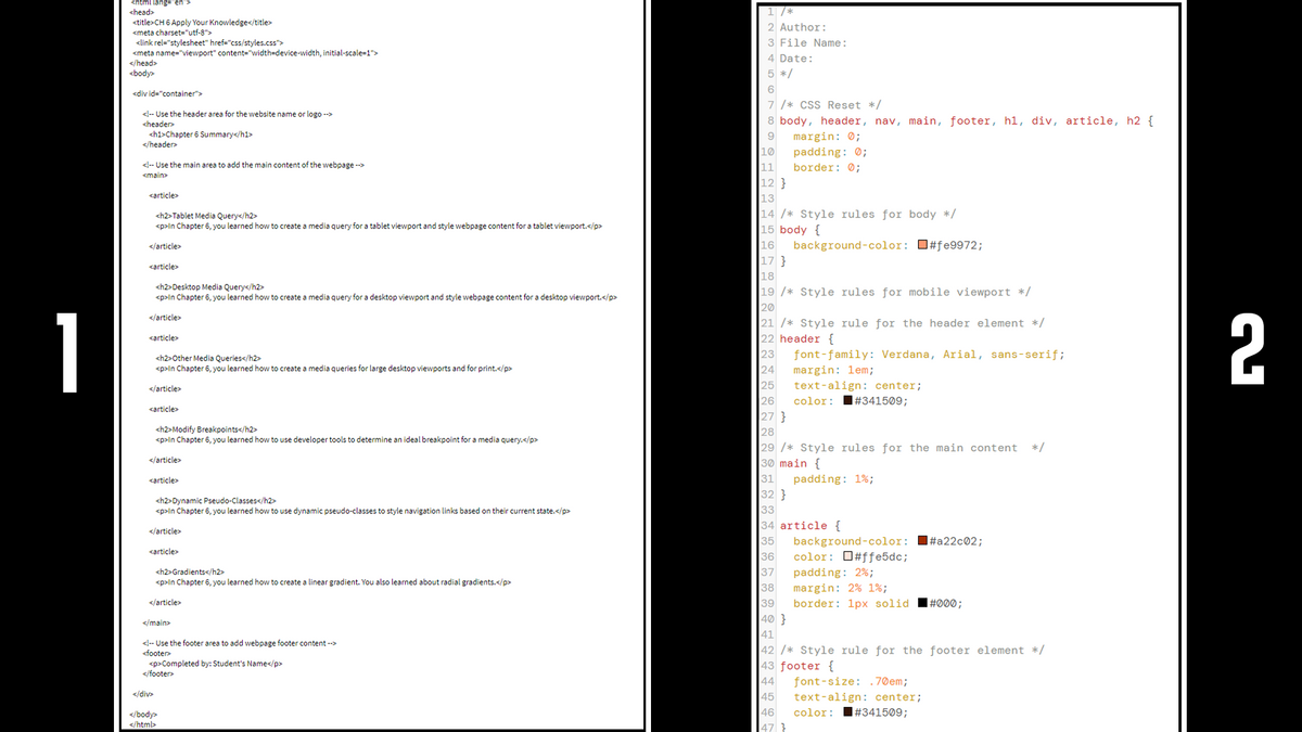
Transcribed Image Text:<html lang="en">
<head>
<title>CH 6 Apply Your Knowledge</title>
<meta charset="utf-8">
<link rel="stylesheet" href="css/styles.css">
<meta name="viewport" content="width=device-width, initial-scale=1">
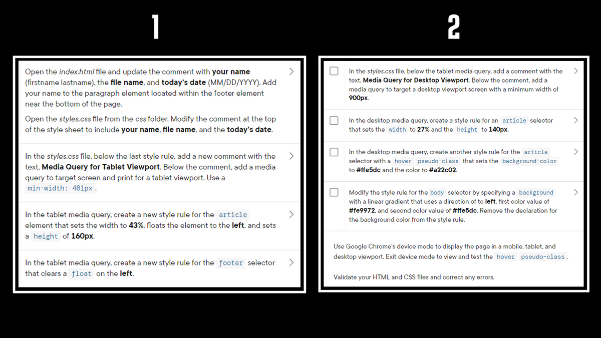
1 /*
2 Author:
3 File Name:
4 Date:
</head>
<body>
5 */
<div id="container">
7 /* CSS Reset */
<!-- Use the header area for the website name or logo -->
8 body, header, nav, main, footer, hl, div, article, h2 {
margin: 0;
padding: 0;
border: 0;
<header>
<h1>Chapter 6 Summary</h1>
</header>
9
10
<!-- Use the main area to add the main content of the webpage -->
11
12 }
<main>
<article>
13
14 /* Style rules for body */
15 body {
16
<h2>Tablet Media Query</h2>
<p>ln Chapter 6, you learned how to create a media query for a tablet viewport and style webpage content for a tablet viewport.</p>
background-color: O#fe9972;
17 }
</article>
<article>
18
<h2>Desktop Media Query</h2>
<p>In Chapter 6, you learned how to create a media query for a desktop viewport and style webpage content for a desktop viewport.</p>
19 /* Style rules for mobile viewport */
20
21 /* Style rule for the header element */
22 header {
23
24
25
26
27 }
|28
29 /* Style rules for the main content
30 main {
31
32 }
1
</article>
2
<article>
font-family: Verdana, Arial, sans-serif;
<h2>Other Media Queries</h2>
<p>In Chapter 6, you learned how to create a media queries for large desktop viewports and for print.</p>
margin: 1em;
text-align: center;
</article>
color:
I#341509;
<article>
<h2>Modify Breakpoints</h2>
<p>ln Chapter 6, you learned how to use developer tools to determine an ideal breakpoint for a media query.</p>
*/
</article>
<article>
padding: 1%;
<h2>Dynamic Pseudo-Classes</h2>
<p>ln Chapter 6, you learned how to use dynamic pseudo-classes to style navigation links based on their current state.</p>
33
34 article {
35
36
37
38
39
|40 }
41
|42 /* Style rule for the footer element */
|43 footer {
44
45
46
47 }
</article>
background-color: I#a22c®2;
color: O#ffe5dc;
<article>
<h2>Gradients</h2>
<p>In Chapter 6, you learned how to create a linear gradient. You also learned about radial gradients.</p>
padding: 2%;
margin: 2% 1%;
</article>
border: 1px solid
|#خ0;
</main>
<!-- Use the footer area to add webpage footer content -->
<footer
<p>Completed by: Student's Name</p>
</footer>
font-size: .70em;
</div>
text-align: center;
I#341509;
color:
</body>
</html>
Transcribed Image Text:1
2
Open the index.html file and update the comment with your name
In the styles.css file, below the tablet media query, add a comment with the
(firstname lastname), the file name, and today's date (MM/DD/YYYY). Add
your name to the paragraph element located within the footer element
near the bottom of the page.
text, Media Query for Desktop Viewport. Below the comment, add a
media query to target a desktop viewport screen with a minimum width of
900рх.
Open the styles.css file from the css folder. Modify the comment at the top
of the style sheet to include your name, file name, and the today's date.
In the desktop media query, create a style rule for an article selector
that sets the width to 27% and the height to 140px.
In the desktop media query, create another style rule for the article
In the styles.css file, below the last style rule, add a new comment with the
text, Media Query for Tablet Viewport. Below the comment, add a media
selector with a hover pseudo-class that sets the background-color
to #ffe5dc and the color to #a22c02.
query to target screen and print for a tablet viewport. Use a
min-width: 481px .
Modify the style rule for the body selector by specifying a background
with a linear gradient that uses a direction of to left, first color value of
#fe9972, and second color value of #ffe5dc. Remove the declaration for
In the tablet media query, create a new style rule for the article
the background color from the style rule.
element that sets the width to 43%, floats the element to the left, and sets
a height of 160px.
Use Google Chrome's device mode to display the page in a mobile, tablet, and
desktop viewport. Exit device mode to view and test the hover pseudo-class.
In the tablet media query, create a new style rule for the footer selector
that clears a float on the left.
Validate your HTML and CSS files and correct any errors.
Expert Solution
This question has been solved!
Explore an expertly crafted, step-by-step solution for a thorough understanding of key concepts.

This is a popular solution!

Trending now
This is a popular solution!

Step by step
Solved in 3 steps with 3 images

Follow-up Questions
Read through expert solutions to related follow-up questions below.
Follow-up Question
What does it mean by "Remove the deceleration for the background color from the style rule."
Solution
 by Bartleby Expert
Recommended textbooks for you
Computer Networking: A Top-Down Approach (7th Edi…
Computer Engineering
ISBN:
9780133594140
Author:
James Kurose, Keith Ross
Publisher:
PEARSON

Computer Organization and Design MIPS Edition, Fi…
Computer Engineering
ISBN:
9780124077263
Author:
David A. Patterson, John L. Hennessy
Publisher:
Elsevier Science

Network+ Guide to Networks (MindTap Course List)
Computer Engineering
ISBN:
9781337569330
Author:
Jill West, Tamara Dean, Jean Andrews
Publisher:
Cengage Learning
Computer Networking: A Top-Down Approach (7th Edi…
Computer Engineering
ISBN:
9780133594140
Author:
James Kurose, Keith Ross
Publisher:
PEARSON
Computer Organization and Design MIPS Edition, Fi…
Computer Engineering
ISBN:
9780124077263
Author:
David A. Patterson, John L. Hennessy
Publisher:
Elsevier Science
Network+ Guide to Networks (MindTap Course List)
Computer Engineering
ISBN:
9781337569330
Author:
Jill West, Tamara Dean, Jean Andrews
Publisher:
Cengage Learning

Concepts of Database Management
Computer Engineering
ISBN:
9781337093422
Author:
Joy L. Starks, Philip J. Pratt, Mary Z. Last
Publisher:
Cengage Learning

Prelude to Programming
Computer Engineering
ISBN:
9780133750423
Author:
VENIT, Stewart
Publisher:
Pearson Education

Sc Business Data Communications and Networking, T…
Computer Engineering
ISBN:
9781119368830
Author:
FITZGERALD
Publisher:
WILEY