What type of graph would be a better choice to display these data, and why? OA. A better choice would be a bar graph or pie chart because the data set is categorical. The numbers 1, 2, and 3 represent categories, so a histogram should not be used. OB. A better choice would be a dotplot. This would improve the graph by individualizing the students, making it easier to see patterns in the data. OC. A better choice would be a relative frequency histogram. This would show the proportion of students with specific body images rather than the frequency of students. OD. The current graph is the best choice because the histogram displays the data in the most appropriate way.
What type of graph would be a better choice to display these data, and why? OA. A better choice would be a bar graph or pie chart because the data set is categorical. The numbers 1, 2, and 3 represent categories, so a histogram should not be used. OB. A better choice would be a dotplot. This would improve the graph by individualizing the students, making it easier to see patterns in the data. OC. A better choice would be a relative frequency histogram. This would show the proportion of students with specific body images rather than the frequency of students. OD. The current graph is the best choice because the histogram displays the data in the most appropriate way.

Glencoe Algebra 1, Student Edition, 9780079039897, 0079039898, 2018
18th Edition
ISBN:9780079039897
Author:Carter
Publisher:Carter
Chapter10: Statistics
Section10.6: Summarizing Categorical Data
Problem 10CYU

Related questions
Question
Ex 2.5 Q2
Please solve this multiple choice questions correctly and provide correct option
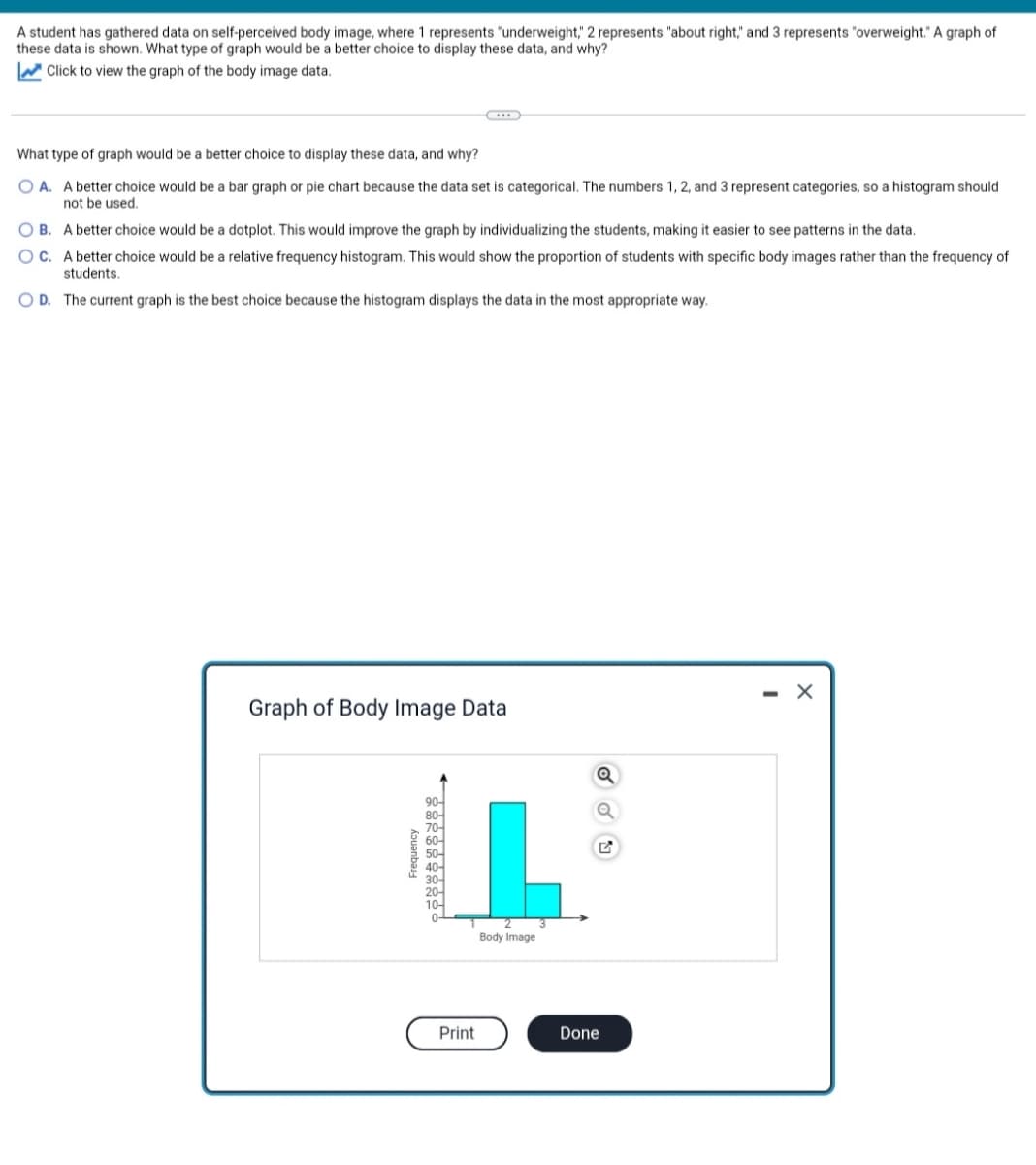
Transcribed Image Text:A student has gathered data on self-perceived body image, where 1 represents "underweight," 2 represents "about right," and 3 represents "overweight." A graph of
these data is shown. What type of graph would be a better choice to display these data, and why?
Click to view the graph of the body image data.
What type of graph would be a better choice to display these data, and why?
OA. A better choice would be a bar graph or pie chart because the data set is categorical. The numbers 1, 2, and 3 represent categories, so a histogram should
not be used.
OB. A better choice would be a dotplot. This would improve the graph by individualizing the students, making it easier to see patterns in the data.
OC. A better choice would be a relative frequency histogram. This would show the proportion of students with specific body images rather than the frequency of
students.
OD. The current graph is the best choice because the histogram displays the data in the most appropriate way.
Graph of Body Image Data
Frequency
← ទន់ន់ទន់ន់ន់ន់ន់ -
Print
Body Image
Done
- X
Expert Solution
This question has been solved!
Explore an expertly crafted, step-by-step solution for a thorough understanding of key concepts.

This is a popular solution!

Trending now
This is a popular solution!

Step by step
Solved in 3 steps

Recommended textbooks for you
Glencoe Algebra 1, Student Edition, 9780079039897…
Algebra
ISBN:
9780079039897
Author:
Carter
Publisher:
McGraw Hill

Holt Mcdougal Larson Pre-algebra: Student Edition…
Algebra
ISBN:
9780547587776
Author:
HOLT MCDOUGAL
Publisher:
HOLT MCDOUGAL

Big Ideas Math A Bridge To Success Algebra 1: Stu…
Algebra
ISBN:
9781680331141
Author:
HOUGHTON MIFFLIN HARCOURT
Publisher:
Houghton Mifflin Harcourt
Glencoe Algebra 1, Student Edition, 9780079039897…
Algebra
ISBN:
9780079039897
Author:
Carter
Publisher:
McGraw Hill
Holt Mcdougal Larson Pre-algebra: Student Edition…
Algebra
ISBN:
9780547587776
Author:
HOLT MCDOUGAL
Publisher:
HOLT MCDOUGAL
Big Ideas Math A Bridge To Success Algebra 1: Stu…
Algebra
ISBN:
9781680331141
Author:
HOUGHTON MIFFLIN HARCOURT
Publisher:
Houghton Mifflin Harcourt