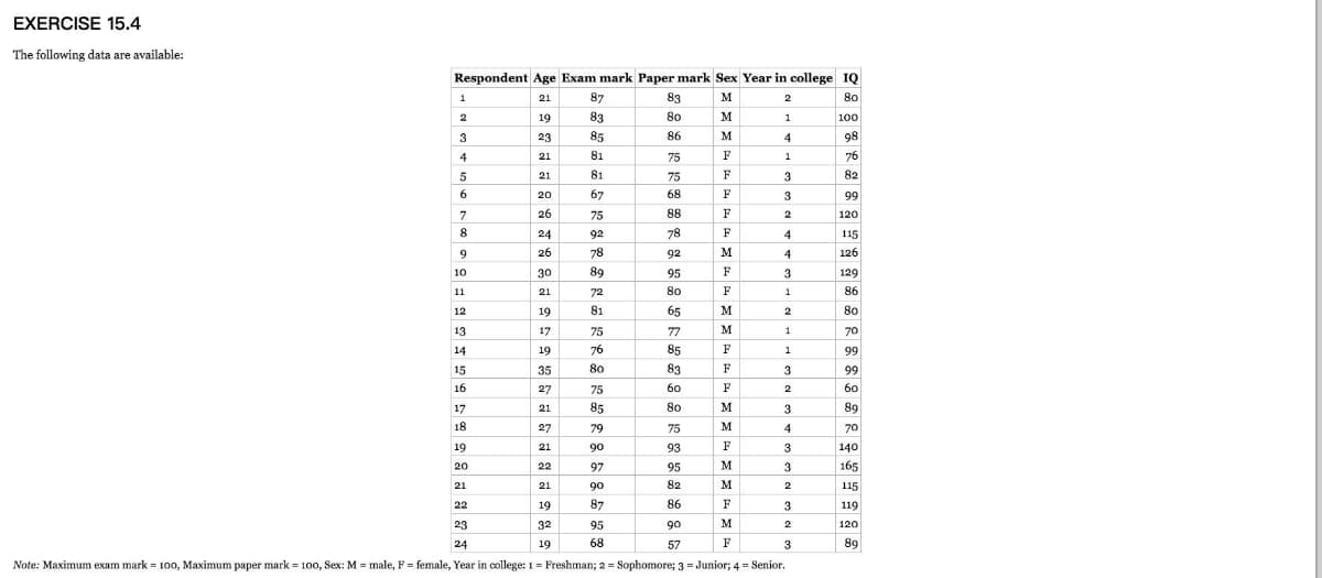
1. Complete descriptive statistics. 2. Create a pie chart for years in college 3. Create a histogram for IQ 4. Create a scatter plot with IQ on the x-axis and score on the y-axis. What do you conclude?

Q: construct a histogram and scatter plot with the following data, analyse and explain the trends and…
A: Given:
Q: E The standard length of a game in a basketball league is 48 minutes. For 20 basketball players, a…
A: A best fit line is used to predict the value of response variable at different values of explanatory…
Q: Connie made a scatterplot comparing the shoulder heights of her friends' dogs to their weights.…
A: The equation of line passing through two point (x1,y1) and (x2,y2) is given by…
Q: Vanessa wishes to determine the extent of relationship between a person's systolic blood pressure…
A:
Q: The distribution of cholesterol levels in teenage boys is approximately normal with mean 170 and…
A: Obtain the expected number of teenager boys to have cholesterol levels between 170 and 225. The…
Q: 5. Find the equation of the line of best fit for the data below: y 30 1 2 28 4 20 15 6. 10
A:
Q: A pediatrician wants to determine the relation that may exist between a child's height and head…
A: Step-by-step procedure to find the regression line using Excel: In Excel sheet, enter x and y in…
Q: Music Emily Lucia and Paul complied to the following data shown in the table the table shows the…
A: There are two variables which are named as audience impression and CDs sold. Audience impression is…
Q: The dot plots show the numbers of miles Ian skated on several days in two different months. July 10…
A: Using the dot plot representing the number of miles skated each day for the month of July, extract…
Q: The dot plot of time (in minutes) it takes employees to drive to work is shown below. Find the mean,…
A: Given data The dot plot of time taken by employees to drive to work is given.
Q: 6. Which data will most likely show a negative correlation when graphed on a scatterplot? A. The…
A: 6. Need to determine which among the following is most likely to show a negative correlation when…
Q: a) Find the population mean and the range for the number of smallmouth bass caught per day by each…
A:
Q: Given the following stem-and-leaf plot/diagram: 1 | 03 2 | 2224 3 | 123333 4 | 1156 5 | 3356 6 | 45…
A: From the given stem and leaf diagram the numbers…
Q: Which line represents the best fit for the scatter plot data? 10 8. 6. 4 2 o2 4 6 8 10 10 6. 4. 2 O…
A: First graph is the best fit for the scatter plot data.
Q: Given the data as shown in the table below Y 5 2 8 4 9 5 10 8 Use technology to graph the…
A:
Q: PART A: How many of the students in Landon’s class are at least 65 inches tall? Show or explain how…
A: As per our guidelines, we are allowed to answer first three sub-parts only. Thanks First we will…
Q: 3) Veterinary Science: Shetland Ponies - How much should pony (in months), and let y be the average…
A: X Y X*Y X*X Y*Y 3 60 180 9 3600 6 95 570 36 9025 12 140 1680 144 19600 18 170 3060 324 28900…
Q: When Air Jordan 1 shoes were first released, they were the highest priced sneaker on the market at…
A:
Q: 10. Which data will most likely show a negative correlation when graphed on a scatterplot? A. the…
A: Correlation means, the relationship between two variables. If change one variable shows changes in…
Q: Which statement about the scatter plot is correct? O The scatter plot shows a positive association…
A: Scatter plots (also known as scatter graphs) are kind of like line graphs. A line graph uses a line…
Q: A data set has five values. The smallest value is 13. The median is 18. The mode is 27. What is the…
A: Solution
Q: Find the class midpoints and class boundaries. (b) Prepare the relative frequency and percentage…
A: Solution Relative frequency = frequency/N
Q: What type of association is shown by the data in the scatter plot? y 60 40 20 40 A positive…
A: A scatter plot gives the association between two variables. In general, for a scatter plot 1) if the…
Q: 31. Reason Where should the line of best fit be in relationship to the points plotted on a scatter…
A: Scatter Plot : A scatter plot is a type of plot which display values for typically two…
Q: d. Develop the estimated regression equation by computing the values of b0 and b1 (1 decimal) e.…
A:
Q: From the data included in the photo can you please help me make: 1. Histogram 2. Box and Whisper…
A: 1) The following procedure is used to construct histogram using Excel software and it is given…
Q: Estimate the most likely degree of correlation for the scatterplot Options: a. -.99 b. 0 c.…
A: Correlation is the measure that used to determine the strength of association between the two…
Q: The data to the right represent the cost of living for 20 states. The cost of living is a measure of…
A: Given data to the right represent the cost of living for 20 states. The cost of living is a measure…
Q: Guess Actual Age 18 15 25 28 28 24 39 42 50 56 36 45 72 80
A:
Q: b. Write the equation of the line of best fit. c. Predict the final grade given eight absences.…
A: The provided information is Number of absences ((x) Final Grade (y) xy x2 0 97 0 0 1 97 97 1…
Q: The Toyota Camry is one of the best-selling cars in North America. The cost of a previously owned…
A: Given: Miles (1000s) Price (1000 s) 22 16.2 29 16 36 13.8 47 11.5 63 12.5 77 12.9…
Q: Which of the following is shown on the scatter plot below? 10 8. 6. 4
A: From the given picture, it is noticed that the marked points are grouped in a proper manner.
Q: What type of relationship is depicted in the following scatter diagram? 12 10 8. 6. 4 2 20 30 40 50
A: A scatterplot represents bivariate data by plotting them on a plane as points corresponding to the…
Q: 6. Assume that the scatterplot shows the median volume and median value of used cars over the years…
A: Since you have posted a question with multiple sub-parts, we will solve first three subparts for…
Q: A health journal conducted a study to see if packaging a healthy food product like junk food would…
A: Provided information: n=407, X bar=3.28 s=2.55, µ=3 The null and alternative hypothesis is, Ho: The…
Q: 15. Every coach and every athlete on the Douglas High School track team recorded how many miles s/he…
A: Solution:Given The boxplot of Athletes shows the approximate five number summary asMinimum = 12,…
Q: a. What should be the label on the horizontal axis of the scatter plot? b. What should be the label…
A: Given: A scatter plot for blocks and blocks per game in the given volleyball tournament. (a)…
Q: 4- The fuel tank capacity in gallons and the cruising range is given for 6 SUV's. a. Develop a…
A: (a) Use EXCEL to construct the scatter plot. EXCEL procedure: Go to EXCEL Go to Insert menu…
Q: A researcher wants to analyse whether there is a relationship between country of origin of…
A: Introduction: The best possible way to obtain the required information would be by enumerating all…
Q: The dot plots shows the number of miles run per week for two different math classes at Cypress…
A: Statement (A) is false because in class A there are 5+3+2+1+4+2=17 students and in class B there are…
Q: dear sir mam how do u create a steam and leaf data plot
A: Stem-and-leaf plot:A graphical representation of the quantitative data in which each data entry is…
Q: 6. Mr. Landis created a box and whisker plot to represent the scores his students made on the final…
A: PLOT THE GIVEN DATA AND WE GET AS SHOWN BELOW
Q: 6. Which equation represents the line of best fit for the scatter plot below?
A:
Q: Use the scatter plot to answer the following questions. Pizza Prices Around Town ở 1 2 34 5 67 89 10…
A: Given: Scatter plot
Q: In a scatter diagram of the data of 50 participants, how many points are plotted? A. 5…
A: The scatter diagram consists of 50 participants.
Q: 1 > To the right are box plots comparing the ticket prices of two performing arts theaters. a. What…
A: Boxplot: A boxplot is a graphical tool that is more often used in the informational analysis of data…
Q: A researcher wants to represent the difference in the prevalence of infant mortality rates among a…
A: Answer - A researcher wants to represent the difference in the prevalence of infant mortality rates…
Q: The attached plots were constructed using a sample of 272 observations. Each observation gives the…
A: Note: Hey there! Thank you for the question. We have answered the question based only on the…
Q: A doctor wanted to determine whether there is a relation between a male's age and his HDL…
A: a) Excel Procedure: Enter X and Y data in Excel>Data>Data Analysis> ‘Regression’>Select…

Step by step
Solved in 6 steps with 6 images


- The article “Effect of Varying Solids Concentration and Organic Loading on the Performance of Temperature Phased Anaerobic Digestion Process” (S. Vandenburgh and T. Ellis, Water Environment Research, 2002:142–148) discusses experiments to determine the effect of the solids concentration on the performance of treatment methods for wastewater sludge. In the first experiment, the concentration of solids (in g/L) was 43.94 ± 1.18. In the second experiment, which was independent of the first, the concentration was 48.66 ± 1.76. Estimate the difference in the concentration between the two experiments, and find the uncertainty in the estimate.A researcher is interested in testing the relationship between smoking and BMI (kg/m2) in adults aged 30-45. In order to test this association, the researcher divides smoking into currently more than a pack a day, currently less than a pack a day, and never smokers. The following table represents the BMIs for each participant enrolled by their respective smoking category. Current Smoker (≥1pack/day) Current Smoker (<1 pack/day Never Smoked 26.7 29.4 22.1 29.4 28.6 30.4 24.3 27.4 21.3 28.4 23.2 26.4 21.6 20.1 19.7 27.4 20.6 19.8 26.8 19.7 21.6 36.4 19.6 22.3 31.5 21.6 24.3 27.4 21.5 *Continue as though all assumptions for ANOVA are met. A) Calculate the MSW and MSB for the data represented above. B) Carry out a formal test for a one-way analysis of variance among the groups and interpret your results.The attached data contains Part Quality data of three suppliers. At = 0.05, does Part Quality depend on Supplier, or should the cheapest Supplier be chosen?
- An article reported data from a study in which both a baseline gasoline mixture and a reformulated gasoline were used. Consider the following observations on age (yr) and NOx emissions (g/kWh): Engine 1 2 3 4 5 6 7 8 9 10 Age 0 0 2 11 7 16 9 0 12 4 Baseline 1.74 4.38 4.04 1.23 5.30 0.58 3.35 3.44 0.73 1.23 Reformulated 1.85 5.93 5.52 2.67 6.54 0.76 4.94 4.87 0.69 1.39 Construct scatter plots of the baseline NOx emissions versus age. Construct scatter plots of the reformulated NOx emissions versus age. What appears to be the nature of the relationship between these two variables? As age increases, emissions also increase.As age increases, emissions decrease. There is no compelling relationship between the data.An article reported data from a study in which both a baseline gasoline mixture and a reformulated gasoline were used. Consider the following observations on age (yr) and NOx emissions (g/kWh): Engine 1 2 3 4 5 6 7 8 9 10 Age 0 0 2 11 7 16 9 0 12 4 Baseline 1.70 4.38 4.06 1.24 5.29 0.59 3.35 3.45 0.73 1.22 Reformulated 1.86 5.91 5.51 2.70 6.50 0.71 4.95 4.86 0.72 1.41 Construct scatter plots of the baseline NOx emissions versus age. What appears to be the nature of the relationship between these two variables? There is no compelling relationship between the data. As age increases, emissions also increase. As age increases, emissions decrease.A deficiency of the trace element selenium in the diet can negatively impact growth, immunity, muscle and neuromuscular function, and fertility. The introduction of selenium supplements to dairy cows is justified when pastures have low selenium levels. Authors of the article “Effects of Short-Term Supplementation with Selenised Yeast on Milk Production and Composition of Lactating Cows” (Australian J. of Dairy Tech., 2004: 199–203) supplied the following data on milk selenium concentration (mg/L) for a sample of cows given a selenium supplement and a control sample given no supplement, both initially and after a 9-day period. Obs Init Se Init Cont Final Se Final Cont 1 11.4 9.1 138.3 9.3 2 9.6 8.7 104 8.8 3 10.1 9.7 96.4 8.8 4 8.5 10.8 89 10.1 5 10.3 10.9 88 9.6 6 10.6 10.6 103.8 8.6 7 11.8 10.1 147.3 10.4 8 9.8 12.3 97.1 12.4 9 10.9 8.8 172.6 9.3 10 10.3…
- Obtain the Z scores on each subject’s age. DATA Subject Gender Marital Status Age Education Household Income Personal Income 1 F 1 30 0 70000.00 40000.00 2 F 0 40 0 32500.00 32500.00 3 M 1 45 0 42000.00 .0 4 M 1 23 0 50000.00 50000.00 5 M 0 50 0 4500.00 4500.00 6 F 0 65 1 40000.00 22000.00 7 F 1 33 1 12000.00 12000.00 8 F 0 20 2 56000.00 52000.00 9 F missing 30 3 17500.00 17500.00 10 M 1 Missing 4 44000.00 39000.00 11 M 2 58 1 missing missing 12 M 2 32 2 10000.00 10000.00 13 M 1 35 3 missing missing 14 F 2 23 4 100000.00 50000.00 15 F 2 34 1 64000.00 64000.00 16 M 1 26 2 Missing missing 17 M 1 36 3 missing missing 18 F 0 41 4 7500.00 5500.00 19 F 0 43 1 missing missing…Determine the mean waiting time W for an M/M/2 system when lambda = 2 and μ = 1.2. Compare this with the mean waiting time in an M/M/1 system whose arrival rate is lambda = 1 and service rate is μ = 1.2. Since the arrival rate per server is the same in both cases and service times don’t vary, should the wait times be the same in both cases?A researcher collects data that represents the average number of hours of sleep in the last two nights by 8 depressed patients and 9 non-depressed patients. The researcher is interested in whether the two groups reliably differ in the amount of sleep they get. Use Jamovi to calculate t-obt and the p value.
- The data are the maximum daily temperatures at Cox-Dayton International Airport for June and July 2018. maximum daily temperatures at Cox-Dayton International Airport for June and July 2018. Date Max (°F) Jun 1 80 Jun 2 82 Jun 3 81 Jun 4 75 Jun 5 76 Jun 6 71 Jun 7 82 Jun 8 85 Jun 9 86 Jun 10 77 Jun 11 75 Jun 12 78 Jun 13 85 Jun 14 82 Jun 15 86 Jun 16 90 Jun 17 92 Jun 18 92 Jun 19 89 Jun 20 85 Jun 21 72 Jun 22 81 Jun 23 79 Jun 24 85 Jun 25 79 Jun 26 79 Jun 27 81 Jun 28 85 Jun 29 89 Jun 30 92 Jul 1 93 Jul 2…Obtain the appropriate measure of dispersion for age and both income variables. DATA Subject Gender Marital Status Age Education Household Income Personal Income 1 F 1 30 0 70000.00 40000.00 2 F 0 40 0 32500.00 32500.00 3 M 1 45 0 42000.00 .0 4 M 1 23 0 50000.00 50000.00 5 M 0 50 0 4500.00 4500.00 6 F 0 65 1 40000.00 22000.00 7 F 1 33 1 12000.00 12000.00 8 F 0 20 2 56000.00 52000.00 9 F missing 30 3 17500.00 17500.00 10 M 1 Missing 4 44000.00 39000.00 11 M 2 58 1 missing missing 12 M 2 32 2 10000.00 10000.00 13 M 1 35 3 missing missing 14 F 2 23 4 100000.00 50000.00 15 F 2 34 1 64000.00 64000.00 16 M 1 26 2 Missing missing 17 M 1 36 3 missing missing 18 F 0 41 4 7500.00 5500.00 19…The following data were obtained from a dependent t-test research study. What is the value of MD for these data?