The graphs below show the change in allele frequency over 500 generations of natural selection. The two graphs represent two populations experiencing two different selective scenarios. Which statement best describes the difference between the two populations? 1000T 0.900 f(A) f(A) 0400 0300 0300 0200 0.100 250 300 150 400 30 100 190 200 Generatioe a) * Selection is favoring a beneficial recessive allele in the population on the left and a beneficial dominant allele in the population on the right. b) The selective coefficient is smaller in the population on the left than in the population on the right. c)" The graph on the left shows heterozygote advantage; the graph on the right shows a beneficial dominant allele. d) * The graph on the left shows genetic drift; the graph on the right shows natural selection. The graph on the left shows an unstable equilibrium; the graph on the right shows a stable equilibrium.
The graphs below show the change in allele frequency over 500 generations of natural selection. The two graphs represent two populations experiencing two different selective scenarios. Which statement best describes the difference between the two populations? 1000T 0.900 f(A) f(A) 0400 0300 0300 0200 0.100 250 300 150 400 30 100 190 200 Generatioe a) * Selection is favoring a beneficial recessive allele in the population on the left and a beneficial dominant allele in the population on the right. b) The selective coefficient is smaller in the population on the left than in the population on the right. c)" The graph on the left shows heterozygote advantage; the graph on the right shows a beneficial dominant allele. d) * The graph on the left shows genetic drift; the graph on the right shows natural selection. The graph on the left shows an unstable equilibrium; the graph on the right shows a stable equilibrium.

Human Heredity: Principles and Issues (MindTap Course List)
11th Edition
ISBN:9781305251052
Author:Michael Cummings
Publisher:Michael Cummings
Chapter19: Population Genetics And Human Evolution
Section: Chapter Questions
Problem 1QP

Related questions

Question
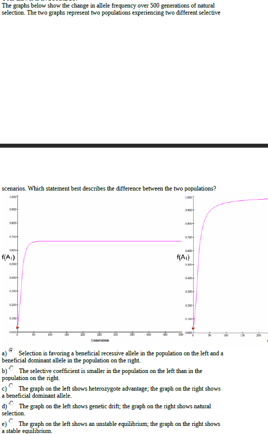
Transcribed Image Text:The graphs below show the change in allele frequency over 500 generations of natural
selection. The two graphs represent two populations experiencing two different selective
scenarios. Which statement best describes the difference between the two populations?
1000T
0.900
f(A)
f(A)
0400
0300
0300
0200
0.100
250
300
150
400
30
100
190
200
Generatioe
a) * Selection is favoring a beneficial recessive allele in the population on the left and a
beneficial dominant allele in the population on the right.
b) The selective coefficient is smaller in the population on the left than in the
population on the right.
c)" The graph on the left shows heterozygote advantage; the graph on the right shows
a beneficial dominant allele.
d) * The graph on the left shows genetic drift; the graph on the right shows natural
selection.
The graph on the left shows an unstable equilibrium; the graph on the right shows
a stable equilibrium.
Expert Solution
This question has been solved!
Explore an expertly crafted, step-by-step solution for a thorough understanding of key concepts.

This is a popular solution!

Trending now
This is a popular solution!

Step by step
Solved in 4 steps

Knowledge Booster


Learn more about
Need a deep-dive on the concept behind this application? Look no further. Learn more about this topic, biology and related others by exploring similar questions and additional content below.Recommended textbooks for you
Human Heredity: Principles and Issues (MindTap Co…
Biology
ISBN:
9781305251052
Author:
Michael Cummings
Publisher:
Cengage Learning
Human Heredity: Principles and Issues (MindTap Co…
Biology
ISBN:
9781305251052
Author:
Michael Cummings
Publisher:
Cengage Learning