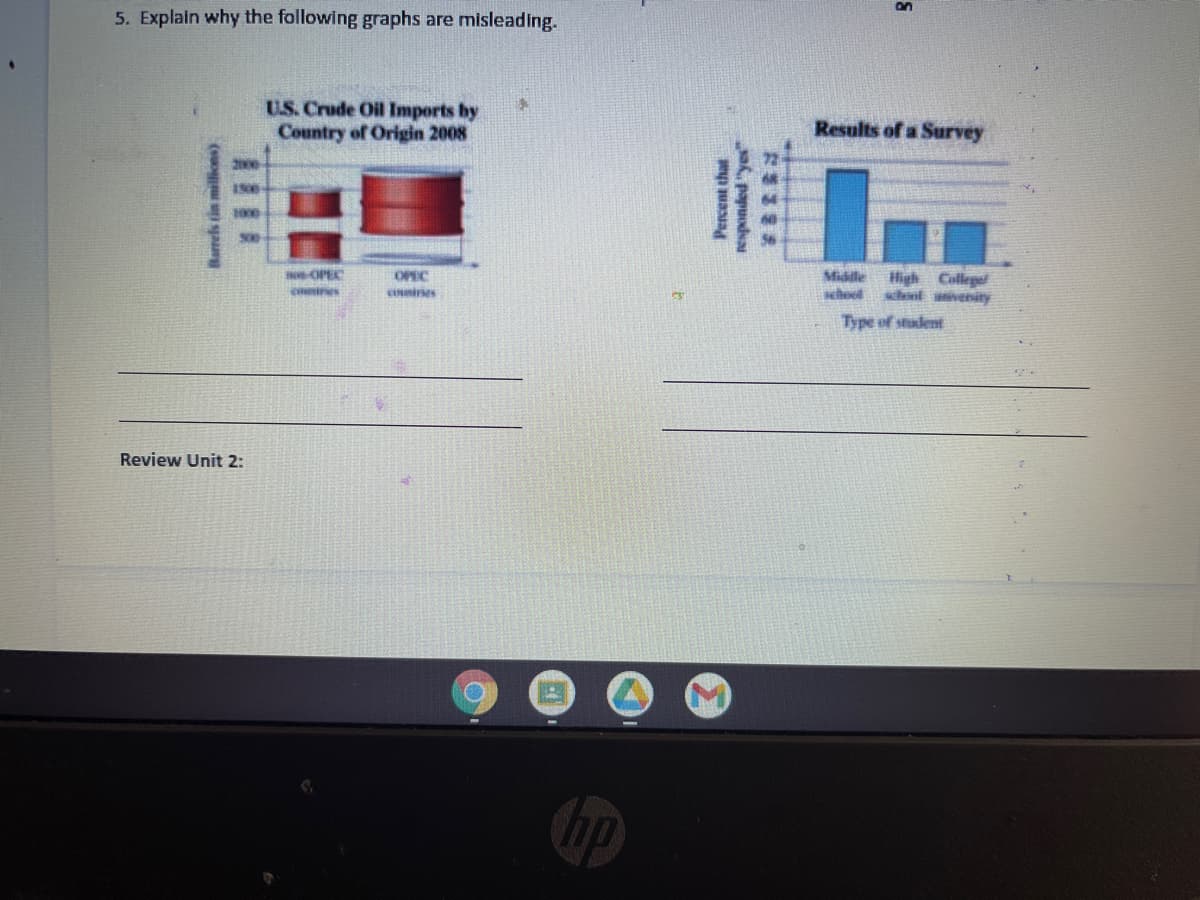
5. Explain why the following graphs are misleading. U.S. Crude Oil Imports by Country of Origin 2008 Results of a Survey 2000 -OPEC OPEC Midle High College whnl aivenity cotres ciines Type of student Review Unit 2: Barrels tin millions) Percent that s papuodsa
Q: It is a graphical representation of data, in which it clearly shows what part of the whole is…
A: Pie charts: A pie chart is a circular graph that is divided in to segments where each segment…
Q: 10. Nonstop, one-way flight times from O'Hare Airport in Chicago and prices of a one-way ticket are…
A: Given: Flight times from O'Hare Airport in Chicago and price of one way ticket are shown in the…
Q: From the following data, compute a quantity index: commodity quantity price in 2016 2017 2016 30 25…
A:
Q: The president of State University wants to forecast student enrollments for this academic year based…
A: Given information: Given data represents the number of student enrolments for the years 1 to 5.
Q: a. Capture both datasets, thereafter, b. Compute percent frequencies in both data sets c. Generate a…
A: Percent frequency= Relative frequency * 100 A pie chart is a pictorial representation, where slices…
Q: 1 A company employed 300 workers when it started and now employs 852 workers. (a) Calculate the…
A: Initial number of workers is 300 Workers at present is 852 Now, precentage…
Q: The following table provides monthly revenue values for Tedstar, Inc., a company thatsells valves to…
A: The following table provides monthly revenue values for Tedstar, Inc., a company thatsells valves to…
Q: The accompanying table gives the number of cable television subscribers (in millions) and the number…
A: The data of cable television subscribers (in millions) and the number of households with televisions…
Q: Click on the datafile logo to reference the data. DATA file 14 19 21 22 23 25 21 16 16 16 24 19 24…
A: The frequency of a class or observation is the number of values corresponding to it. The relative…
Q: Yearly Number of Businesses 110 100 90 80 70 60 2005 2007 2009 2011 Year City planners in Beaufort,…
A: # Given: Fitted on graph (X1,y1)=(2005,70) (X2,y2)=(2011,100) Then tto find value of y at x=2015
Q: Approximate the measures of center for following GFDT. Data Frequency 60 - 64 2 65 - 69 1 70 - 74 11…
A: Calculate Mean, Median from the following grouped data Class Frequency 60 - 64 2 65 - 69 1…
Q: ich of the following bar graphs best represent the trend on the relative resolution rate between the…
A: Graphical representation is the way to represent and analyze the data.
Q: The following chart shows "living wage" jobs in Rochester per 1000 working age adults over a 5 year…
A: Consider the formula for the average rate of change and determine the average rate of change in the…
Q: Item Expenditure (- Food 240 4. The adjoining table gives the break-up of Clothing 66 the…
A: A percentage bar diagram is a form of bar diagram, in which each variable under study is represented…
Q: a) Draw a Pie-diagram and also a Component Bar-diagram for the following data: Item Expenditure in…
A: INTRODUCTION: Pie- Diagram: Pie diagram is used to determine the data in the circular graph. It…
Q: 1. Construct a table using the following diagram. Number of cigarettes consumption per adolescent…
A: Given, The chart is given, To find, From the chart construct a data table.
Q: Construct price index number from the following data Commodity Price(2000) Quantity(2000)…
A: to find the price index number using passches ideal method
Q: :4:18. Draw a pie diagram to represent the following data of proposed expenditure hy a State…
A:
Q: Balance Middle East Asia 44% 46% Europe 6% Others America 3% 1% 2010 OFW Destination Middle Balance…
A: Given the pie chart for comparision of OFWs by work destination, 2000 and 2010.
Q: The following tables shows beef production of the six largest beef producers in the world (2016…
A: Given the data of beef production of six largest beef producers in world.
Q: 1. What measure(s) of central tendency can be used to summarize nominal data? 2. What measure(s) of…
A: 1. Nominal data is where the data is categorized or when it does not hold any numerical value that…
Q: The American Community Survey collects important US population information between census years. In…
A: 1.
Q: Use the data below that describes a nation’s population to answer the following questions: a) How…
A: The unemployment rate is the percentage of the labor force that is unemployed. It is calculated as…
Q: 5.4 a) Approximately how many employees make $77,000 or more per year? b) What is the bin width…
A: Given the histogram, the graph shows the distribution of salaries (in thousands of dollars) for the…
Q: Construct index number of price from the following data by applying: Bowley’s method…
A:
Q: 5. The way NAICS industry data are classified can change measures like HHI and Concentration Ratio.…
A: business classification can bias CR upwards if the industry statistics are categorized in a way that…
Q: The higher education department of Holmes Institute recorded data on the number of students enrolled…
A: The appropriate chart is Clustered Bar Chart to compare the number of enrollments in 2018 with that…
Q: Make frequency tables for the following data sets. Include columns for relative and cumulative…
A:
Q: 2. Refer to the chart below for the following questions. Unemployment rate 8% 7% 6% 5% 4% 3% 2% 1%…
A: Since you have posted a question with multiple subparts, we will solve first three subparts for you.…
Q: Identify the following as nominal level, ordinal level, interval level, or ratio level data : "Ages…
A: Given : "Ages (in years) of nursing students"
Q: 5. Complete the following: Draw a scatter plot of the data below. b. Draw a trend line. Write its…
A:
Q: An enquiry into the budgets of middle class families in a certain city gave following information:…
A: Given: Expenses Prices(2010) Prices(2011) Food 35% 1150 145 Fuel 10% 25 3 Clothing 20% 75…
Q: given below: Year Index No.: Interpolate the missing index number. 26. Working class cost of living…
A:
Q: Complete the table. Ages Number of students Cumulative Frequency 15-18 4 19-22 4 23-26…
A: Cumulative frequency : Cumulative frequency is found by adding up all successive frequencies in a…
Q: Cumulative Frequency
A: Here cumulative frequency of any class is sum of frequency of class those are above that particular…
Q: Here is a tabular presentation of the data labels from the bar chart comparing mode of news across…
A: Introduction: It is required to identify what is wrong with the given data in the table.
Q: Describe the graph you created above. 2. What measures of center and spread would be best to use for…
A: The given graph is histogram of weight gained for female while pregnant. Where weight gained is…
Q: Listed below are repair costs (in dollars) for cars crashed at 6mi/h in full-front crash tests and…
A: According to our guidelines, we can answer only first three sub-parts. Please re post the other…
Q: Which of the following bar graphs best represent the trend on the relative resolution rate between…
A: Graph H suitably represent the trend on the relative resolution between different liquids and…
Q: A new gelato store recently opened in your neighborhood. The following graph shows the income and…
A: The solution is given below in the next step:
Q: 2 9 11 11 13 14 14 15 15 16 16 17 17 18 18 18 18 19 19 20 give the five-number summary. find…
A: We have been given the data as, 2 9 11 11 13 14 14 15 15 16 16 17 17 18 18 18 18 19 19 20 We have,…
Q: Consider the following steam and leaf chart: a. Determine the original set of data. b. Find five…
A: Note : As per guidelines we are supposed to solve only first three subparts at a time. Please repost…
Q: The attached plots were constructed using a sample of 272 observations. Each observation gives the…
A: Note: Hey there! Thank you for the question. We have answered the question based only on the…
Q: a. Compute the cumulative frequency and cumulative percentage distribution for the data. b. What…
A: Email Hours per week Frequency 0 19 1 20 2 13 3 5 4 2 5 6 6 5 7 2 8 3 9 1 10…
Q: Answer the question below by clicking on the correct response. CONFERENCE EXPENSES Miscellaneous- 5%…
A: The problems related to calculating the total value from the percentage of value can be solved using…
Q: Graph the data in a scatter diagram: Age Calories 765 1520 15 2540 500 5. 795 17 2350 9. 1900 639
A: The given data is: Age x Caloriesy 6 765 8 1520 15 2540 2 500 5 795 17 2350 9 1900…
Q: Example 3 Draw bar diagram for the following data. Years 1996 1997 1998 1999 2000 2001 Scale (*000)…
A: We have the following data to draw a bar diagram.
Step by step
Solved in 2 steps
- If an administrator at a regional hospital wanted to organize the following data, which chart/graph would they select, and why: a. Inpatient mortality rate (data on how many inpatients have died while in the hospital's care prior to being discharged). Sorted by first-listed diagnosis. b. Average revenue generated per physician. Sorted by physician. c. Percent of admitted patients with overnight stays compared to industry average.Create a graph based on the statistics.Prepare a Stem and Leaf Graph with these data 85,91,93,93,96,97,98,121,122,125,135,162,165