a. Capture both datasets, thereafter, b. Compute percent frequencies in both data sets c. Generate a pie chart illustrating the percent frequency per students program
a. Capture both datasets, thereafter, b. Compute percent frequencies in both data sets c. Generate a pie chart illustrating the percent frequency per students program

MATLAB: An Introduction with Applications
6th Edition
ISBN:9781119256830
Author:Amos Gilat
Publisher:Amos Gilat
Chapter1: Starting With Matlab
Section: Chapter Questions
Problem 1P

Related questions
Question
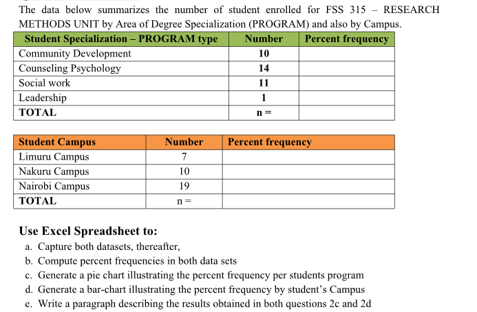
Transcribed Image Text:The data below summarizes the number of student enrolled for FSS 315 - RESEARCH
METHODS UNIT by Area of Degree Specialization (PROGRAM) and also by Campus.
Student Specialization – PROGRAM type
|Community Development
| Counseling Psychology
Social work
Number
Percent frequency
10
14
11
Leadership
ТОTAL
1
n =
Student Campus
Number
Percent frequency
Limuru Campus
7
Nakuru Campus
10
Nairobi Campus
19
ТОTAL
n =
Use Excel Spreadsheet to:
a. Capture both datasets, thereafter,
b. Compute percent frequencies in both data sets
c. Generate a pie chart illustrating the percent frequency per students program
d. Generate a bar-chart illustrating the percent frequency by student's Campus
e. Write a paragraph describing the results obtained in both questions 2c and 2d
Expert Solution
This question has been solved!
Explore an expertly crafted, step-by-step solution for a thorough understanding of key concepts.

Step by step
Solved in 2 steps with 1 images

Knowledge Booster


Learn more about
Need a deep-dive on the concept behind this application? Look no further. Learn more about this topic, statistics and related others by exploring similar questions and additional content below.Recommended textbooks for you
MATLAB: An Introduction with Applications
Statistics
ISBN:
9781119256830
Author:
Amos Gilat
Publisher:
John Wiley & Sons Inc

Probability and Statistics for Engineering and th…
Statistics
ISBN:
9781305251809
Author:
Jay L. Devore
Publisher:
Cengage Learning

Statistics for The Behavioral Sciences (MindTap C…
Statistics
ISBN:
9781305504912
Author:
Frederick J Gravetter, Larry B. Wallnau
Publisher:
Cengage Learning
MATLAB: An Introduction with Applications
Statistics
ISBN:
9781119256830
Author:
Amos Gilat
Publisher:
John Wiley & Sons Inc
Probability and Statistics for Engineering and th…
Statistics
ISBN:
9781305251809
Author:
Jay L. Devore
Publisher:
Cengage Learning
Statistics for The Behavioral Sciences (MindTap C…
Statistics
ISBN:
9781305504912
Author:
Frederick J Gravetter, Larry B. Wallnau
Publisher:
Cengage Learning

Elementary Statistics: Picturing the World (7th E…
Statistics
ISBN:
9780134683416
Author:
Ron Larson, Betsy Farber
Publisher:
PEARSON

The Basic Practice of Statistics
Statistics
ISBN:
9781319042578
Author:
David S. Moore, William I. Notz, Michael A. Fligner
Publisher:
W. H. Freeman

Introduction to the Practice of Statistics
Statistics
ISBN:
9781319013387
Author:
David S. Moore, George P. McCabe, Bruce A. Craig
Publisher:
W. H. Freeman