A study was conducted to determine how people get jobs. The table below lists data from 400 randomly selected subjects. Choose the correct pie chart. Job Sources Frequency 12 Help-wanted ads (H) Executive search firms (E) Networking (N) Mass mailing (M) Help-wanted ads (H) O Executive search firms (E) O Networking (N) O Mass mailing (M) 48 74 294 Mass mailing G Networking (N) O Executive search firms (E) O Help-wanted ads (H) IHelp-wanted ads (H) I Executive search firms (E) O Networking (N) O Mass mailing (M) Compare the pie chart found above to the Pareto chart given on the left. Can you determine which graph is more effective in showing the relative importance of job sources? O A. The pie chart is more effective. O B. The Pareto chart is more effective. O C. Neither one is effective.
A study was conducted to determine how people get jobs. The table below lists data from 400 randomly selected subjects. Choose the correct pie chart. Job Sources Frequency 12 Help-wanted ads (H) Executive search firms (E) Networking (N) Mass mailing (M) Help-wanted ads (H) O Executive search firms (E) O Networking (N) O Mass mailing (M) 48 74 294 Mass mailing G Networking (N) O Executive search firms (E) O Help-wanted ads (H) IHelp-wanted ads (H) I Executive search firms (E) O Networking (N) O Mass mailing (M) Compare the pie chart found above to the Pareto chart given on the left. Can you determine which graph is more effective in showing the relative importance of job sources? O A. The pie chart is more effective. O B. The Pareto chart is more effective. O C. Neither one is effective.

Holt Mcdougal Larson Pre-algebra: Student Edition 2012
1st Edition
ISBN:9780547587776
Author:HOLT MCDOUGAL
Publisher:HOLT MCDOUGAL
Chapter11: Data Analysis And Probability
Section11.4: Collecting Data
Problem 6E

Related questions
Question
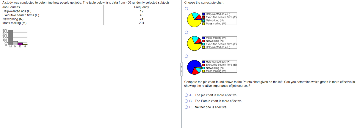
Transcribed Image Text:A study was conducted to determine how people get jobs. The table below lists data from 400 randomly selected subjects.
Choose the correct pie chart.
Job Sources
Frequency
Help-wanted ads (H)
Executive search firms (E)
Networking (N)
Mass mailing (M)
12
Help-wanted ads (H)
Executive search firms (E)
O Networking (N)
O Mass mailing (M)
48
74
294
300-
250-
200-
150-
100-
50-
0-
M NE H
Mass mailing (M)
I Networking (N)
O Executive search firms (E)
O Help-wanted ads (H)
Help-wanted ads (H)
O Executive search firms (E)
O Networking (N)
O Mass mailing (M)
Compare the pie chart found above to the Pareto chart given on the left. Can you determine which graph is more effective in
showing the relative importance of job sources?
O A. The pie chart is more effective.
O B. The Pareto chart is more effective.
OC. Neither one is effective.
.. -
Expert Solution
This question has been solved!
Explore an expertly crafted, step-by-step solution for a thorough understanding of key concepts.

This is a popular solution!

Trending now
This is a popular solution!

Step by step
Solved in 2 steps with 1 images

Recommended textbooks for you
Holt Mcdougal Larson Pre-algebra: Student Edition…
Algebra
ISBN:
9780547587776
Author:
HOLT MCDOUGAL
Publisher:
HOLT MCDOUGAL

Glencoe Algebra 1, Student Edition, 9780079039897…
Algebra
ISBN:
9780079039897
Author:
Carter
Publisher:
McGraw Hill

College Algebra (MindTap Course List)
Algebra
ISBN:
9781305652231
Author:
R. David Gustafson, Jeff Hughes
Publisher:
Cengage Learning
Holt Mcdougal Larson Pre-algebra: Student Edition…
Algebra
ISBN:
9780547587776
Author:
HOLT MCDOUGAL
Publisher:
HOLT MCDOUGAL
Glencoe Algebra 1, Student Edition, 9780079039897…
Algebra
ISBN:
9780079039897
Author:
Carter
Publisher:
McGraw Hill
College Algebra (MindTap Course List)
Algebra
ISBN:
9781305652231
Author:
R. David Gustafson, Jeff Hughes
Publisher:
Cengage Learning
