Correctly label the x-axis and y-axis with the terms price and quantity. Assign values for price and quantity along each axis. Consider the numbers in your data table and the size of your graph. For example, you may want to label price in increments of 25. Create a title for your graph by choosing a good or service for the data to represent. Using the data table below, plot a demand curve and label the curve "D." Add a curve to your graph that represents a DECREASE in demand. Label the new curve "D." Add another curve to your graph that represents an INCREASE in demand. Label the new curve Price Quantity (In whole dollars) 50 900 75 008 100 700 125 600 150 500 175 400 200 300 225 200 250 100
Correctly label the x-axis and y-axis with the terms price and quantity. Assign values for price and quantity along each axis. Consider the numbers in your data table and the size of your graph. For example, you may want to label price in increments of 25. Create a title for your graph by choosing a good or service for the data to represent. Using the data table below, plot a demand curve and label the curve "D." Add a curve to your graph that represents a DECREASE in demand. Label the new curve "D." Add another curve to your graph that represents an INCREASE in demand. Label the new curve Price Quantity (In whole dollars) 50 900 75 008 100 700 125 600 150 500 175 400 200 300 225 200 250 100

Essentials of Economics (MindTap Course List)
8th Edition
ISBN:9781337091992
Author:N. Gregory Mankiw
Publisher:N. Gregory Mankiw
Chapter7: Consumers, Producers, And The Efficiency Of Markets
Section: Chapter Questions
Problem 11PA

Related questions
Question
I need help turning this chart into a graph. The instructions on the picture.
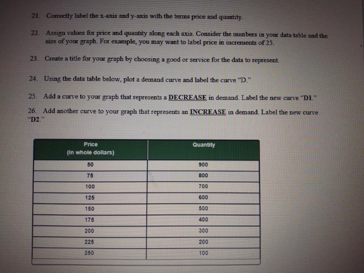
Transcribed Image Text:21. Correctly label the x-axis and y-axis with the terms price and quantity.
22. Assign values for price and quantity along each axis. Consider the numbers in your data table and the
size of your graph. For example, you may want to label price in increments of 25.
23. Create a title for your graph by choosing a good or service for the data to represent
24. Using the data table below, plot a demand curve and label the curve "D."
25. Add a curve to your graph that represents a DECREASE in demand. Label the new curve DI
26.
Add another curve to your graph that represents an INCREASE in demand. Label the new curve
D2."
Price
Anueno
(In whole dollars)
50
900
75
008
100
700
125
600
150
500
175
400
200
300
225
200
250
100
Expert Solution
This question has been solved!
Explore an expertly crafted, step-by-step solution for a thorough understanding of key concepts.

This is a popular solution!

Trending now
This is a popular solution!

Step by step
Solved in 4 steps with 3 images

Recommended textbooks for you
Essentials of Economics (MindTap Course List)
Economics
ISBN:
9781337091992
Author:
N. Gregory Mankiw
Publisher:
Cengage Learning


Essentials of Economics (MindTap Course List)
Economics
ISBN:
9781337091992
Author:
N. Gregory Mankiw
Publisher:
Cengage Learning


Economics (MindTap Course List)
Economics
ISBN:
9781337617383
Author:
Roger A. Arnold
Publisher:
Cengage Learning