The following scatterplot shows the relationship between the year a person started their job and their salary in thousands of dollars per year. Explain the trend in context of the graph. Scatterplot of Salary vs Start Year 100 80 40 1985 1990 1995 2000 2005 2010 Start Year Salary (in thousands of dollars per year)
The following scatterplot shows the relationship between the year a person started their job and their salary in thousands of dollars per year. Explain the trend in context of the graph. Scatterplot of Salary vs Start Year 100 80 40 1985 1990 1995 2000 2005 2010 Start Year Salary (in thousands of dollars per year)

Glencoe Algebra 1, Student Edition, 9780079039897, 0079039898, 2018
18th Edition
ISBN:9780079039897
Author:Carter
Publisher:Carter
Chapter4: Equations Of Linear Functions
Section4.5: Correlation And Causation
Problem 23PFA

Related questions
Question
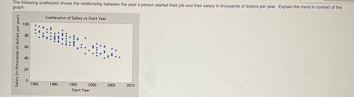
Transcribed Image Text:The following scatterplot shows the relationship between the year a person started their job and their salary in thousands of dollars per year. Explain the trend in context of the
graph.
Scatterplot of Salary vs Start Year
100
40
20
1985
1990
1995
2000
2005
2010
Start Year
Salary (in thousands of dollars per year)
Expert Solution
This question has been solved!
Explore an expertly crafted, step-by-step solution for a thorough understanding of key concepts.

This is a popular solution!

Trending now
This is a popular solution!

Step by step
Solved in 2 steps with 1 images

Recommended textbooks for you
Glencoe Algebra 1, Student Edition, 9780079039897…
Algebra
ISBN:
9780079039897
Author:
Carter
Publisher:
McGraw Hill

Big Ideas Math A Bridge To Success Algebra 1: Stu…
Algebra
ISBN:
9781680331141
Author:
HOUGHTON MIFFLIN HARCOURT
Publisher:
Houghton Mifflin Harcourt

Holt Mcdougal Larson Pre-algebra: Student Edition…
Algebra
ISBN:
9780547587776
Author:
HOLT MCDOUGAL
Publisher:
HOLT MCDOUGAL
Glencoe Algebra 1, Student Edition, 9780079039897…
Algebra
ISBN:
9780079039897
Author:
Carter
Publisher:
McGraw Hill
Big Ideas Math A Bridge To Success Algebra 1: Stu…
Algebra
ISBN:
9781680331141
Author:
HOUGHTON MIFFLIN HARCOURT
Publisher:
Houghton Mifflin Harcourt
Holt Mcdougal Larson Pre-algebra: Student Edition…
Algebra
ISBN:
9780547587776
Author:
HOLT MCDOUGAL
Publisher:
HOLT MCDOUGAL