11. An economist produced this graphic with an article stating that gas prices did not move much between November 2004 and July 2005. Explain why the graph does not give a fair picture of the changes in gas prices in this period. Gentle Fluctuation in Gas prices 250 200 150 100 50 2/15/05 5/15/05 11/15/04
11. An economist produced this graphic with an article stating that gas prices did not move much between November 2004 and July 2005. Explain why the graph does not give a fair picture of the changes in gas prices in this period. Gentle Fluctuation in Gas prices 250 200 150 100 50 2/15/05 5/15/05 11/15/04

Glencoe Algebra 1, Student Edition, 9780079039897, 0079039898, 2018
18th Edition
ISBN:9780079039897
Author:Carter
Publisher:Carter
Chapter4: Equations Of Linear Functions
Section4.4: Scatter Plots And Line Of Fit
Problem 1GP

Related questions

Question
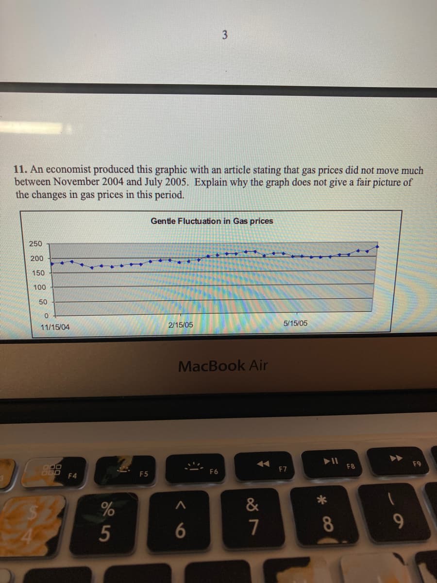
Transcribed Image Text:11. An economist produced this graphic with an article stating that gas prices did not move much
between November 2004 and July 2005. Explain why the graph does not give a fair picture of
the changes in gas prices in this period.
Gentle Fluctuation in Gas prices
250
200
150
100
50
2/15/05
5/15/05
11/15/04
MacBook Air
F9
F8
DOO
F6
F7
F4
F5
%
&
7
8
9.
5
6
Transcribed Image Text:COCLIC
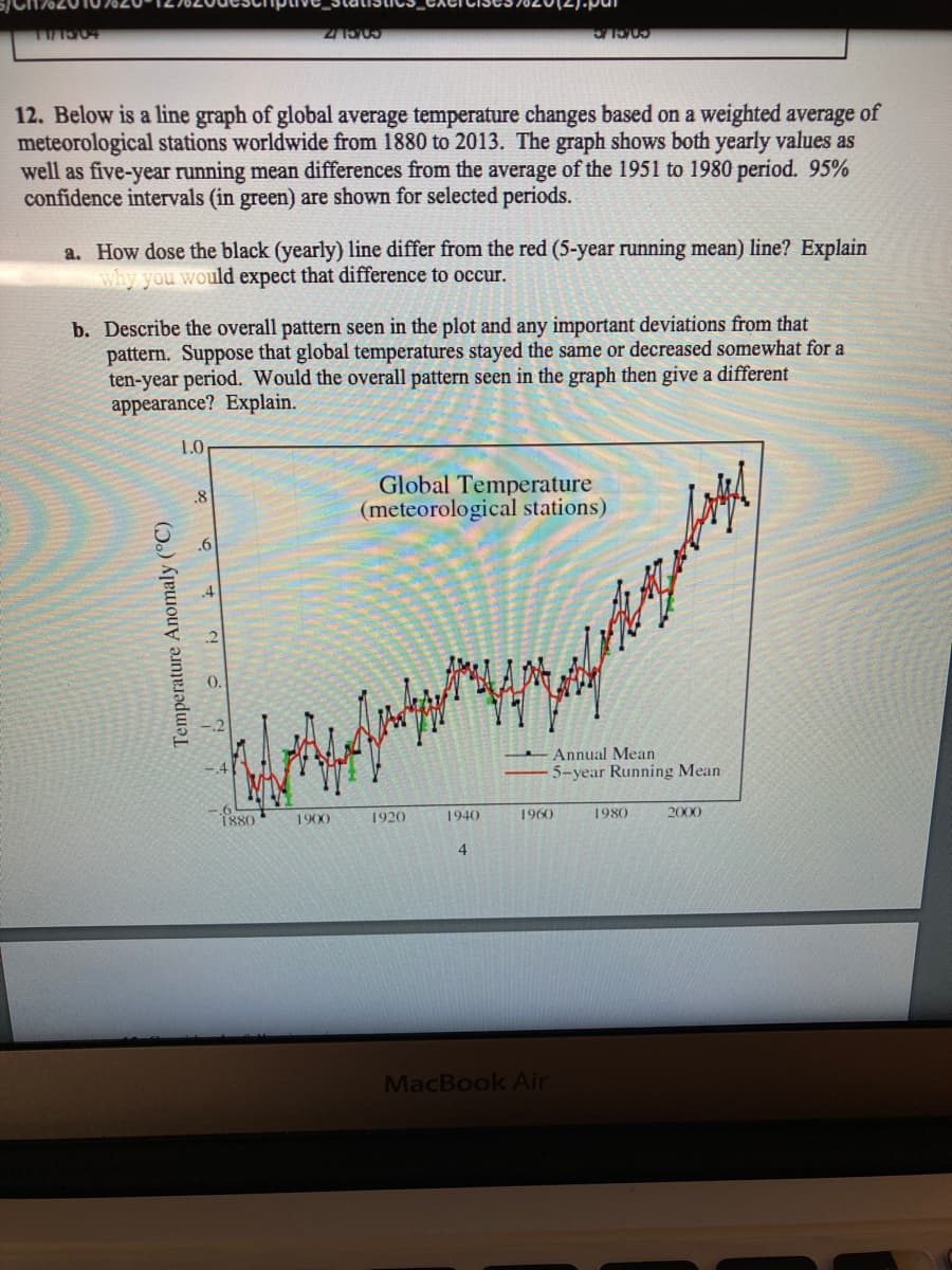
12. Below is a line graph of global average temperature changes based on a weighted average of
meteorological stations worldwide from 1880 to 2013. The graph shows both yearly values as
well as five-year running mean differences from the average of the 1951 to 1980 period. 95%
confidence intervals (in green) are shown for selected periods.
a. How dose the black (yearly) line differ from the red (5-year running mean) line? Explain
why you would expect that difference to occur.
b. Describe the overall pattern seen in the plot and any important deviations from that
pattern. Suppose that global temperatures stayed the same or decreased somewhat for a
ten-year period. Would the overall pattern seen in the graph then give a different
appearance? Explain.
1.0
Global Temperature
(meteorological stations)
.8
.6
.4
Annual Mean
5-year Running Mean
1880
1900
1920
1940
1960
1980
2000
4.
MacBook Air
Temperature Anomaly (°C)
Expert Solution
This question has been solved!
Explore an expertly crafted, step-by-step solution for a thorough understanding of key concepts.

This is a popular solution!

Trending now
This is a popular solution!

Step by step
Solved in 2 steps

Knowledge Booster


Learn more about
Need a deep-dive on the concept behind this application? Look no further. Learn more about this topic, statistics and related others by exploring similar questions and additional content below.Recommended textbooks for you
Glencoe Algebra 1, Student Edition, 9780079039897…
Algebra
ISBN:
9780079039897
Author:
Carter
Publisher:
McGraw Hill
Glencoe Algebra 1, Student Edition, 9780079039897…
Algebra
ISBN:
9780079039897
Author:
Carter
Publisher:
McGraw Hill