2. The following bar graph shows LinkedIn's annual (quarterly) revenue growth (in million $) from three different sources alongside Year-over-Year (YOY) growth curve. Describe the graph briefly with relevant information using your own words. LinkedIn's Impressive Revenue Growth LinkedIn's quarterly revenue since 2009 (in million U.S. dollars) Talent Solutions Advertising Premium Subscriptions Year-over-year growth $300m 150% $240m 120%
2. The following bar graph shows LinkedIn's annual (quarterly) revenue growth (in million $) from three different sources alongside Year-over-Year (YOY) growth curve. Describe the graph briefly with relevant information using your own words. LinkedIn's Impressive Revenue Growth LinkedIn's quarterly revenue since 2009 (in million U.S. dollars) Talent Solutions Advertising Premium Subscriptions Year-over-year growth $300m 150% $240m 120%

Chapter9: Sequences, Probability And Counting Theory
Section9.7: Probability
Problem 60SE: Use this data for the exercises that follow: In 2013, there were roughly 317 million citizens in the...

Related questions
Question
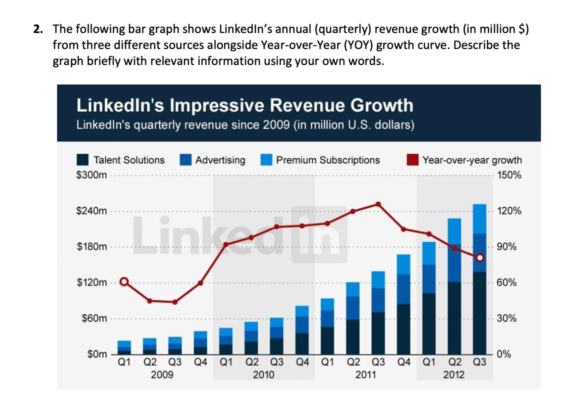
Transcribed Image Text:2. The following bar graph shows LinkedIn's annual (quarterly) revenue growth (in million $)
from three different sources alongside Year-over-Year (YOY) growth curve. Describe the
graph briefly with relevant information using your own words.
LinkedIn's Impressive Revenue Growth
LinkedIn's quarterly revenue since 2009 (in million U.S. dollars)
Talent Solutions
Advertising
Premium Subscriptions
Year-over-year growth
$300m
150%
Linkedn
$240m
120%
$180m
90%
$120m
60%
$60m
30%
$0m
Q1
0%
Q1 Q2 Q3
Q2 Q3
Q4
Q1
Q2 Q3
Q4
Q1
Q2
Q3
Q4
2009
2010
2011
2012
Expert Solution
This question has been solved!
Explore an expertly crafted, step-by-step solution for a thorough understanding of key concepts.

This is a popular solution!

Trending now
This is a popular solution!

Step by step
Solved in 2 steps

Recommended textbooks for you

Glencoe Algebra 1, Student Edition, 9780079039897…
Algebra
ISBN:
9780079039897
Author:
Carter
Publisher:
McGraw Hill
Glencoe Algebra 1, Student Edition, 9780079039897…
Algebra
ISBN:
9780079039897
Author:
Carter
Publisher:
McGraw Hill