7 5 10 20 30 40 50 60 70 80 90 100 Temperature ("C) (b) Calculate the slope of the line. (c) Determine the y-intercept of the line. Volume (L) 2.
7 5 10 20 30 40 50 60 70 80 90 100 Temperature ("C) (b) Calculate the slope of the line. (c) Determine the y-intercept of the line. Volume (L) 2.
Introductory Chemistry: A Foundation
9th Edition
ISBN:9781337399425
Author:Steven S. Zumdahl, Donald J. DeCoste
Publisher:Steven S. Zumdahl, Donald J. DeCoste
Chapter13: Gases
Section: Chapter Questions
Problem 118AP: 2.50Lcontainer at 1.00atm and 48Cis filled with 5.41gof a monatomic gas. Determine the identity of...

Related questions

Question
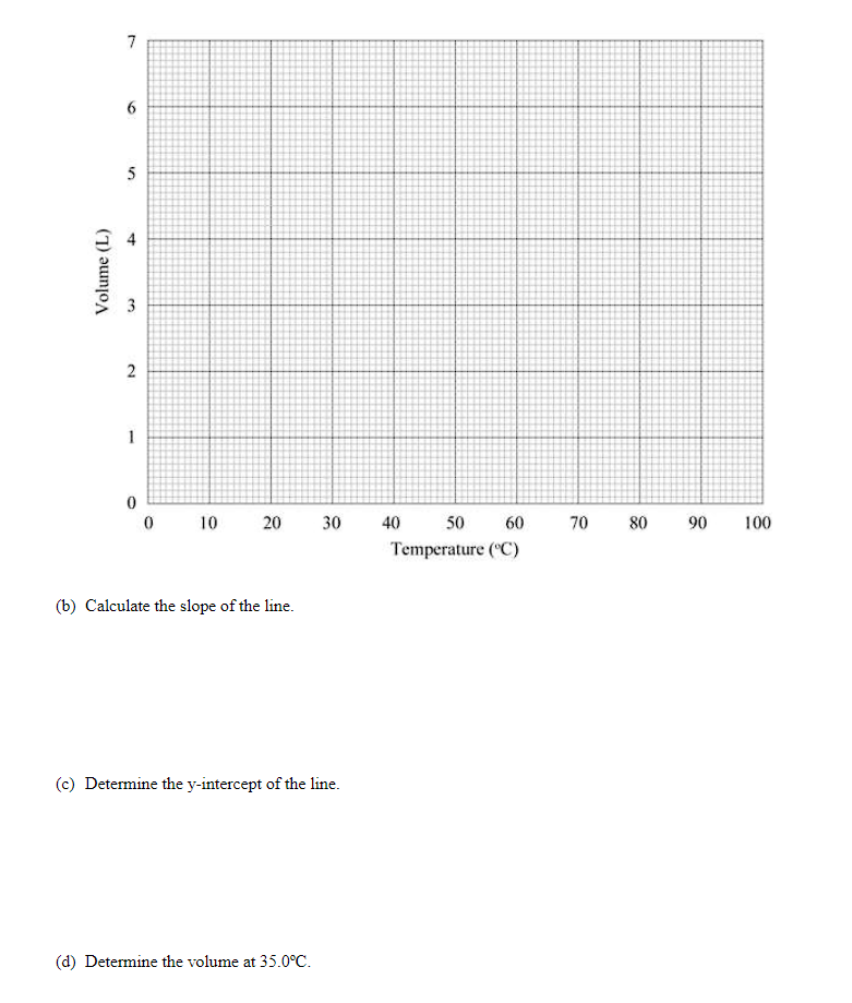
Transcribed Image Text:7
6.
5
3
2
1
10
20
30
40
50
60
70 80 90
100
Temperature (C)
(b) Calculate the slope of the line.
(c) Determine the y-intercept of the line.
(d) Determine the volume at 35.0°C.
Volume (L)
4.
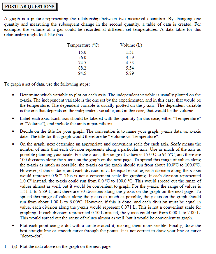
Transcribed Image Text:POSTLAB QUESTIONS
A graph is a picture representing the relationship between two measured quantities. By changing one
quantity and measuring the subsequent change in the second quantity, a table of data is created. For
example, the volume of a gas could be recorded at different set temperatures. A data table for this
relationship might look like this:
Temperature (°C)
Volume (L)
15.0
1.51
3.59
56.0
74.5
4.53
88.2
5.54
94.5
5.89
To graph a set of data, use the following steps:
Determine which variable to plot on each axis. The independent variable is usually plotted on the
x-axis. The independent variable is the one set by the experimenter, and in this case, that would be
the temperature. The dependent variable is usually plotted on the y-axis. The dependent variable
is the one that depends on the independent variable, and in this case, that would be the volume.
Label each axis. Each axis should be labeled with the quantity (in this case, either "Temperature"
or "Volume"), and include the units in parenthesis.
Decide on the title for your graph. The convention is to name your graph: y-axis data vs. x-axis
date. The title for this graph would therefore be "Volume vs. Temperature".
On the graph, next determine an appropriate and convenient scale for each axis. Scale means the
number of units that each division represents along a particular axis. Use as much of the axis as
possible planning your scale. For the x-axis, the range of values is 15.0°C to 94.5°C, and there are
100 divisions along the x-axis on the graph on the next page. To spread this range of values along
the x-axis as much as possible, the x-axis on the graph should run from about 10.0°C to 100.0°C.
However, if this is done, and each division must be equal in value, each division along the x-axis
would represent 0.9C°. This is not a convenient scale for graphing. If each division represented
1.0 C° instead, the x-axis could run from 0.0 °C to 100.0 °C. This would spread out the range of
values almost as well, but it would be convenient to graph. For the y-axis, the range of values is
1.51 L to 5.89 L, and there are 70 divisions along the y-axis on the graph on the next page. To
spread this range of values along the y-axis as much as possible, the y-axis on the graph should
run from about 1.00 L to 6.00°C. However, if this is done, and each division must be equal in
value, each division along the y-axis would represent 0.071 L. This is not a convenient scale for
graphing. If each division represented 0.10 L instead, the y-axis could run from 0.00 L to 7.00 L.
This would spread out the range of values almost as well, but it would be convenient to graph.
"S.
Plot each point using a dot with a circle around it, making them more visible. Finally, draw the
best straight line or smooth curve through the points. It is not correct to draw your line or curve
"dot-to-dot".
1. (a) Plot the data above on the graph on the next page
Expert Solution
This question has been solved!
Explore an expertly crafted, step-by-step solution for a thorough understanding of key concepts.

Step by step
Solved in 3 steps with 1 images

Knowledge Booster


Learn more about
Need a deep-dive on the concept behind this application? Look no further. Learn more about this topic, chemistry and related others by exploring similar questions and additional content below.Recommended textbooks for you
Introductory Chemistry: A Foundation
Chemistry
ISBN:
9781337399425
Author:
Steven S. Zumdahl, Donald J. DeCoste
Publisher:
Cengage Learning
Introductory Chemistry: An Active Learning Approa…
Chemistry
ISBN:
9781305079250
Author:
Mark S. Cracolice, Ed Peters
Publisher:
Cengage Learning

Chemistry: Matter and Change
Chemistry
ISBN:
9780078746376
Author:
Dinah Zike, Laurel Dingrando, Nicholas Hainen, Cheryl Wistrom
Publisher:
Glencoe/McGraw-Hill School Pub Co
Introductory Chemistry: A Foundation
Chemistry
ISBN:
9781337399425
Author:
Steven S. Zumdahl, Donald J. DeCoste
Publisher:
Cengage Learning
Introductory Chemistry: An Active Learning Approa…
Chemistry
ISBN:
9781305079250
Author:
Mark S. Cracolice, Ed Peters
Publisher:
Cengage Learning
Chemistry: Matter and Change
Chemistry
ISBN:
9780078746376
Author:
Dinah Zike, Laurel Dingrando, Nicholas Hainen, Cheryl Wistrom
Publisher:
Glencoe/McGraw-Hill School Pub Co

Living By Chemistry: First Edition Textbook
Chemistry
ISBN:
9781559539418
Author:
Angelica Stacy
Publisher:
MAC HIGHER
Introductory Chemistry: A Foundation
Chemistry
ISBN:
9781285199030
Author:
Steven S. Zumdahl, Donald J. DeCoste
Publisher:
Cengage Learning
Principles of Modern Chemistry
Chemistry
ISBN:
9781305079113
Author:
David W. Oxtoby, H. Pat Gillis, Laurie J. Butler
Publisher:
Cengage Learning