Listed below are the numbers of unprovoked shark attacks worldwide for the last several years. Why is it that a dotplot of these data would not be very effective helping us understand the data? Which of the following graphs would be most effective for these data: dotplot, stemplot, time-series graph, Pareto chart, pie cha frequency polygon? 70 54 68 82 79 83 76 73 98 81 Why is it that a dotplot of these data would not be very effective in helping us understand the data? O A. The spread of the data is very small, so it would be nearly impossible to see any differences when represented graphically. OB. The data set is too small for a dotplot to reveal important characteristics of the data. OC. There are several duplicate values in the data and most graphical methods cannot accurately show duplicate values. O D. Even though the data are numeric, they are actually categorical data because each value is discrete. Which of the following graphs would be most effective for these data: dotplot, stemplot, time-series graph, Pareto chart, pie chart, frequency polygon? O A. A time-series graph would be most effective, since the data are listed in order over a period of several years. B. A stemplot would be most effective, since it is important to be able to recreate the original list of values. OC. A Pareto chart would be most effective, since the data are categorical data. O D. A pie chart would be most effective, since the data are categorical data. O E. A frequency polygon would be most effective, since the data are listed in order over a period of several years. OF. A dotplot would be most effective, since it is important to be able to recreate the original list of values.
Listed below are the numbers of unprovoked shark attacks worldwide for the last several years. Why is it that a dotplot of these data would not be very effective helping us understand the data? Which of the following graphs would be most effective for these data: dotplot, stemplot, time-series graph, Pareto chart, pie cha frequency polygon? 70 54 68 82 79 83 76 73 98 81 Why is it that a dotplot of these data would not be very effective in helping us understand the data? O A. The spread of the data is very small, so it would be nearly impossible to see any differences when represented graphically. OB. The data set is too small for a dotplot to reveal important characteristics of the data. OC. There are several duplicate values in the data and most graphical methods cannot accurately show duplicate values. O D. Even though the data are numeric, they are actually categorical data because each value is discrete. Which of the following graphs would be most effective for these data: dotplot, stemplot, time-series graph, Pareto chart, pie chart, frequency polygon? O A. A time-series graph would be most effective, since the data are listed in order over a period of several years. B. A stemplot would be most effective, since it is important to be able to recreate the original list of values. OC. A Pareto chart would be most effective, since the data are categorical data. O D. A pie chart would be most effective, since the data are categorical data. O E. A frequency polygon would be most effective, since the data are listed in order over a period of several years. OF. A dotplot would be most effective, since it is important to be able to recreate the original list of values.

MATLAB: An Introduction with Applications
6th Edition
ISBN:9781119256830
Author:Amos Gilat
Publisher:Amos Gilat
Chapter1: Starting With Matlab
Section: Chapter Questions
Problem 1P

Related questions
Question
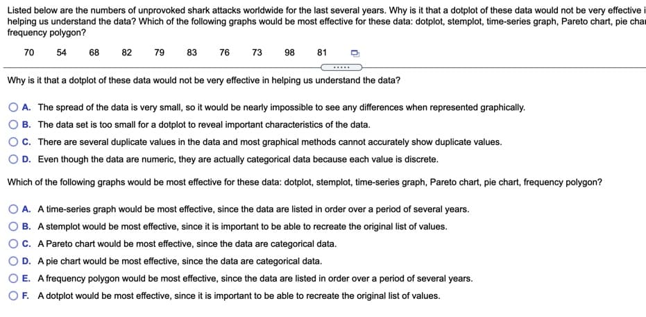
Transcribed Image Text:Listed below are the numbers of unprovoked shark attacks worldwide for the last several years. Why is it that a dotplot of these data would not be very effective i
helping us understand the data? Which of the following graphs would be most effective for these data: dotplot, stemplot, time-series graph, Pareto chart, pie char
frequency polygon?
70
54
68
82
79
83
76
73
98
81
Why is it that a dotplot of these data would not be very effective in helping us understand the data?
O A. The spread of the data is very small, so it would be nearly impossible to see any differences when represented graphically.
B. The data set is too small for a dotplot to reveal important characteristics of the data.
c. There are several duplicate values in the data and most graphical methods cannot accurately show duplicate values.
O D. Even though the data are numeric, they are actually categorical data because each value is discrete.
Which of the following graphs would be most effective for these data: dotplot, stemplot, time-series graph, Pareto chart, pie chart, frequency polygon?
O A. A time-series graph would be most effective, since the data are listed in order over a period of several years.
B. A stemplot would be most effective, since it is important to be able to recreate the original list of values.
C. A Pareto chart would be most effective, since the data are categorical data.
D. A pie chart would be most effective, since the data are categorical data.
O E. A frequency polygon would be most effective, since the data are listed in order over a period of several years.
OF. A dotplot would be most effective, since it is important to be able to recreate the original list of values.
Expert Solution
This question has been solved!
Explore an expertly crafted, step-by-step solution for a thorough understanding of key concepts.

This is a popular solution!

Trending now
This is a popular solution!

Step by step
Solved in 3 steps with 3 images

Recommended textbooks for you
MATLAB: An Introduction with Applications
Statistics
ISBN:
9781119256830
Author:
Amos Gilat
Publisher:
John Wiley & Sons Inc

Probability and Statistics for Engineering and th…
Statistics
ISBN:
9781305251809
Author:
Jay L. Devore
Publisher:
Cengage Learning

Statistics for The Behavioral Sciences (MindTap C…
Statistics
ISBN:
9781305504912
Author:
Frederick J Gravetter, Larry B. Wallnau
Publisher:
Cengage Learning
MATLAB: An Introduction with Applications
Statistics
ISBN:
9781119256830
Author:
Amos Gilat
Publisher:
John Wiley & Sons Inc
Probability and Statistics for Engineering and th…
Statistics
ISBN:
9781305251809
Author:
Jay L. Devore
Publisher:
Cengage Learning
Statistics for The Behavioral Sciences (MindTap C…
Statistics
ISBN:
9781305504912
Author:
Frederick J Gravetter, Larry B. Wallnau
Publisher:
Cengage Learning

Elementary Statistics: Picturing the World (7th E…
Statistics
ISBN:
9780134683416
Author:
Ron Larson, Betsy Farber
Publisher:
PEARSON

The Basic Practice of Statistics
Statistics
ISBN:
9781319042578
Author:
David S. Moore, William I. Notz, Michael A. Fligner
Publisher:
W. H. Freeman

Introduction to the Practice of Statistics
Statistics
ISBN:
9781319013387
Author:
David S. Moore, George P. McCabe, Bruce A. Craig
Publisher:
W. H. Freeman