Draw the appropriate graph for each of the data sets given below. Explain the chosen graphs and give a short interpretation.


Q: A survey was given to a group of ACC students. One question asked the students how many years they…
A: A bar chart is a chart that presents categorical data with rectangular bars with heights. A…
Q: Show the five-number summary for the following data: 5, 16, 18, 9, 7, 12, 17, 9, 5. minimum first…
A:
Q: Give an example of a data set with: N=4 H = 7.1
A: We are given N = 4 μ = 7.1 σ = 0 The standard deviation being zero indicated that…
Q: onsider two data sets. (Refer to screensho
A: The mean formula is, x=∑xn Now, x=∑xn4=∑x5∑x=20 Now, If one score of X = 20 is added to the sample,…
Q: A car company agent conducted a survey to find out which car models most customers prefer. What is…
A: The company agent has collected the data of preference of car models of different customers. Now,…
Q: 1) For each of the data sets below, indicate which type of graph you would choose to display the…
A: We'll answer the first question since the exact one wasn't specified. Please submit a new question…
Q: Provide an appropriate chart for the following data
A:
Q: Which of the following is the best way to graph the data in the table below? (b)AWH Changing Forests…
A:
Q: Which data would be suitable for a pie chart?
A: Option (C): Oxnard University category (undergraduate, masters, doctors). This is the correct option…
Q: A middle school wanted to visualize the association between how many days a student is absent and…
A: We have given that the scatter plot of the Number of Absence and the grade. In this scatter plot,…
Q: Which type of graph(s) should be used for the following data? Choose all that apply. {38, 59, 46,…
A: Given Information: Data = ( 38,59,46,38,55,64,78,47,95,65,45,12,48,68,56,46)
Q: 1) For each of the data sets below, indicate which type of graph you would choose to display the…
A: a) Scores on an anxiety scale that range from “not anxious”, “somewhat anxious”, “moderately…
Q: interested in examining the relationship between happiness (measured using a Likert scale), and…
A: From the given information we find the solution.
Q: Which group has the largest number of data points?
A:
Q: #4 Use the graph to the right. Which data set could be used to create the box plot? O 3, 4, 8, 10,…
A: In this question we will use basic of algebra i.e solution from box plot We will use simple…
Q: Use a pivot table to construct a frequency distribution and histogram of lunch sales amounts for the…
A: Date Day Lunch Dinner Delivery 01-Apr Saturday 595 1406 911 02-Apr Sunday 938 1270 526 04-Apr…
Q: Is this pie chart a good way to represent this data? Why or why not?
A: The given pie chart is The given pie chart shows the distribution of redrawing the Starbucks logo.…
Q: A key question in determining whether a data set is one or two variable is: a. "How many facts do…
A: The correct option for this is: (a) "How many facts do you know about each individual?" For example:…
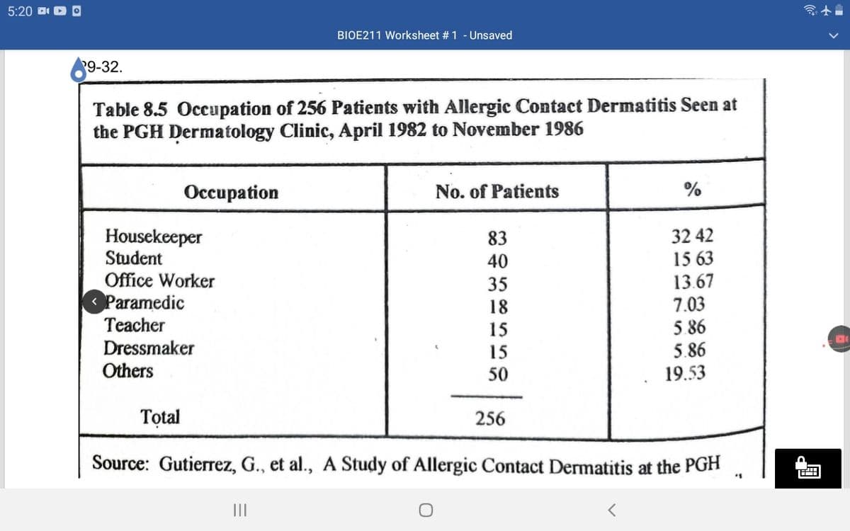
Q: Draw the appropriate graph for each of the data sets given below. Explain the chosen graphs and give…
A: The frequency and percentage distribution of occupation of patients is given.
Q: A. What type of data is this (Categorical or Numerical)? B. What would be an appropriate type of…
A: 1. A random sample of 24 individuals who has completed the syllabus survey at the beginning of the…
Q: 2. 1. What kind of graph was used to show the data? O stem-and-leaf plot O box-and-whisker What in…
A: (1) Clearly from the given figure we can observe.
Q: Which data is more likely to be displayed in a bar graph rather than on a line plot? Select all that…
A: A line chart or line plot or line graph or curve chart is a type of chart which displays information…
Q: a) Based on the data above, i. calculate all type of Measure Central Tendency (mean, median, mode,…
A: Given information: Sales Frequency 1 to 10 2 11 to 20 3 21 to 30 5 31 to 40 7 41 to…
Q: A survey was given to a group of ACC students. One question asked the students how many hours they…
A:
Q: The American Community Survey collects important US population information between census years. In…
A: 1.
Q: d) Name a better sampling method the principal could use. Describe how this sample could be…
A: Sampling is the method is a way which used to make sample. There are two types of sampling, they are…
Q: Draw an appropriate graphs for the given data set , categorized as: ≤ 5 and > 5. 12,…
A: Given the data set: 12, 3, 15, 4, 10, 5, 6, 9, 8 Draw appropriate graphs for the given data…
Q: Based on the data bellow, i. calculate all type of Measure Central Tendency (mean, median, mode, Q1…
A: Given : Sales and frequency We have to find out Mean median mode Q1, Q3 Histogram and frequency…
Q: What type of association is shown in the scatter plot?
A: We have to choose the correct option from the given scatter plot.
Q: Which type of graph(s) should be used for the following data? Choose all that apply. Country…
A: We can use Bar graph and pareto graph for the above table.
Q: 11 12 13 14 15 16 17 18 19 20 21 22 23 24 multiple choice score 5. 3. 2. 1. # of students
A: From the given histogram we find average multiple choice score.
Q: The following statement refers to which aspect of a statistical study: "A meteorologist constructs a…
A: The statement "A meteorologist constructs a graph showing the total precipitation in Phoenix,…
Q: After giving a statistics exam, Professor Dang determined the following five-number summary for her…
A: The given five- number summary for her class results are: 60 68 77 89 98 The five…
Q: Describe the difference in appearance between a bar graph and a histogram and identify the…
A: Bar graphs and Histogram are used for diagrammatic representation of data
Q: Make a histogram graph and make table of required data
A: Fromm the given question, Lets data be as follows below:
Q: Is the data point, P, an outlier, an influential point, both, or neither? 12 Influential point Both…
A: An influential point is an outlier that affects the slope of the regression line. An influential…
Q: The scatter plot shown would seem to indicate which type of data association
A:
Q: 1. Which type of graph is used with single or two variable statistics? Identify. bar graph…
A: Introduction: Types of graph in statistics Bar Chart Box plot Histogram Scatter plot Pie chart All…
Q: If there are 13 data points in a set of data, what is the number of degrees of freedom?
A: Sample size n=13
Q: The following line graph shows the combined Math and English SAT score averages for Missouri from…
A: The SAT score averages from year 1994 to 1998 Year SAT score average 1994 1114 1995 1135…
Q: Consider the variables in our data set, what type of graph would you use to present the following…
A: Given some variables we have to explain what type of graph would we use to present the following…
Q: For the given dataset, find the range? 21,13,24,31,18,16,34,11
A: Given that The data set 21,13,24,31,18,16,34,11
Q: What is a literal count of each member of a data set and how often it occurs
A: Given:To find the literal count based on the data set each member which it occurs as follows,
Q: interpretation
A: As this is the data between year and 3 different diseases mortality rate per 100,000 population So…
Q: The red blood cell count of a healthy person was measured on each of 15 days. The number recorded is…
A: The provided data set is: 5.4 5.2 5 5.2 5.5 5.3 5.4 5.2 5.1 5.3 5.3 4.9…
Q: Need a line graph for the given data
A:
Q: In a scatter plot, each. O A.individual is represented by two data points B. group mean is…
A: in A scatter plot each 1): individual is represented by two data points 2): group mean represented…
Q: a. Compute the cumulative frequency and cumulative percentage distribution for the data. b. What…
A: Email Hours per week Frequency 0 19 1 20 2 13 3 5 4 2 5 6 6 5 7 2 8 3 9 1 10…
Q: A store manager, using his data for the past four years, presents his sales using a bar graph. Under…
A: The answer is Descriptive statistics. Hence option is A.
Q: A market researcher asked a random sample of 100 individuals their favorite place to get coffee. The…
A: Solution: The table of the number of individuals and their favorite place to get coffee is given.…
D. Draw the appropriate graph for each of the data sets given below. Explain the chosen graphs and give a short interpretation.

Step by step
Solved in 3 steps with 1 images

- A tax accountant would like to test the claim that the proportion of individuals who owe when filing their taxes is less than 0.20. If the z− test statistic was calculated as z=−2.11, does the tax accountant have enough evidence to reject the null hypothesis? Assume α=0.005. Move the blue dot to choose the appropriate test (left-, right, or two-tailed). Then, use the graph below to show the test statistic, p-value, and the rejection region to make a conclusion about the hypothesis test. powered by Move the blue dot to choose the appropriate test α=0.01 α=0.025 α=0.05 α=0.1 Significance level = 0.01 Select the correct answer below: There is enough evidence to suggest the proportion of individuals who owe when filing their taxes is less than 0.20. There is not enough evidence to suggest the proportion of individuals who owe when filing their taxes is less than 0.20. There is enough evidence to suggest the proportion of individuals who owe when filing their taxes is greater than 0.20.…The British Department of Transportation studied to see if people avoid driving on Friday the 13th. They did a traffic count on a Friday and then again on a Friday the 13th at the same two locations. The data for each location on the two different dates is in the table. Do the data show that on average fewer people drive on Friday the 13th? Test at the 5% level.Traffic Count Dates 6th 13th 1990, July 137669 135825 1990, July 129699 128891 1991, September 136898 138275 1991, September 138966 139940 1991, December 132021 129640 1991, December 119268 119214 1992, March 131938 131104 1992, March 123306 124760 1992, November 129499 129219 1992, November 138568 135934The number of contaminating particles on a silicon waferprior to a certain rinsing process was determined for eachwafer in a sample of size 100, resulting in the followingfrequencies:Number of particles 0 1 2 3 4 5 6 7Frequency 1 2 3 12 11 15 18 10Number of particles 8 9 10 11 12 13 14Frequency 12 4 5 3 1 2 1a. What proportion of the sampled wafers had at leastone particle? At least five particles?b. What proportion of the sampled wafers had betweenfive and ten particles, inclusive? Strictly between fiveand ten particles?c. Draw a histogram using relative frequency on thevertical axis. How would you describe the shape of thehistogram?
- A problem with a telephone line that prevents a customer from receiving or making calls is upsetting to both the customer and the telephone company. The Sheet 8 contains samples of 20 problems reported to two different offices of a telephone company and the time to clear these problems (in minutes) from the customers' lines: test the Null hypothesis that the time to clear the problem doesn't significantly differ across to centers at the 0.03 level. Sheet 8 Location 1. Location 2 1,48 7,55 1,75 3,75 0,78 12,00 2,85 1,10 0,52 0,60 1,60 0,52 4,15 3,30 3,97 2,10 1,48 0,58 3,10 13,00 1,02 3,75 0,53 0,65 0,93 1,92 1,60 0,60 0,80 1,53 1,05 4,23 6,32…Consider number of male doctors in military and civilian hospitals. Test claim there is a smaller proportion of male doctors in military than in civilian life at alpa= 0.05 Military 1 Civilian 2 Male doctors 358 6786 Total doctors 407 7363 a. At the 0.05 level of significance, the data provides insufficient evidence to conclude that the population proportion of male military doctors is less than the population proportion of male civilian doctors. b. At the 0.05 level of significance, the data provides sufficient evidence to conclude that the population proportion of male military doctors is more than the population proportion of male civilian doctors. c. At the 0.05 level of significance, the data provides insufficient evidence to conclude that the population proportion of male military doctors is more than the population proportion of male civilian doctors. d. At the 0.05 level of significance, the data provides sufficient evidence to conclude…Suppose that 80% of 3–4-year-old children and 70% of5–8-year-old children in a village are vaccinated with QIVvaccine. Also assume that children who are not vaccinatedhave twice the incidence of influenza as the control groupin Table 3.7.3.29 What % of 3–4-year-old children in the village will getinfluenza?3.30 What % of 5–8-year-old children in the village will getinfluenza?3.31 Suppose we identify a 5–8-year-old child with influenzain the village but are uncertain whether the childwas vaccinated. If we make the same assumptions as inProblems 3.29–3.30, then what is the probability that thechild was vaccinated? (Hint: Use Bayes’ rule here.)
- A heart study objective was to study heart disease among healthy volunteers.After a 10-year follow-up period involving men aged 40 to 59, there were 16 casesof coronary heart disease (CHD) among the 454 men who initially had cholesterollevels below 210 mg/100 ml (referred to as the low serum cholesterol group). Incontrast, among the 424 men whose initial cholesterol levels were at least 245mg/100 ml (referred to as the high serum cholesterol group), there were 51 cases ofCHD. With this information, Draw a 2x2 contingency table then calculate the relative risk (RR) associated with high serum cholesterol and provide an interpretation of the result.A report in LTO stated that the average age of taxis in the Philippines is 9 years. An operations manager of a large taxi company selects a sample of 40 taxis and finds the average age of the taxis is 8.2 years. The σ of the population is 2.3 years. At ? = 0.05, can it be concluded that the average age of the taxis in his company is less than the national average?A common characterization of obese individuals is that their body mass index is at least 30 [BMI = weight/(height)2, where height is in meters and weight is in kilograms]. An article reported that in a sample of female workers, 269 had BMIs of less than 25, 156 had BMIs that were at least 25 but less than 30, and 121 had BMIs exceeding 30. Is there compelling evidence for concluding that more than 20% of the individuals in the sampled population are obese? (a) State the appropriate hypotheses with a significance level of 0.05. H0: p = 0.20Ha: p > 0.20H0: p > 0.20Ha: p = 0.20 H0: p = 0.20Ha: p < 0.20H0: p = 0.20Ha: p ≠ 0.20 Calculate the test statistic and determine the P-value. (Round your test statistic to two decimal places and your P-value to four decimal places.) z=P-value= What can you conclude? Reject the null hypothesis. There is sufficient evidence that more than 20% of the population of female workers is obese.Reject the null hypothesis. There is not…
- A common characterization of obese individuals is that their body mass index is at least 30 [BMI = weight/(height)2, where height is in meters and weight is in kilograms]. An article reported that in a sample of female workers, 269 had BMIs of less than 25, 156 had BMIs that were at least 25 but less than 30, and 121 had BMIs exceeding 30. Is there compelling evidence for concluding that more than 20% of the individuals in the sampled population are obese? (c) What is the probability of not concluding that more than 20% of the population is obese when the actual percentage of obese individuals is 23%? (Round your answer to four decimal places.)A survey of 90 recently delivered women on the rolls of a county welfare department revealed that 27 had a history of intrapartum or postpartum infection. Can we conclude that the population proportion with a history of intrapartum or postpartum infection is less than or equal to 0.25. Let alpha = 0.05Samples are collected from the River X and pH values are observed. 9 different pH values arelisted in table 3.Table 3Concentrations 4.2 3.8 6.0 3.5 8.1 4.9 4.1 3.2 4.0Draw box plot and finda. Bowley’s coefficient of skewnessb. Karl Pearson’s coefficient of skewnessc. Third momentRubricStages of Process MarksImagine and Plan 2Composition 2Effort 1


