represents the indepen usually represents the dependent varia To show the general relationship between the two has a hor line that is drawn to "fit," or come close to, most of the data points. The graphs below show steps used to construct a scatter plot 6 Identify Which axis of a graph usually represents the independent variable? of the drink sales data at the left. Visualize It! Drink Sales 200 100 T 200 80 60 + 40 40 + 20 20 0 20 40 40 80 100 High temperature (*F) 0. 20 40 G0 80 100 20 40 60 80 100 High temperature (°F) High temperature (F) Step 1 Label the Axes Label each axis on a graph with the name of the variable that is Step 2 Plot the Data Points Plot the data from the table as Step 3 Draw a Line of Best Fit Draw a line that comes close data points on the graph. represented. Each axis can have its own range and scale so that the data can be seen easily. The range is the difference between the greatest value and the least value of a variable. The scale is the size that is used for each box or grid mark on the graph. 7 Analyze Do you see a trend in these data? Explain. to most of the data points. The line shows the pattern described by the data. It also shows how the data differ from the pattern. Moughton t Number of drinks sold Number of drinks sold Number of drinks sold
represents the indepen usually represents the dependent varia To show the general relationship between the two has a hor line that is drawn to "fit," or come close to, most of the data points. The graphs below show steps used to construct a scatter plot 6 Identify Which axis of a graph usually represents the independent variable? of the drink sales data at the left. Visualize It! Drink Sales 200 100 T 200 80 60 + 40 40 + 20 20 0 20 40 40 80 100 High temperature (*F) 0. 20 40 G0 80 100 20 40 60 80 100 High temperature (°F) High temperature (F) Step 1 Label the Axes Label each axis on a graph with the name of the variable that is Step 2 Plot the Data Points Plot the data from the table as Step 3 Draw a Line of Best Fit Draw a line that comes close data points on the graph. represented. Each axis can have its own range and scale so that the data can be seen easily. The range is the difference between the greatest value and the least value of a variable. The scale is the size that is used for each box or grid mark on the graph. 7 Analyze Do you see a trend in these data? Explain. to most of the data points. The line shows the pattern described by the data. It also shows how the data differ from the pattern. Moughton t Number of drinks sold Number of drinks sold Number of drinks sold

Glencoe Algebra 1, Student Edition, 9780079039897, 0079039898, 2018
18th Edition
ISBN:9780079039897
Author:Carter
Publisher:Carter
Chapter4: Equations Of Linear Functions
Section4.4: Scatter Plots And Line Of Fit
Problem 11PPS

Related questions
Question
Please help
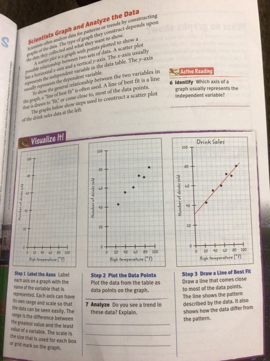
Transcribed Image Text:Scientists Graph and Analyze the Data
Scientists often analyze data for patterns or trends by constructing
graphs of the data. The type of graph they construct depends upon
the data they collected and what they want to show.
A scatter plot is a graph with points plotted to show a
possible relationship between two sets of data. A scatter plot
has a horizontal xr-axis and a vertical y-axis. The x-axis usually
represents the independent variable in the data table. The y-axis
usually represents the dependent variable.
To show the general relationship between the two variables in
the graph, a "line of best fit" is often used. A line of best fit is a line
that is drawn to "fit," or come close to, most of the data points.
The graphs below show steps used to construct a scatter plot
Active Reading
6 Identify Which axis of a
graph usually represents the
independent variable?
of the drink sales data at the left.
OVisualize It!
Drink Sales
100
100
80-
80 +
80
60
60
60 +
40
40
20
20
20
0 20 40 GO 80 100
High temperature (° F)
0.
20
40
60 80 100
20
40 60 80 100
High temperature (°F)
High temperature (°F)
Step 1 Label the Axes Label
each axis on a graph with the
name of the variable that is
Step 2 Plot the Data Points
Plot the data from the table as
Step 3 Draw a Line of Best Fit
Draw a line that comes close
represented. Each axis can have
data points on the graph.
to most of the data points.
The line shows the pattern
its own range and scale so that
the data can be seen easily. The
range is the difference between
the greatest value and the least
value of a variable. The scale is
the size that is used for each box
or grid mark on the graph.
7 Analyze Do you see a trend in
these data? Explain.
described by the data. It also
shows how the data differ from
the pattern.
Number of drinks sold
Number of drinks sold
Expert Solution
This question has been solved!
Explore an expertly crafted, step-by-step solution for a thorough understanding of key concepts.

This is a popular solution!

Trending now
This is a popular solution!

Step by step
Solved in 3 steps

Recommended textbooks for you
Glencoe Algebra 1, Student Edition, 9780079039897…
Algebra
ISBN:
9780079039897
Author:
Carter
Publisher:
McGraw Hill


Holt Mcdougal Larson Pre-algebra: Student Edition…
Algebra
ISBN:
9780547587776
Author:
HOLT MCDOUGAL
Publisher:
HOLT MCDOUGAL
Glencoe Algebra 1, Student Edition, 9780079039897…
Algebra
ISBN:
9780079039897
Author:
Carter
Publisher:
McGraw Hill
Holt Mcdougal Larson Pre-algebra: Student Edition…
Algebra
ISBN:
9780547587776
Author:
HOLT MCDOUGAL
Publisher:
HOLT MCDOUGAL

Algebra & Trigonometry with Analytic Geometry
Algebra
ISBN:
9781133382119
Author:
Swokowski
Publisher:
Cengage

Big Ideas Math A Bridge To Success Algebra 1: Stu…
Algebra
ISBN:
9781680331141
Author:
HOUGHTON MIFFLIN HARCOURT
Publisher:
Houghton Mifflin Harcourt
Trigonometry (MindTap Course List)
Trigonometry
ISBN:
9781305652224
Author:
Charles P. McKeague, Mark D. Turner
Publisher:
Cengage Learning