
Concept explainers
Videos
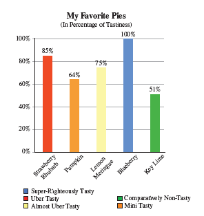
On the show How I Met Your Mother, Marshall demonstrated the true versatility of pie charts and bar graphs in the most brilliant way possible: by making a pie chart describing his favorite bars, and a bar graph describing his favorite pies. The charts are reproduced below.
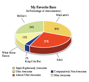
Look at Marshall’s pie chart and try to ignore the percentages for a moment. Which slice appears to be the biggest? Which actually should be?

Trending nowThis is a popular solution!

Chapter 1 Solutions
PATHWAYS TO MATH LITERACY 2ND (LL)
Additional Math Textbook Solutions
Mathematics for the Trades: A Guided Approach (10th Edition) - Standalone book
Finite Mathematics for Business, Economics, Life Sciences and Social Sciences Plus NEW MyLab Math with Pearson eText -- Access Card Package (13th Edition)
Probability and Statistics for Engineers and Scientists
Using and Understanding Mathematics: A Quantitative Reasoning Approach (6th Edition)
Mathematics All Around (6th Edition)
Mathematical Ideas (13th Edition) - Standalone book


 Glencoe Algebra 1, Student Edition, 9780079039897...AlgebraISBN:9780079039897Author:CarterPublisher:McGraw Hill
 Holt Mcdougal Larson Pre-algebra: Student Edition...AlgebraISBN:9780547587776Author:HOLT MCDOUGALPublisher:HOLT MCDOUGAL