
Videos
a.
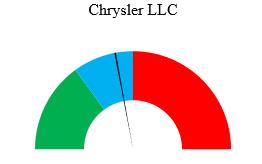
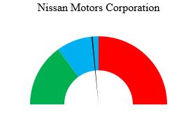
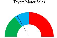
Create a gauge for each automaker.
a.
Explanation of Solution
The gauge for each automaker can be made using the Excel software.
Software Procedure:
Enter the data in Excel using following steps:
Open Excel sheet and name column A as Complaint (A1) and column B as Gauge (B1).
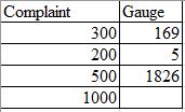
Enter 300, 200 and 500 in the cells A2:A4 (complaint levels-low, medium and high) and 1000 in A5 (sum of all entries in the column).
Under the gauge column, enter 169 (number of complaints received by American Honda) in B2, 5 (width of the pointer of the gauge) in B3, and enter the formula,
The constructed table in excel looks as follows:
Procedure to construct Gauge:
Select both the columns together.
Go to Insert > Charts > All Charts > Combo > Create Custom Combo Chart…
Change the first Chart type to Doughnut and second Chart type to Pie.
Check the secondary axis box for Pie and keep the secondary axis box for doughnut unchecked.
Click on OK.
Click on graph and go to Format and select Series “gauge� from the drop-down box in the Current Selection area.
Click on Format Selection in the Current Selection area.
In the Format Data Series area, change the ‘Angle of first slice’ of the secondary Axis to
Use Ctrl plus the right arrow key to move to each section of the pie.
Go to the Series ‘gauge’ Point 1 using the above method.
Click on Fill & Line option in the Format Data Series area.
Under the Fill list, select no fill.
Do the same above three steps to select solid fill (Black color) for Series ‘gauge’ Point 2 and no fill for Series ‘gauge’ Point 3.
From the drop-down box in the Current Selection area change Series “gauge� to Series ‘Complaint’.
Click on Format Selection in the Current Selection area.
In the Format Data Series area, change the ‘Angle of first slice’ of the secondary Axis to
Use Ctrl plus the right arrow key to move to each section of the doughnut.
Go to the Series ‘Complaint’ Point 1 using the above method.
Click on Fill & Line option in the Format Data Series area.
Under the Fill list, select solid fill and choose a green color.
Perform the same above three steps to select solid fill (blue color) for Series ‘Complaint’ Point 2, solid fill (red color) for Series ‘Complaint’ Point 3 and no fill for Series ‘Complaint’ Point 4.
Delete legends from the pie chart.
Rename the chart title as per the company.
Now, replace the number of complaints received by individual automakers to obtain the respective gauge one by one.
From the above procedure, the obtained gauge for each automaker are as follows:


b.
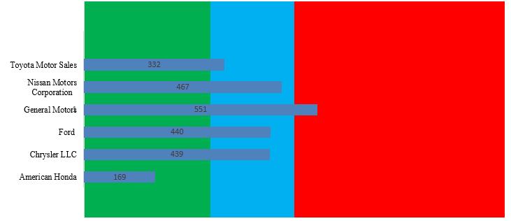
Construct the bullet graph for the automakers.
b.
Explanation of Solution
The bullet graph for the automakers can be created using the Excel software.
Software procedure:
Step by step procedure to create the required bullet graph is as follows:
Enter the given data in Excel and select the data.
Select Insert, then the bar chart icon, and select first 2-D Bar gallery item (Clustered bar).
In the newly constructed bar chart, click on plus sign and uncheck Gridlines.
Right click in the whitespace to the right of chart title and click Format chart area in the shortcut menu.
In the fill part of format chart area pane select No fill.
In the cell
Select Insert, then the bar chart icon, and select second 2-D bar gallery item (Stacked bar).
In the newly constructed bar chart, click on plus sign and uncheck every box.
Right click in the white space to the right of chart title area and click on Select Data in the shortcut menu.
In the data Select Source Dialog box, click Switch Row/Column and then click on OK.
Right click one stacked bar and then click on Format Data Series. In the series option part, change the gap width to
Adjust the size of chart and right click the chart border and select Send to Back > Send to Back in the shortcut menu.
Drag the bar chart with transparent background over the stacked bar chart, such that both charts coincide.
The obtained bullet graph in Excel is as shown below:
c.
Mention the display that is more effective at comparing the number of complaints received by each automaker.
c.
Explanation of Solution
The bullet graph displays the data in a single graph, while gauges should be plotted for each automaker separately. Thus, the bullet graph is a more efficient way to display the data as it requires less space than the gauges. Moreover, the bullet graph also provides the ease of comparing the data at the same time.
Want to see more full solutions like this?
Chapter 17 Solutions
Basic Business Statistics, Student Value Edition (13th Edition)


 Glencoe Algebra 1, Student Edition, 9780079039897...AlgebraISBN:9780079039897Author:CarterPublisher:McGraw Hill
 Big Ideas Math A Bridge To Success Algebra 1: Stu...AlgebraISBN:9781680331141Author:HOUGHTON MIFFLIN HARCOURTPublisher:Houghton Mifflin Harcourt
 Holt Mcdougal Larson Pre-algebra: Student Edition...AlgebraISBN:9780547587776Author:HOLT MCDOUGALPublisher:HOLT MCDOUGAL