Elementary Statistics: A Step By Step Approach
10th Edition
ISBN: 9781259755330
Author: Allan G. Bluman
Publisher: McGraw-Hill Education
bartleby

Concept explainers

bartleby

Videos

Textbook Question
Book Icon
Chapter 2, Problem 2.2.9RE

Construct a histogram, frequency polygon, and ogive for the data in Exercise 5.

Expert Solution & Answer
Check Mark
To determine

To construct: The histogram, frequency polygon, and ogive for given data.

Answer to Problem 2.2.9RE

The histogram, frequency polygon and Ogive shown below:

Histogram:

Elementary Statistics: A Step By Step Approach, Chapter 2, Problem 2.2.9RE , additional homework tip  1

Frequency polygon:

Elementary Statistics: A Step By Step Approach, Chapter 2, Problem 2.2.9RE , additional homework tip  2

Ogive:

Elementary Statistics: A Step By Step Approach, Chapter 2, Problem 2.2.9RE , additional homework tip  3

Explanation of Solution

Given info: The given data is shown below,

90 420 300 194
640 68 268 276
620 76 165 833
370 53 132 600
594 70 308  
574 215 109  
317 850 212  
300 256 187  

Calculation:

Step-by-step procedure to construct frequency distribution table is as follows:

The number of classes is 6.

Here the minimum number is 53 and maximum number is 850.

Thus, the range is, 85053=797 .

Class width is obtained by dividing the range by the number of classes.

Thus,

Classwidth=RangeNumberofcalsses=7976=132.83135(roundedupforconvenient)

Since, we have to make 6 classes for given data we take class width 135 for convenient.

Lower class limits:

The class limits are obtained by taking the minimum value or less than minimum value as lower limit for the first class. For second class, the lower limit is obtained by adding the class width to the previous class lower limit. That is,

53+135=188 .

Similarly, the lower limits for the remaining classes can be obtained.

Upper class limits:

For the first class, the upper limit is one less than the lower limit of the second class that is,

1880.5=187.5 .

The other upper limits are obtained by adding the upper limit of the preceding class and the class width.

Thus, the lower class and upper class limits are as follows:

Lower limit Upper limit
52.5 1880.5=187.5
52.5+135=187.5 322.5
187.5+135=322.5 457.5
322.5+135=457.5 592.5
457.5+135=592.5 727.5
592.5+135=727.7 862.5
727.5+135=862.5 997.5

Make a tally mark for each entry in the corresponding class and continue for all number of children in the data.

The number of tally marks in each class represents the frequency, f of that class.

Thus, the frequency distribution table the distribution of declaration of independence is as follows,

Class Tally Frequency f
52.5-187.5 ||||||| 9
187.5-322.5 |||||||| 10
322.5-457.5 ||| 3
457.5-592.5 ||| 3
592.5-727.5 | 1
727.5-862.5 || 2

Relative frequency:

The portion of the data that falls in the corresponding class is relative frequency of that class.

Relativefrequency=ClassfrequencySamplesize=fn

Thus, the relative frequency for each class is tabulated below,

Class Frequency f Relative frequency
52.5-187.5 9 928=0.3214
187.5-322.5 10 1028=0.3571
322.5-457.5 3 328=0.1071
457.5-592.5 3 328=0.1071
592.5-727.5 1 128=0.035
727.5-862.5 2 228=0.071
Total 28  

From the frequency table it is observed that maximum relative frequency is for class 187.5-322.5 and also frequency is maximum for that class.

Adding the frequency and write in next column.

Determine the mid value of class boundaries as taking average between the lower boundaries and higher boundaries.

Thus grouped frequency table for the given data is,

Class Frequency f Mid value Cumulative frequency Cumulative percentage
52.5-187.5 9 120 9 32.14
187.5-322.5 10 255 19 67.85
322.5-457.5 3 390 22 78.57
457.5-592.5 3 525 25 89.28
592.5-727.5 1 660 26 92.85
727.5-862.5 2 795 28 100
Total 28      

Thus, the table shows the frequency distribution table for the given data.
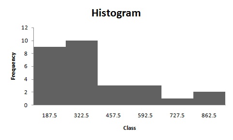
Histogram:

Software procedure:

Step-by-step procedure to construct the histogram by using EXCEL is given below:

  • Enter the data in column A of new worksheet, one number per cell.
  • Enter the boundaries in column B.
  • From the toolbar, select the Data tab, the select data analysis.
  • In data analysis, select HISTOGRAM and click ok.
  • In HISTOGRAM dialog box, type A1:A6 in the input range.
  • Click ok and histogram shown below,

The shape of the distribution is positive skewed.

Frequency polygon:

Software procedure:

Step-by-step procedure to construct the histogram by using EXCEL is given below:

  • Enter midpoint and frequency in column A and column B respectively.
  • Select the insert tab from the toolbar and line chart option.
  • Select 2-D line chart.
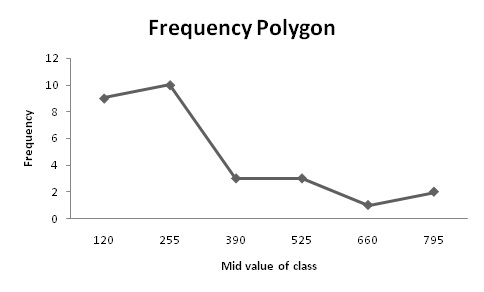
  • Frequency polygon shown below,

The frequency polygon shows that distribution is positively skewed.

Ogive:

Software procedure:

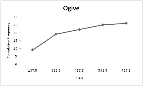
  • Enter upper class boundaries and cumulative frequency in column A and column B respectively.
  • Select the insert tab from the toolbar and line chart option.
  • Select 2-D line chart.

Therefore, from the ogive it can say that distribution is increasing in trend.

Want to see more full solutions like this?

Subscribe now to access step-by-step solutions to millions of textbook problems written by subject matter experts!

Chapter 2 Solutions

Elementary Statistics: A Step By Step Approach

Ch. 2.1 - For Exercises 912, show frequency distributions...Ch. 2.1 - For Exercises 912, show frequency distributions...Ch. 2.1 - For Exercises 912, show frequency distributions...Ch. 2.1 - Favorite Coffee Flavor A survey was taken asking...Ch. 2.1 - Trust in Internet Information A survey was taken...Ch. 2.1 - Eating at Fast Food Restaurants A survey was taken...Ch. 2.1 - Ages of Dogs The ages of 20 dogs in a pet shelter...Ch. 2.1 - Maximum Wind Speeds The data show the maximum wind...Ch. 2.1 - Stories in the Worlds Tallest Buildings The number...Ch. 2.1 - Ages of Declaration of Independence Signers The...Ch. 2.1 - Salaries of Governors Here are the salaries (in...Ch. 2.1 - Charity Donations A random sample of 30 large...Ch. 2.1 - Unclaimed Expired Prizes The number of unclaimed...Ch. 2.1 - Scores in the Rose Bowl The data show the scores...Ch. 2.1 - Consumption of Natural Gas Construct a frequency...Ch. 2.1 - Average Wind Speeds A sample of 40 large cities...Ch. 2.1 - Percentage of People Who Completed 4 or More Years...Ch. 2.1 - JFK Assassination A researcher conducted a survey...Ch. 2.1 - The Value of Pi The ratio of the circumference of...Ch. 2.2 - Selling Real Estate Assume you are a realtor in...Ch. 2.2 - Do Students Need Summer Development? For 108...Ch. 2.2 - Bear Kills The number of bears killed in 2014 for...Ch. 2.2 - Pupils Per Teacher The average number of pupils...Ch. 2.2 - Number of College Faculty The number of faculty...Ch. 2.2 - Railroad Crossing Accidents The data show the...Ch. 2.2 - NFL Salaries The salaries (in millions of dollars)...Ch. 2.2 - Suspension Bridges Spans The following frequency...Ch. 2.2 - Costs of Utilities The frequency distribution...Ch. 2.2 - Air Pollution One of the air pollutants that is...Ch. 2.2 - Making the Grade The frequency distributions shown...Ch. 2.2 - Blood Glucose Levels The frequency distribution...Ch. 2.2 - Waiting Times The frequency distribution shows the...Ch. 2.2 - Construct a histogram, frequency polygon, and...Ch. 2.2 - Construct a histogram, frequency polygon, and...Ch. 2.2 - Construct a histogram, frequency polygon, and...Ch. 2.2 - Construct a histogram, frequency polygon, and...Ch. 2.2 - Home Runs The data show the most number of home...Ch. 2.2 - Protein Grams in Fast Food The amount of protein...Ch. 2.2 - Using the histogram shown here, do the following....Ch. 2.2 - Using the results from Exercise 19. answer these...Ch. 2.2 - Math SAT Scores Shown is an ogive depicting the...Ch. 2.3 - Applying the Concepts 23 Causes of Accidental...Ch. 2.3 - Tech Company Employees Construct a vertical and...Ch. 2.3 - Worldwide Sales of Fast Foods The worldwide sales...Ch. 2.3 - Gulf Coastlines Construct a Pareto chart for the...Ch. 2.3 - Roller Coaster Mania The World Roller Coaster...Ch. 2.3 - Online Ad Spending The amount spent (in billions...Ch. 2.3 - Violent Crimes The number of all violent crimes...Ch. 2.3 - U.S. Licensed Drivers 70 or Older Draw a time...Ch. 2.3 - Valentines Day Spending The data show the average...Ch. 2.3 - Credit Cards Draw and analyze a pie graph for the...Ch. 2.3 - Reasons We Travel The following data are based on...Ch. 2.3 - Kids and Guns The following data show where...Ch. 2.3 - Colors of Automobiles The popular car colors are...Ch. 2.3 - Ages of Football Players The data show the ages of...Ch. 2.3 - Teacher Strikes In Pennsylvania the numbers of...Ch. 2.3 - Years of Experience The data show the number of...Ch. 2.3 - Commuting Times Fifty off-campus students were...Ch. 2.3 - Home Run Club There are 43 Major League baseball...Ch. 2.3 - Calories in Salad Dressings A listing of calories...Ch. 2.3 - Length of Major Rivers The data show the lengths...Ch. 2.3 - Math and Reading Achievement Scores The math and...Ch. 2.3 - State which type of graph (Pareto chart, time...Ch. 2.3 - State which graph (Pareto chart, time series...Ch. 2.3 - U.S. Health Dollar The U.S. health dollar is spent...Ch. 2.3 - Prob. 24ECh. 2.3 - Cost of Milk The graph shows the increase in the...Ch. 2.3 - U.S. Population by Age The following information...Ch. 2.3 - Chicago Homicides Draw and compare two time series...Ch. 2.3 - Trip Reimbursements The average amount requested...Ch. 2 - How People Get Their News The Brunswick Research...Ch. 2 - Mens World Hockey Champions The United States won...Ch. 2 - BUN Count The blood urea nitrogen (BUN) count of...Ch. 2 - Wind Speed The data show the average wind speed...Ch. 2 - Waterfall Heights The data show the heights (in...Ch. 2 - Ages of the Vice Presidents at the Time of Their...Ch. 2 - Find the relative frequency for the frequency...Ch. 2 - Find the relative frequency for the frequency...Ch. 2 - Construct a histogram, frequency polygon, and...Ch. 2 - Construct a histogram, frequency polygon, and...Ch. 2 - Construct a histogram, frequency polygon, and...Ch. 2 - Construct a histogram, frequency polygon, and...Ch. 2 - Non-Alcoholic Beverages The data show the yearly...Ch. 2 - Calories of Nuts The data show the number of...Ch. 2 - Crime The data show the percentage of the types of...Ch. 2 - AID: 1825 | 31/5/2018 16. Pet Care The data (in...Ch. 2 - Broadway Stage Engagements The data show the...Ch. 2 - High School Dropout Rate The data show the high...Ch. 2 - Prob. 2.3.19RECh. 2 - Smart Phone Insurance Construct and analyze a pie...Ch. 2 - Prob. 2.3.21RECh. 2 - Prob. 2.3.22RECh. 2 - Weights of Football Players A local football team...Ch. 2 - Public Libraries The numbers of public libraries...Ch. 2 - Pain Relief The graph below shows the time it...Ch. 2 - Casino Payoffs The graph shows the payoffs...Ch. 2 - From the Data Bank located in Appendix B, choose...Ch. 2 - Prob. 2DACh. 2 - From the Data Bank, select at least 30 subjects...Ch. 2 - Prob. 4DACh. 2 - Using the data from Data Set XI in Appendix B,...Ch. 2 - Prob. 7DACh. 2 - Determine whether each statement is true or false....Ch. 2 - Prob. 2CQCh. 2 - Prob. 3CQCh. 2 - Frequency distributions can aid the researcher in...Ch. 2 - Determine whether each statement is true or false....Ch. 2 - Prob. 6CQCh. 2 - Determine whether each statement is true or false....Ch. 2 - Prob. 8CQCh. 2 - What are the boundaries for 8.68.8? a. 89 b....Ch. 2 - What graph should be used to show the relationship...Ch. 2 - Prob. 11CQCh. 2 - The three types of frequency distributions are...Ch. 2 - In a frequency distribution, the number of classes...Ch. 2 - Prob. 14CQCh. 2 - Data collected over a period of time can be...Ch. 2 - A statistical device used in exploratory data...Ch. 2 - On a Pareto chart, the frequencies should be...Ch. 2 - Housing Arrangements A questionnaire on housing...Ch. 2 - Housing Arrangements A questionnaire on housing...Ch. 2 - Prob. 20CQCh. 2 - Construct a histogram, a frequency polygon, and an...Ch. 2 - Coal Consumption The following data represent the...Ch. 2 - Construct a histogram, frequency polygon, and...Ch. 2 - Recycled Trash Construct a Pareto chart and a...Ch. 2 - Identity Thefts The results of a survey of 84...Ch. 2 - Needless Deaths of Children The New England...Ch. 2 - Prob. 27CQCh. 2 - Parking Meter Revenue In a small city the number...Ch. 2 - Prob. 29CQCh. 2 - The Great Lakes Shown are various statistics about...Ch. 2 - Teacher Strikes In Pennsylvania there were more...
Knowledge Booster
Background pattern image
Statistics
Learn more about
Need a deep-dive on the concept behind this application? Look no further. Learn more about this topic, statistics and related others by exploring similar questions and additional content below.
Recommended textbooks for you
Text book image
Holt Mcdougal Larson Pre-algebra: Student Edition...
Algebra
ISBN:9780547587776
Author:HOLT MCDOUGAL
Publisher:HOLT MCDOUGAL
Text book image
Glencoe Algebra 1, Student Edition, 9780079039897...
Algebra
ISBN:9780079039897
Author:Carter
Publisher:McGraw Hill
Text book image
Big Ideas Math A Bridge To Success Algebra 1: Stu...
Algebra
ISBN:9781680331141
Author:HOUGHTON MIFFLIN HARCOURT
Publisher:Houghton Mifflin Harcourt
The Shape of Data: Distributions: Crash Course Statistics #7; Author: CrashCourse;https://www.youtube.com/watch?v=bPFNxD3Yg6U;License: Standard YouTube License, CC-BY
Shape, Center, and Spread - Module 20.2 (Part 1); Author: Mrmathblog;https://www.youtube.com/watch?v=COaid7O_Gag;License: Standard YouTube License, CC-BY
Shape, Center and Spread; Author: Emily Murdock;https://www.youtube.com/watch?v=_YyW0DSCzpM;License: Standard Youtube License