Videos
(a)
To graph: A stem-and-leaf plot for the data of the age distribution.
(a)
Explanation of Solution
The data shows the ages of 50 drivers arrested while driver under the influence of alcohol.
Graph: To construct stem-and-leaf plot by using the Minitab, the steps are as follows:
Step 1: Enter the data in C1.
Step 2: Go to Graph > Stem-and-Leaf plot and select ‘C1’ in Graph variable.
Step 3: Click on OK.
The Stem-and-Leaf plot for these data is obtained as:
| Stem-and-leaf of the age distribution N = 50 | ||
| 1 | 6 8 | |
| 2 | 0 1 1 2 2 2 3 4 4 5 6 6 6 7 7 7 9 | |
| 3 | 0 0 1 1 2 3 4 4 5 5 6 7 8 9 | |
| 4 | 0 0 1 3 5 6 7 7 9 9 | |
| 5 | 1 3 5 6 8 | |
| 6 | 3 4 | |
(b)
To find: The frequency table for the data..
(b)
Answer to Problem 8CR
Solution: The complete frequency table is as:
| Class Limits | Class boundaries | Midpoints | Frequency | Relative Frequency | Cumulative Frequency |
| 16-22 | 15.5-22.5 | 19 | 8 | 0.16 | 8 |
| 23-29 | 22.5-29.5 | 26 | 11 | 0.22 | 19 |
| 30-36 | 29.5-36.5 | 33 | 11 | 0.22 | 30 |
| 37-43 | 36.5-43.5 | 40 | 7 | 0.14 | 37 |
| 44-50 | 43.5-50.5 | 47 | 6 | 0.12 | 43 |
| 51-57 | 50.5-57.5 | 54 | 4 | 0.08 | 47 |
| 58-64 | 57.5-64.5 | 61 | 3 | 0.06 | 50 |
Explanation of Solution
Calculation: To find the class width for the whole data of 50 values, it is observed that largest value of the data set is 64 and the smallest value is 16 in the data. Using 7 classes, the class width calculated in the following way:
The value is round up to the nearest whole number. Hence, the class width of the data set is 7. The class width for the data is 7 and the lowest data value (16) will be the lower class limit of the first class. Because the class width is 7, it must add 7 to the lowest class limit in the first class to find the lowest class limit in the second class. There are 7 desired classes. Hence, the class limits are 16-22, 23-29, 30-36, 37-43, 44-50, 51-57, and 58-64. Now, to find the class boundaries subtract 0.5 from lower limit of every class and add 0.5 to the upper limit of the every class interval. Hence, the class boundaries are 15.5-22.5, 22.5-29.5, 29.5-36.5, 36.5-43.5, 43.5-50.5, 50.5-57.5, and 57.5-64.5.
Next to find the midpoint of the class is calculated by using formula,
Midpoint of first class is calculated as:
The frequencies for respective classes are 8, 11, 11, 7, 6, 4 and 3.
Relative frequency is calculated by using the formula,
The frequency for 1st class is 8 and total frequencies are 50 so the relative frequency is
The calculated frequency table is as follows:
| Class limits | Class boundaries | midpoints | Frequency | Relative Frequency | Cumulative Frequency |
| 16-22 | 15.5-22.5 | 19 | 8 | 0.16 | 8 |
| 23-29 | 22.5-29.5 | 26 | 11 | 0.22 | |
| 30-36 | 29.5-36.5 | 33 | 11 | 0.22 | |
| 37-43 | 36.5-43.5 | 40 | 7 | 0.14 | |
| 44-50 | 43.5-50.5 | 47 | 6 | 0.12 | |
| 51-57 | 50.5-57.5 | 54 | 4 | 0.08 | |
| 58-64 | 57.5-64.5 | 61 | 3 | 0.06 |
Interpretation: Hence, the complete frequency table is as:
| Class limits | Class boundaries | Midpoints | Frequency | Relative Frequency | Cumulative Frequency |
| 16-22 | 15.5-22.5 | 19 | 8 | 0.16 | 8 |
| 23-29 | 22.5-29.5 | 26 | 11 | 0.22 | |
| 30-36 | 29.5-36.5 | 33 | 11 | 0.22 | |
| 37-43 | 36.5-43.5 | 40 | 7 | 0.14 | |
| 44-50 | 43.5-50.5 | 47 | 6 | 0.12 | |
| 51-57 | 50.5-57.5 | 54 | 4 | 0.08 | |
| 58-64 | 57.5-64.5 | 61 | 3 | 0.06 |
(c)
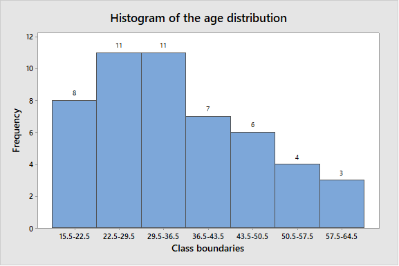
To graph: A histogram for the data of the age distribution.
(c)
Explanation of Solution
The data shows the ages of 50 drivers arrested while driver under the influence of alcohol.
Graph: To construct the histogram by using the MINITAB, the steps are as follows:
Step 1: Enter the class boundaries in C1 and frequency in C2.
Step 2: Go to Graph > Histogram > Simple.
Step 3: Enter C1 in Graph variable then go to Data options > Frequency > C2.
Step 4: Click on OK.
The obtained histogram is
(d)
The shape of the histogram of age distribution..
(d)
Answer to Problem 8CR
Solution: The shape of histogram of age distribution is skewed to the right.
Explanation of Solution
A right-skewed distribution has a long right tail. Right-skewed distributions are also called positive-skew distributions. That’s because there is a long tail in the positive direction on the number line.
From above histogram, there are two class boundaries (22.5-29.5 and 29.5-36) have higher frequencies 11 on left side and most of the data values fall on the left side of the graph. The data to lean towards right side of the graph and also there is tail on right side.
Hence, the shape of histogram of age distribution is skewed to the right.
Want to see more full solutions like this?
Chapter 2 Solutions
Understanding Basic Statistics


 Glencoe Algebra 1, Student Edition, 9780079039897...AlgebraISBN:9780079039897Author:CarterPublisher:McGraw Hill