Elementary Statistics: A Step By Step Approach
10th Edition
ISBN: 9781259755330
Author: Allan G. Bluman
Publisher: McGraw-Hill Education
bartleby

Videos

Textbook Question
Book Icon
Chapter 2.2, Problem 4E

Number of College Faculty The number of faculty listed for a sample of private colleges that offer only bachelor’s degrees is listed below. Use these data to construct a frequency distribution with 7 classes, a histogram, a frequency polygon, and an ogive. Discuss the shape of this distribution. What proportion of schools have 180 or more faculty?

Chapter 2.2, Problem 4E, Number of College Faculty The number of faculty listed for a sample of private colleges that offer

Expert Solution & Answer
Check Mark
To determine

A grouped frequency distribution with 7 classes and draw a histogram, frequency polygon, and ogive; the explanation of these shapes and calculate the proportions of schools that have 180 or more faculty.

Answer to Problem 4E

Output using EXCEL software is given below:

Histogram:

Elementary Statistics: A Step By Step Approach, Chapter 2.2, Problem 4E , additional homework tip  1

Frequency polygon:

Elementary Statistics: A Step By Step Approach, Chapter 2.2, Problem 4E , additional homework tip  2

Ogive:

Elementary Statistics: A Step By Step Approach, Chapter 2.2, Problem 4E , additional homework tip  3

The proportion of schools that has 180 or more faculty is 0.448.

Explanation of Solution

Given info:

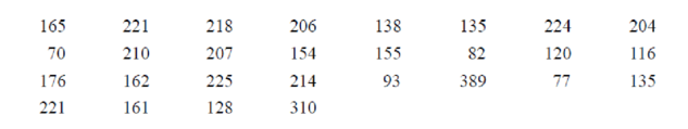
The data shows the number of college faculty listed in the table is given below:

165 221 218 206 138 135 224 204
70 210 207 154 155 82 120 116
176 162 225 214 93 389 77 135
221 161 128 310

Calculation:

The class boundaries for any class are given by:

Upperclassboundary=Upperclasslimit+d2Lowerclassboundary=Lowerclasslimit-d2

Where, d is the gap between the upper limit of any class and the lower limit of the succeeding class.

The grouped frequency distribution is as follows:

Class limit Class boundaries Tally Frequency
70-115 69.5-115.5 |||| 4
116-161 115.5-161.5 |||||||| 9
162-207 161.5-207.5 ||| 3
208-253 207.5-253.5 |||||||| 10
254-299 253.5-299.5 0
300-345 299.5-345.5 | 1
346-391 345.5-391.5 | 1
Total 28

The midpoint of class boundaries is obtained by adding lower and upper limit and dividing by 2.

The relative frequency is the ration of a class frequency to the total frequency. Cumulative relative frequency can also defined as the sum of all previous frequencies up to the current point.
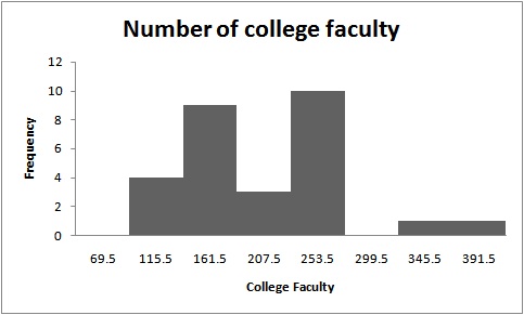
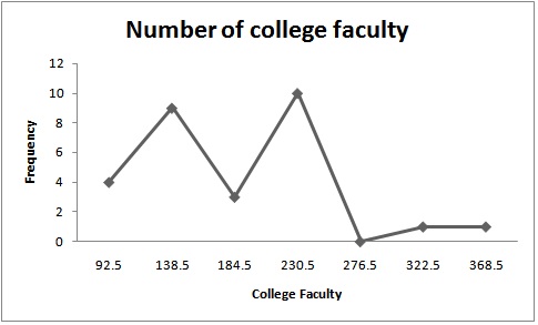
Class boundaries Mid point Frequency Cumulative frequency
69.5-115.5 92.5 4 4
115.5-161.5 138.5 9 13
161.5-207.5 184.5 3 16
207.5-253.5 230.5 10 26
253.5-299.5 276.5 0 26
299.5-345.5 322.5 1 27
345.5-391.5 368.5 1 28

The histogram is a graph that displays the data by using contiguous vertical bars of various heights to represent the frequencies of the classes.

Upper Limit Frequency
69.5 0
115.5 4
161.5 9
207.5 3
253.5 10
299.5 0
345.5 1
391.5 1

Histogram:

Software procedure:

Step-by-step procedure to construct the histogram using EXCEL software is given below:

  • Press [Ctrl]-N for a new workbook.
  • Enter the data in column A, one number per cell.
  • Enter the upper boundaries into column B.
  • From the toolbar, select the Data tab, then select Data Analysis.
  • In Data Analysis, select Histogram and click [OK].
  • In the Histogram dialog box, select relative column in the Input Range box and select upper limit column in the Bin Range box.
  • Select New Worksheet Ply and Chart Output. Click [OK].

The distribution is slightly symmetric as the histogram shows that majority of the data value fall around the mean of the data. And the frequency is maximum at 253.5 and minimum at 391.5.

Frequency polygon:

Software procedure:

Frequency polygons are a graphical device for understanding the shapes of distributions. They serve the same purpose as histograms, but are especially helpful for comparing sets of data.

Step-by-step procedure to construct the frequency polygon using EXCEL software is given below:

  • Press [CTRL]-N for a new notebook.
  • Enter the midpoints of the data into column A and the frequencies into column B including labels.
  • Press and hold the left mouse button, and drag over the Frequencies (including the label) from column B.
  • Select the Insert tab from the toolbar and the Line Chart option.
  • Select the 2-D line chart type.
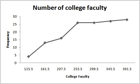
Ogive:

Software procedure:

Step-by-step procedure to construct the ogive using EXCEL software is given below:

  • Create an ogive, use the upper class boundaries (horizontal axis) and cumulative frequencies (vertical axis) from the frequency distribution.
  • Type the upper class boundaries (including a class with frequency 0 before the lowest class to anchor the graph to the horizontal axis) and
  • Corresponding cumulative frequencies into adjacent columns of an Excel worksheet.
  • Press and hold the left mouse button, and drag over the Cumulative Frequencies from column B.
  • Select Line Chart, then the 2-D Line option.

The points plotted are the upper class limit and the corresponding cumulative frequency.

The observations are based on number of faculty is greater or equal to 180 given as:

224 204 210 207 225 214 389 221 310

The sum of the above observations is 2204.

The total observations for number of college faculty are given as:

165 221 218 206 138 135 224 204
70 210 207 154 155 82 120 116
176 162 225 214 93 389 77 135
221 161 128 310

The sum of all above observations is 4916.

The proportion is calculated by dividing 2204 with 4916, that is,

Proportion=22044916=0.448

The value 0.448 is the proportion of schools that has 180 or more faculty

Want to see more full solutions like this?

Subscribe now to access step-by-step solutions to millions of textbook problems written by subject matter experts!

Chapter 2 Solutions

Elementary Statistics: A Step By Step Approach

Ch. 2.1 - For Exercises 912, show frequency distributions...Ch. 2.1 - For Exercises 912, show frequency distributions...Ch. 2.1 - For Exercises 912, show frequency distributions...Ch. 2.1 - Favorite Coffee Flavor A survey was taken asking...Ch. 2.1 - Trust in Internet Information A survey was taken...Ch. 2.1 - Eating at Fast Food Restaurants A survey was taken...Ch. 2.1 - Ages of Dogs The ages of 20 dogs in a pet shelter...Ch. 2.1 - Maximum Wind Speeds The data show the maximum wind...Ch. 2.1 - Stories in the Worlds Tallest Buildings The number...Ch. 2.1 - Ages of Declaration of Independence Signers The...Ch. 2.1 - Salaries of Governors Here are the salaries (in...Ch. 2.1 - Charity Donations A random sample of 30 large...Ch. 2.1 - Unclaimed Expired Prizes The number of unclaimed...Ch. 2.1 - Scores in the Rose Bowl The data show the scores...Ch. 2.1 - Consumption of Natural Gas Construct a frequency...Ch. 2.1 - Average Wind Speeds A sample of 40 large cities...Ch. 2.1 - Percentage of People Who Completed 4 or More Years...Ch. 2.1 - JFK Assassination A researcher conducted a survey...Ch. 2.1 - The Value of Pi The ratio of the circumference of...Ch. 2.2 - Selling Real Estate Assume you are a realtor in...Ch. 2.2 - Do Students Need Summer Development? For 108...Ch. 2.2 - Bear Kills The number of bears killed in 2014 for...Ch. 2.2 - Pupils Per Teacher The average number of pupils...Ch. 2.2 - Number of College Faculty The number of faculty...Ch. 2.2 - Railroad Crossing Accidents The data show the...Ch. 2.2 - NFL Salaries The salaries (in millions of dollars)...Ch. 2.2 - Suspension Bridges Spans The following frequency...Ch. 2.2 - Costs of Utilities The frequency distribution...Ch. 2.2 - Air Pollution One of the air pollutants that is...Ch. 2.2 - Making the Grade The frequency distributions shown...Ch. 2.2 - Blood Glucose Levels The frequency distribution...Ch. 2.2 - Waiting Times The frequency distribution shows the...Ch. 2.2 - Construct a histogram, frequency polygon, and...Ch. 2.2 - Construct a histogram, frequency polygon, and...Ch. 2.2 - Construct a histogram, frequency polygon, and...Ch. 2.2 - Construct a histogram, frequency polygon, and...Ch. 2.2 - Home Runs The data show the most number of home...Ch. 2.2 - Protein Grams in Fast Food The amount of protein...Ch. 2.2 - Using the histogram shown here, do the following....Ch. 2.2 - Using the results from Exercise 19. answer these...Ch. 2.2 - Math SAT Scores Shown is an ogive depicting the...Ch. 2.3 - Applying the Concepts 23 Causes of Accidental...Ch. 2.3 - Tech Company Employees Construct a vertical and...Ch. 2.3 - Worldwide Sales of Fast Foods The worldwide sales...Ch. 2.3 - Gulf Coastlines Construct a Pareto chart for the...Ch. 2.3 - Roller Coaster Mania The World Roller Coaster...Ch. 2.3 - Online Ad Spending The amount spent (in billions...Ch. 2.3 - Violent Crimes The number of all violent crimes...Ch. 2.3 - U.S. Licensed Drivers 70 or Older Draw a time...Ch. 2.3 - Valentines Day Spending The data show the average...Ch. 2.3 - Credit Cards Draw and analyze a pie graph for the...Ch. 2.3 - Reasons We Travel The following data are based on...Ch. 2.3 - Kids and Guns The following data show where...Ch. 2.3 - Colors of Automobiles The popular car colors are...Ch. 2.3 - Ages of Football Players The data show the ages of...Ch. 2.3 - Teacher Strikes In Pennsylvania the numbers of...Ch. 2.3 - Years of Experience The data show the number of...Ch. 2.3 - Commuting Times Fifty off-campus students were...Ch. 2.3 - Home Run Club There are 43 Major League baseball...Ch. 2.3 - Calories in Salad Dressings A listing of calories...Ch. 2.3 - Length of Major Rivers The data show the lengths...Ch. 2.3 - Math and Reading Achievement Scores The math and...Ch. 2.3 - State which type of graph (Pareto chart, time...Ch. 2.3 - State which graph (Pareto chart, time series...Ch. 2.3 - U.S. Health Dollar The U.S. health dollar is spent...Ch. 2.3 - Prob. 24ECh. 2.3 - Cost of Milk The graph shows the increase in the...Ch. 2.3 - U.S. Population by Age The following information...Ch. 2.3 - Chicago Homicides Draw and compare two time series...Ch. 2.3 - Trip Reimbursements The average amount requested...Ch. 2 - How People Get Their News The Brunswick Research...Ch. 2 - Mens World Hockey Champions The United States won...Ch. 2 - BUN Count The blood urea nitrogen (BUN) count of...Ch. 2 - Wind Speed The data show the average wind speed...Ch. 2 - Waterfall Heights The data show the heights (in...Ch. 2 - Ages of the Vice Presidents at the Time of Their...Ch. 2 - Find the relative frequency for the frequency...Ch. 2 - Find the relative frequency for the frequency...Ch. 2 - Construct a histogram, frequency polygon, and...Ch. 2 - Construct a histogram, frequency polygon, and...Ch. 2 - Construct a histogram, frequency polygon, and...Ch. 2 - Construct a histogram, frequency polygon, and...Ch. 2 - Non-Alcoholic Beverages The data show the yearly...Ch. 2 - Calories of Nuts The data show the number of...Ch. 2 - Crime The data show the percentage of the types of...Ch. 2 - AID: 1825 | 31/5/2018 16. Pet Care The data (in...Ch. 2 - Broadway Stage Engagements The data show the...Ch. 2 - High School Dropout Rate The data show the high...Ch. 2 - Prob. 2.3.19RECh. 2 - Smart Phone Insurance Construct and analyze a pie...Ch. 2 - Prob. 2.3.21RECh. 2 - Prob. 2.3.22RECh. 2 - Weights of Football Players A local football team...Ch. 2 - Public Libraries The numbers of public libraries...Ch. 2 - Pain Relief The graph below shows the time it...Ch. 2 - Casino Payoffs The graph shows the payoffs...Ch. 2 - From the Data Bank located in Appendix B, choose...Ch. 2 - Prob. 2DACh. 2 - From the Data Bank, select at least 30 subjects...Ch. 2 - Prob. 4DACh. 2 - Using the data from Data Set XI in Appendix B,...Ch. 2 - Prob. 7DACh. 2 - Determine whether each statement is true or false....Ch. 2 - Prob. 2CQCh. 2 - Prob. 3CQCh. 2 - Frequency distributions can aid the researcher in...Ch. 2 - Determine whether each statement is true or false....Ch. 2 - Prob. 6CQCh. 2 - Determine whether each statement is true or false....Ch. 2 - Prob. 8CQCh. 2 - What are the boundaries for 8.68.8? a. 89 b....Ch. 2 - What graph should be used to show the relationship...Ch. 2 - Prob. 11CQCh. 2 - The three types of frequency distributions are...Ch. 2 - In a frequency distribution, the number of classes...Ch. 2 - Prob. 14CQCh. 2 - Data collected over a period of time can be...Ch. 2 - A statistical device used in exploratory data...Ch. 2 - On a Pareto chart, the frequencies should be...Ch. 2 - Housing Arrangements A questionnaire on housing...Ch. 2 - Housing Arrangements A questionnaire on housing...Ch. 2 - Prob. 20CQCh. 2 - Construct a histogram, a frequency polygon, and an...Ch. 2 - Coal Consumption The following data represent the...Ch. 2 - Construct a histogram, frequency polygon, and...Ch. 2 - Recycled Trash Construct a Pareto chart and a...Ch. 2 - Identity Thefts The results of a survey of 84...Ch. 2 - Needless Deaths of Children The New England...Ch. 2 - Prob. 27CQCh. 2 - Parking Meter Revenue In a small city the number...Ch. 2 - Prob. 29CQCh. 2 - The Great Lakes Shown are various statistics about...Ch. 2 - Teacher Strikes In Pennsylvania there were more...
Knowledge Booster
Background pattern image
Statistics
Learn more about
Need a deep-dive on the concept behind this application? Look no further. Learn more about this topic, statistics and related others by exploring similar questions and additional content below.
Recommended textbooks for you
Text book image
Glencoe Algebra 1, Student Edition, 9780079039897...
Algebra
ISBN:9780079039897
Author:Carter
Publisher:McGraw Hill
Text book image
Holt Mcdougal Larson Pre-algebra: Student Edition...
Algebra
ISBN:9780547587776
Author:HOLT MCDOUGAL
Publisher:HOLT MCDOUGAL
How to make Frequency Distribution Table / Tally Marks and Frequency Distribution Table; Author: Reenu Math;https://www.youtube.com/watch?v=i_A6RiE8tLE;License: Standard YouTube License, CC-BY
Frequency distribution table in statistics; Author: Math and Science;https://www.youtube.com/watch?v=T7KYO76DoOE;License: Standard YouTube License, CC-BY
Frequency Distribution Table for Grouped/Continuous data | Math Dot Com; Author: Maths dotcom;https://www.youtube.com/watch?v=ErnccbXQOPY;License: Standard Youtube License