
Derivation of the market demand curve and its diagrammatic representation.
Explanation of Solution
The market demand curve can be derived by adding each individual’s quantity demand at a different
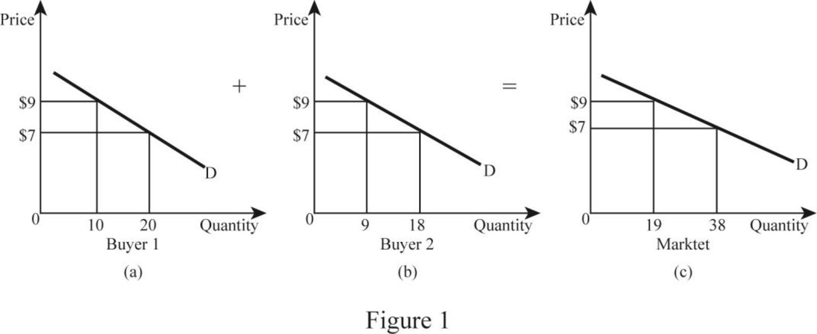
In Figure 1, both panels (a) and (b) indicate the individual demand curve of Buyer 1 and Buyer 2, respectively, where the horizontal axis represents quantity demanded and the vertical axis represents the price of the good. In the figure, Buyer 1 demanded 10 units and Buyer 2 demanded 9 units at $9. Therefore, the total quantity demanded at $9 is 19 units. Similarly, Buyer 1 demanded 20 units and Buyer 2 demanded 18 units at $7. Hence, the total quantity demanded at $7 is 38 units. In Panel (c), the vertical axis represents the total quantity demanded in the market and the vertical axis represents price. By plotting each individual’s quantity demand at different prices creates a market demand curve.
Demand curve: A demand curve shows the level of quantity demanded at different price levels. Since there is a negative relationship between the price and the quantity, the demand curve slopes downward.
Want to see more full solutions like this?
Chapter 3 Solutions
ECONOMICS-APLIA ACCESS (2 TERMS)


 Economics (MindTap Course List)EconomicsISBN:9781337617383Author:Roger A. ArnoldPublisher:Cengage Learning