
Videos
On average, every minute of every day, 158 babies are born. The bar graph represents the results of a single day of births, deaths, and population increase worldwide. Exercises 25-26 are based on the information displayed by the graph.
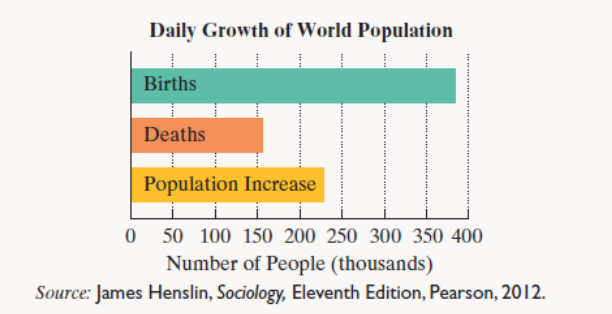
Each day, the number of births in the world exceeds twice the number of deaths by 72 thousand.
a. If the population increase in a single day is 228 thousand, determine the number of birth and deaths per day.
b. If the population increase in a single day is 228 thousand, by how many millions of people does the worldwide population increase each year? Round to the nearest million.
c. Based on your answer to part (b), approximately how many years does it take for the population of the world to increase by an amount greater than the entire U.S. population (315 million)?
Want to see the full answer?
Check out a sample textbook solution
Chapter 6 Solutions
Thinking Mathematically (7th Edition)
Additional Math Textbook Solutions
A Survey of Mathematics with Applications (10th Edition) - Standalone book
Mathematics with Applications In the Management, Natural and Social Sciences (11th Edition)
Finite Mathematics for Business, Economics, Life Sciences and Social Sciences
Mathematical Methods in the Physical Sciences
Mathematics for the Trades: A Guided Approach (10th Edition) - Standalone book
A Problem Solving Approach to Mathematics for Elementary School Teachers (12th Edition)


- On average every minute everyday, 129 bables are born. The bar graph represent single day of births, deaths, and population increase worldwide. Each day, the number of births in the word is 150 thousand less than three times the number of deaths. Complete parts (a) through (c). If the population increase in a single day is 186 thousand, determine the number of births and deaths per day.arrow_forwarda. If the cutout length increases from 0.8 to 2.3 inches, what is the change in the box's volume? (You may use your graphing calculator.) b. If the cutout length increases from 2.3 to 4 inches, what is the change in the box's volume?arrow_forwardA research study recorded the out-of-state tuition fees for a sample of public and for-profit colleges in the United States, and the results can be downloaded from the data file Tuition. Summarize this data by creating histograms with StatKey, and submit your graph as a PDF. When creating your graphs, please make sure the number of buckets is set to 10.arrow_forward
- Full time year around median salary for u.s men in 2010 was 41,300 and the full time year round salary for u.s women in 2010 was 34,000 The full time year round median salary for u.s men in 2010 was ___% of the full time year round median salary for u.s women in 2010arrow_forwardThe bar graph shows average yearly earnings in the United States byhighest educational attainment.The average yearly salary of a man with a bachelor’s degree exceeds that of a man with an associate’s degree by $25 thousand. The average yearly salary of a man with a master’s degree exceeds that of a man with an associate’s degree by $45 thousand. Combined, three men with each of these degrees earn $214 thousand. Find the average yearly salary of men with each of these levels of education.arrow_forwardThe figure below shows total costs for three gym memberships. Which is the most accurate statement? ***SEE CHART*** Of the 3 memberships, Monthly is cheapest for under 5 months, while Standard is cheapest for over 10 months. Platinum is costliest for any duration Monthly is cheapest for any duration except for 5-10 months Standard is cheapest for a duration between 5-10 months; other plans are cheaper for shorter or longer durations.arrow_forward
- If there was a baby boom of Oompa Loompas ready to work for free, what will happen to the Willy Wonka chocolate market? A few things to think about: Has this affected supply or demand of Willy Wonka Chocolate? What has happened to the price of Willy Wonka chocolate? Please justify your answer by graphing the change in either supply or demand, as well as the change in price.arrow_forward(Looking at the graph, we can see that the blue line, representing the population proportion in the USA, is consistently increasing over time and eventually reaches a value of around 0.33 (33%) after 100 years. In contrast, the green line, representing the population proportion in China, is decreasing over time and eventually reaches a value of around 0.67 (67%) after 100 years. The red line, representing the population proportion in Canada, remains relatively constant over time and has the lowest value among the three countries) By year 100, the USA has the highest proportion of the population, followed by China and Canada. Does my analysis correct ?arrow_forwardThe city counsel has just voted to pass the city's budget for next year. If you were writing a report describing the budget so the citizens could understand how the total tax dollars will be spent, which of the following graphs might be most appropriate? A) Ogive B) Scatter diagram C) Pie chart D) Histogramarrow_forward
- It is requiring a graph written response!arrow_forwardThe bar graph shows the estimated number of calories per day needed to maintain energy balance for various gender and age groups for moderately active lifestyles.The mathematical modelW = -66x2 + 526x + 1030describes the number of calories needed per day, W, by women in age group x with moderately active lifestyles. According to the model, how many calories per day are needed by women between the ages of 19 and 30, inclusive, with this lifestyle? Does this underestimate or overestimate the number shown by the graph? By how much?arrow_forwardThe table and graph are background informationarrow_forward
 Algebra: Structure And Method, Book 1AlgebraISBN:9780395977224Author:Richard G. Brown, Mary P. Dolciani, Robert H. Sorgenfrey, William L. ColePublisher:McDougal Littell
 Holt Mcdougal Larson Pre-algebra: Student Edition...AlgebraISBN:9780547587776Author:HOLT MCDOUGALPublisher:HOLT MCDOUGAL