
Concept explainers
Videos
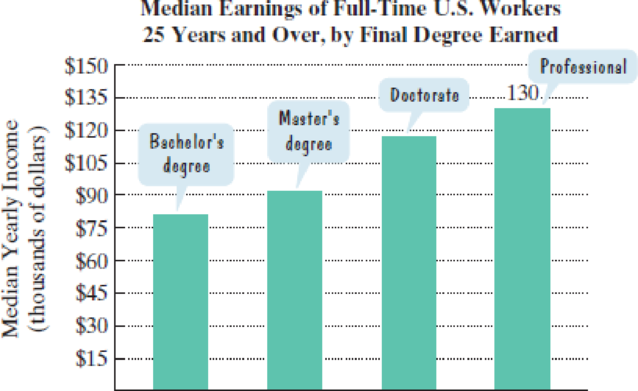
The bar graph shows median yearly earnings of full-time workers in the United States for people 25 years and over with a college education, by final degree earned. Exercises 3–4 are based on the data displayed by the graph.
Source: U.S. Census Bureau
(Exercises 3–4 are based on the graph at the bottom-right of the previous page.)
4. The median yearly salary of an American whose final degree is a doctorate is $45 thousand less than twice that of an American whose final degree is a bachelor’s. Combined, two people with each of these educational attainments earn $198 thousand. Find the median yearly salary of Americans with each of these final degrees.
Want to see the full answer?
Check out a sample textbook solution
Chapter 1 Solutions
MyLab Math with Pearson eText -- Standalone Access Card -- for College Algebra Essentials (5th Edition) (Cisco Top Score (NRP))


- A study is planned to compare the proportion of teenagers (ages 13–19) who dislike anchovies with the proportion of young adults (ages 20–30) who dislike anchovies. A random sample of 41 teenagers was taken, and 78% of them disliked anchovies. A random sample of 56 young adults was also taken, and 71% of them disliked anchovies. Difference = Teenagers - Young Adults The picture below is the question. Use the information above to help.arrow_forwardComplete Part D A recent issue of the AARP Bulletin reported that the average weekly pay for a woman with a high school degree is $520 (AARP Bulletin, January–February, 2010). Suppose you would like to determine if the average weekly pay for all working women is significantly greater than that for women with a high school degree. Data providing the weekly pay for a sample of 50 working women are available in the file named WeeklyPay. These data are consistent with the findings reported in the AARP article. Complete D null hyposthesis: H(o)=520Alternative hypothesis: H(a): greater then 520 sample mean=637.94 the test statistic = 5.62 p-value=0.00 Using a=.05, we would reject the null hypothesis. D. Repeat the hypothesis test using the critical value approach. 582 333 759 633 629 523 320 685 599 753 553 641 290 800 696 627 679 667 542 619 950 614 548 570 678 697 750 569…arrow_forwardEXERCISE 1.3arrow_forward
- sam and ava compared the weights of their puppies each month during the first half of 2015. The graphs generated from this data are shown belowarrow_forwardData is givenarrow_forwardThe table shows the historical in-state tuition rates for the University of Kalamazoo. Use the data to answer the questions and round your answers to two decimal places. Academic year Rate of tuition for one semester 2008–2009 $3,812 2009–2010 $4,002 2010–2011 $4,441 2011–2012 $4,905 2012–2013 $5,181 What is the percentage increase in tuition from the 2008–2009 school year to the 2012–2013 school year?arrow_forward
- Please help with part c. The first picture has all of the data.arrow_forwardThe graphs below give the diabetes mortality rate for countries with low per capita income and countries with high per capita income.arrow_forwardQ. Table gives data on gold prices, the Consumer Price Index (CPI), and the New York Stock Exchange (NYSE) Index for the United States for the period 1974 –2006. The NYSE Index includes most of the stocks listed on the NYSE, some 1500-plus. a. Plot in the same scattergram gold prices, CPI, and the NYSE Index. b. An investment is supposed to be a hedge against inflation if its price and /or rate of return at least keeps pace with inflation. To test this hypothesis, suppose you decide to fit the following model, assuming the scatterplot in (a) suggests that this is appropriate: Gold pricet = β1 + β2 CPIt + ut NYSE indext = β1 + β2 CPIt + ut Note that if beta2 = 1 the response exactly grows with CPI Thank you!arrow_forward
- 21–23. Language enrollments. The line graph in Figure 2.28 shows total course enrollments in languages other than English in U.S. institutions of higher education from 1960 to 2009. (Enrollments in ancient Greek and Latin are not included.) Exercises 21 through 23 refer to this figure. 1,800,000 1,629,326 1.522.770 1,600,000 - 1,400,000 - 1347.036 1,200,000- 1,073,097 1,067,217 1,000.000 - 975.7m 963,930 883.222 1.06.603 922,439 960.588 B00,000 - 97.077 877.91 600,000 - 608,749 400.000 - 200,000 - 1960 1965 1968 | 1972 1977 1980 1983 1986 1990 1995 199 2002 2006 2009 1970 1974 Figure 2.28 Crauder, et al., Quantitative Literacy, 3e, © 2019 W. H. Freeman and Company FIGURE 2.28 Enrollments in languages other than English in U.S. institutions of higher education (2009). 21. During which time periods did the enrollments decrease? 22. Calculate the average growth rate per year in enrollments over the two periods 1960–1965 and 2006– 2009. Note that the time periods are not of the same…arrow_forwardThe following chart shows "living wage" jobs in Rochester per 1000 working age adults over a 5 year period. Year 2016 2017 2018 2019 2020 Jobs 650 705 750 785 805 What is the average rate of change in the number of living wage jobs from 2016 to 2018? Jobs/Year What is the average rate of change in the number of living wage jobs from 2018 to 2020? Jobs/Year Question Help: Video Message instructor Submit Questionarrow_forwardA September, 2014, survey indicated that 53% of U.S. adults aged 18–29 used the social media platform Instagram. If this was 21 percentage points lessthan twice the percent that used Twitter, what percent of U.S. adults aged 18–29 used Twitter?arrow_forward
 Glencoe Algebra 1, Student Edition, 9780079039897...AlgebraISBN:9780079039897Author:CarterPublisher:McGraw Hill
 Holt Mcdougal Larson Pre-algebra: Student Edition...AlgebraISBN:9780547587776Author:HOLT MCDOUGALPublisher:HOLT MCDOUGAL