Videos
A fifth-grade class is wondering ¡f girls’ names tend to be longerthan boys’ names. Table 15.6 shows the names of all thefifth-grade girls and boys at the school.
Table 15.6 Fifth-grader names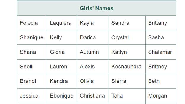
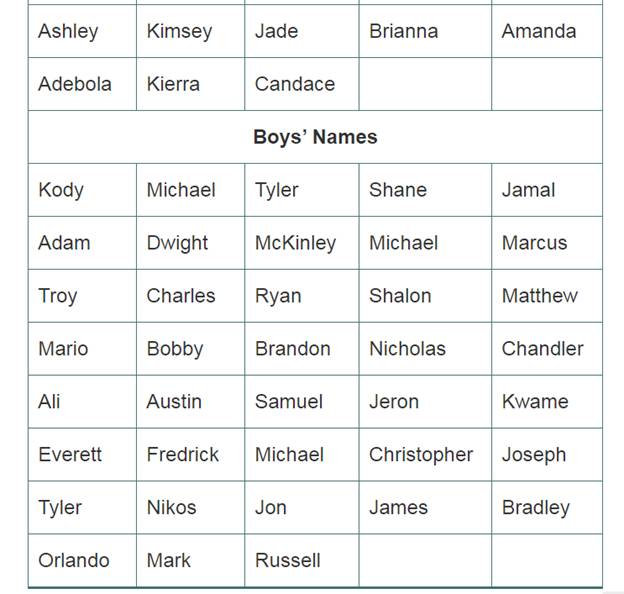
a. Display the lengths of the fifth-grade girls’ and boys’ names in dot plots. Compare the dot plots.
b. Write and answer at least four questions about your dot plots from part (a), including at least one question at each of the three graph-reading levels discussed in Section 15.2 (Read the data, Read between the data, and Read beyond the data).
c. Display the lengths of the fifth-grade girls’ and boys’ names in box plots.
d. Compare the box plots from part (c). What do they tell you about the fifth-grade girls’ and boys’ names?
Want to see the full answer?
Check out a sample textbook solution
Chapter 15 Solutions
Mathematics For Elementary Teachers With Activities


- On May 3, 1999, 59 tornadoes hit a certain state in the largest tornado outbreak ever recorded for that state. Sixteen of these were classified as strong (F2 or F3) or violent (F4 or F5). Answer parts a through c below. A 0 40 a. Make a box-and-whisker plot of the data for length of path. Choose the correct plot below. O A. O B. O C. Q Length of Length of Length of Path Path Path (miles) Intensity (miles) Intensity (miles) F3 7 F2 14 F3 6 F2 7 F2 14 F4 12 F5 38 F4 3 F2 1 F2 F3 20 F3 ✔ 58 4 36 6 11 40 Intensity F3 F2 F3 F2 G 40 Q Q Garrow_forwardPart II Show all of your work. Write the answer in the space provided. ows 11. The ages of 25 people who recently passed the certified quality engineering exam (CQE) are given in the table. 28 33 43 29 37 44 38 29 39 44 29 33 42 39 36 42 28 35 39 42 Construct a dot plot for the data. 39 43 29 32 37 26 27 28 29 30 31 32 33 34 35 36 37 38 39 40 41 42 43 44 45 46arrow_forwardTwenty salesmen were asked how many phone calls they made on a givan day. The data was ecorded in the table balow. Construct a dot plot for the sat. 15 12 0 1 2 3 4 5 0 1 2 3 4 5 0 1 2 3 4 5 0 1 2 34 5arrow_forward
- What would it be for the histogram box?arrow_forwardDraw the box plot of the following:2 2 3 4 5 5 5 6 7 9 12arrow_forwardDraw a scatter plot for the data in the following table. -4 -3 -2 -1 0 1 2 3 4 LO y 0.5 3 4.8 6 7.1 7.2 8.3 8.9 9 9.9 9 8 7 6 5 4 3 21 + -4-3 -2 -1 1 2 3 4 5 Clear All Draw: Dotarrow_forward
- Two dot plots show the number of miles run by 14 students at the beginning and at the end of the school year. In complete sentences, compare the dot plots by discussing their means, medians, and ranges.arrow_forwardLaila wants to create a data display to clearly show the median salary, the highest salary, and the lowest salary of the 685 employees at her company. She is trying to decide whether she should create a dot plot, a box plot, or a histogram of the salaries. A sample of the data is shown below. $25,745; $26,512; $27,322; $27,750; $29,820; $32,500; $35,448; $52,020; $63,485; $87,167 Which graph should Laila choose? Explain your reasoning by completing the sentences. Click the arrows to choose an answer from each menu. A dot plot Choose... A box plot would display the median, minimum, and maximum clearly A histogram Choose... So, Laila shou would display the median, minimum, and maximum clearly cannot be used to determine the median would not work well because there are too many values Copyright 2022 by Curriculum Associates. All rights reserved. These materials, or any portion thereof, may not be reproduced or shared in any manner without express written consent of Curriculum Associates.arrow_forwardLaila wants to create a data display to clearly show the median salary, the highest salary. and the lowest salary of the 685 employees at her company. She is trying to decide whether she should create a dot plot, a box plot, or a histogram of the salaries. A sample of the data is shown below. $25,745; $26,512; $27,322; $27.750; $29,820; $32,500; $35,448; $52,020; $63,485: $87,167 Which graph should Laila choose? Explain your reasoning by completing the sentences.Click the arrows to choose an answer from each menu. A dot plot Choose... option 1 would display the median, minimum and maximum clearly option 2. would not work well because there are too many different values option 3 cannot be used to determaine the median A box plot Choose... option 1 would display the median, minimum and maximum clearly option 2. might not show the minimum or the maximum option 3 cannot be used to determaine the median A histogram Choose... option 1 would display the median, minimum and maximum clearly…arrow_forward
- Mr. Britten recorded the grades his students scored on a math test. He wants to make a dot plot to represent the data. How many more dots will be place above the 100 than above the 70, 75, and 80 combined? Grade Scored on Test 100 85 90 95 85 95 100 80 100 90 70 100 75 95 100 75 90 100 85 95arrow_forwardThe following data are the ages (in years) of 17 economics teachers in a school district. 51, 46, 47, 48, 36, 27, 55, 34, 58, 50, 23, 51, 35, 37, 38, 49, 56 Send data to calculator Using the tool provided, construct a box-and-whisker plot for the data. ? H+HHH +++++++ +H +++++++D 20 25 30 35 40 45 50 55 60 Age of economics teacher (in years)arrow_forwardPLEASE ANSWER THE QUESTION IN THE PHOTO. TY!arrow_forward
 Glencoe Algebra 1, Student Edition, 9780079039897...AlgebraISBN:9780079039897Author:CarterPublisher:McGraw Hill
 Trigonometry (MindTap Course List)TrigonometryISBN:9781337278461Author:Ron LarsonPublisher:Cengage Learning
 Holt Mcdougal Larson Pre-algebra: Student Edition...AlgebraISBN:9780547587776Author:HOLT MCDOUGALPublisher:HOLT MCDOUGAL
 Big Ideas Math A Bridge To Success Algebra 1: Stu...AlgebraISBN:9781680331141Author:HOUGHTON MIFFLIN HARCOURTPublisher:Houghton Mifflin Harcourt
 Functions and Change: A Modeling Approach to Coll...AlgebraISBN:9781337111348Author:Bruce Crauder, Benny Evans, Alan NoellPublisher:Cengage Learning