(a)
To graph:
A histogram for the given data.
(a)
Explanation of Solution
Given information:
| Braking Times for Vehicles at 60 mph (in Minutes) | |
| Class | Frequency |
| 12 | |
| 15 | |
| 14 | |
| 15 | |
| 14 | |
Formula used:
Class mid-point
For adjustment of class boundaries subtract
Calculation:
Compute the class mid-point of each class.
For the class
For the class
For the class
For the class
For the class
Calculate the adjustment factor.
Construct the table with adjusted class boundary and class mid-point.
| Braking Times for Vehicles at 60 mph (in Minutes) | ||
| Class boundary | Mid-point | Frequency |
| 0.06 | 12 | |
| 0.09 | 15 | |
| 0.12 | 14 | |
| 0.15 | 15 | |
| 0.18 | 14 | |
Table 1
Graph:
Construct the histogram corresponding to the table 1.
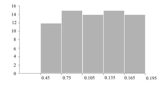
Figure 1
Interpretation:
Figure 1 represents the histogram for the given data.
A histogram is a bar graph of a frequency distribution of quantitative data.
Put classes along
(b)
To calculate:
The relative frequency for each class.
(b)
Answer to Problem 9E
Solution:
Required relative frequency table is,
| Class | Relative Frequency |
Explanation of Solution
Given information:
| Braking Times for Vehicles at 60 mph (in Minutes) | |
| Class | Frequency |
| 12 | |
| 15 | |
| 14 | |
| 15 | |
| 14 | |
Formula used:
Relative Frequency
Calculation:
Compute
Compute relative frequencies for each class in the following table.
| Class | Frequency | Relative Frequency |
| 12 | ||
| 15 | ||
| 14 | ||
| 15 | ||
| 14 |
Table 2
Conclusion:
Thus, the required relative frequency table is,
| Class | Relative Frequency |
(c)
To graph:
A relative frequency histogram for the given data.
(c)
Explanation of Solution
Given information:
| Class | Frequency | Relative Frequency |
| 12 | ||
| 15 | ||
| 14 | ||
| 15 | ||
| 14 |
Formula used:
Class mid-point
For adjustment of class boundaries subtract
Calculation:
Compute the class mid-point of each class.
For the class
For the class
For the class
For the class
For the class
Calculate the adjustment factor.
Construct the table with adjusted class boundary and class mid-point.
| Braking Times for Vehicles at 60 mph (in Minutes) | ||
| Class boundary | Mid-point | Relative Frequency |
| 0.06 | ||
| 0.09 | ||
| 0.12 | ||
| 0.15 | ||
| 0.18 | ||
Table 3
Graph:
Construct the relative frequency histogram corresponding to the table 3.
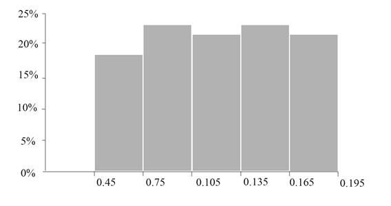
Figure 2
Interpretation:
Figure 2 represents the relative frequency histogram for the given data.
A histogram is a bar graph of a frequency distribution of quantitative data.
Put classes along
Want to see more full solutions like this?
Chapter 2 Solutions
Beginning Statistics

 MATLAB: An Introduction with ApplicationsStatisticsISBN:9781119256830Author:Amos GilatPublisher:John Wiley & Sons Inc
 Probability and Statistics for Engineering and th...StatisticsISBN:9781305251809Author:Jay L. DevorePublisher:Cengage Learning
 Statistics for The Behavioral Sciences (MindTap C...StatisticsISBN:9781305504912Author:Frederick J Gravetter, Larry B. WallnauPublisher:Cengage Learning
 Elementary Statistics: Picturing the World (7th E...StatisticsISBN:9780134683416Author:Ron Larson, Betsy FarberPublisher:PEARSON
 The Basic Practice of StatisticsStatisticsISBN:9781319042578Author:David S. Moore, William I. Notz, Michael A. FlignerPublisher:W. H. Freeman
 Introduction to the Practice of StatisticsStatisticsISBN:9781319013387Author:David S. Moore, George P. McCabe, Bruce A. CraigPublisher:W. H. Freeman