Gen Combo Ll Applied Statistics In Business & Economics; Connect Access Card
6th Edition
ISBN: 9781260260632
Author: David Doane, Lori Seward Senior Instructor of Operations Management
Publisher: McGraw-Hill Education
expand_more
expand_more
format_list_bulleted
Concept explainers
Videos
Textbook Question
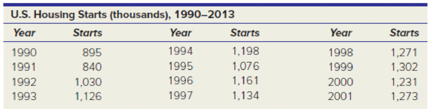
Chapter 3.4, Problem 11SE
(a) Use Excel to prepare a line chart to display the data on housing starts. Modify the default colors, fonts, etc., to make the display effective. (b) Describe the pattern, if any.
Expert Solution & Answer
Want to see the full answer?
Check out a sample textbook solution
Students have asked these similar questions
I need help to do the exercises of the chart given for doing Excel and provide the steps as that need to follow the instructions.
Use Excel to construct a boxplot for the Presidential Heights data. Select the data in the worksheet and click the Insert tab in the top menu. Click Chart and then Box and Whisker. Click on the boxplot, click the Design tab in the top menu, click Add Chart Element, and choose the appropriate element that allows you to add a vertical axis label.
PRESIDENT
HEIGHT
Washington
188
J. Adams
170
Jefferson
189
Madison
163
Monroe
183
J. Q. Adams
171
Jackson
185
Van Buren
168
Harrison
173
Polk
173
Taylor
173
Pierce
178
Buchanan
183
Lincoln
193
Grant
173
Hayes
173
Garfield
183
Cleveland
180
Harrison
168
McKinley
170
T. Roosevelt
178
Taft
182
Wilson
180
Harding
183
Coolidge
178
Hoover
182
F. Roosevelt
188
Truman
175
Eisenhower
179
J. Kennedy
183
Johnson
192
Nixon
182
Carter
177
Reagan
185
G. H. W. Bush
188
Clinton
188
G. W. Bush
183
Obama
188
a. Define a column chart
b. Explain why a column chart may be used
c. Why is it important to select the correct chart type.
Chapter 3 Solutions
Gen Combo Ll Applied Statistics In Business & Economics; Connect Access Card
Ch. 3.1 - (a) Make a stem-and-leaf plot for these 24...Ch. 3.1 - (a) Make a stem-and-leaf plot for the number of...Ch. 3.1 - (a) Make a stacked dot plot to compare the lengths...Ch. 3.2 - (a) The table shows the number of days on the...Ch. 3.2 - (a) The table shows raw scores on a state civil...Ch. 3.2 - (a) Make a frequency distribution and histogram...Ch. 3.2 - (a) Make a frequency distribution and histogram...Ch. 3.2 - (a) Make a frequency distribution and histogram...Ch. 3.2 - For each frequency distribution, suggest nice...Ch. 3.2 - Below are sorted data showing average spending per...
Ch. 3.4 - (a) Use Excel to prepare a line chart to display...Ch. 3.4 - Prob. 12SECh. 3.4 - Prob. 13SECh. 3.4 - (a) Use Excel to prepare a line chart to display...Ch. 3.5 - Prob. 15SECh. 3.5 - The table shows the number of TVs sold by a major...Ch. 3.6 - (a) Use Excel to prepare a 2-D pie chart for these...Ch. 3.6 - Prob. 19SECh. 3.6 - Prob. 20SECh. 3.7 - (a) Use Excel to make a scatter plot of the data...Ch. 3.7 - Prob. 22SECh. 3.7 - Prob. 23SECh. 3.7 - (a) Use Excel to make a scatter plot of the data,...Ch. 3 - Name two attractive features and two limitations...Ch. 3 - (a) What is a frequency distribution? (b) What are...Ch. 3 - (a) What is a histogram? (b) What does it show?Ch. 3 - (a) What is a bimodal histogram? (b) Explain the...Ch. 3 - (a) What is a scatter plot? (b) What do scatter...Ch. 3 - For what kind of data would we use a bar chart?...Ch. 3 - For what kind of data would we use a line chart?...Ch. 3 - (a) List the three most common types of charts in...Ch. 3 - (a) For what kind of data would we use a pie...Ch. 3 - Which types of charts can be used for time series...Ch. 3 - (a) When might we need a log scale? (b) What do...Ch. 3 - When might we use a stacked column chart? An area...Ch. 3 - List five deceptive graphical techniques.Ch. 3 - What is a pivot table? Why is it useful?Ch. 3 - The durations (minutes) of 26 electric power...Ch. 3 - The U.S. Postal Service will ship a Priority Mail,...Ch. 3 - A study of 40 U.S. cardiac care centers showed the...Ch. 3 - Prob. 28CECh. 3 - An executives telephone log showed the following...Ch. 3 - Below are batting averages of the New York Yankees...Ch. 3 - Prob. 31CECh. 3 - Prob. 32CECh. 3 - Download the full data set from the McGraw-Hill...Ch. 3 - (a) What kind of display is this? (b) Identify its...Ch. 3 - (a) What kind of display is this? (b) Identify its...Ch. 3 - (a) What kind of display is this? (b) Identify its...Ch. 3 - (a) What kind of display is this? (b) Identify its...Ch. 3 - Prob. 38CECh. 3 - (a) What kind of display is this? (b) Identify its...Ch. 3 - (a) What kind of display is this? (b) Identify its...Ch. 3 - Prob. 41CECh. 3 - Prob. 42CECh. 3 - (a) Use Excel to prepare an appropriate type of...Ch. 3 - Prob. 44CECh. 3 - Prob. 45CECh. 3 - (a) Use Excel to prepare an appropriate type of...Ch. 3 - Prob. 47CECh. 3 - (a) Use Excel to prepare an appropriate type of...
Knowledge Booster


Learn more about
Need a deep-dive on the concept behind this application? Look no further. Learn more about this topic, statistics and related others by exploring similar questions and additional content below.Similar questions
- Find the slpoe of the line: y=7arrow_forwardData: 46 81 73 59 50 6887 52 56 74 56 7291 54 90 72 85 7960 87 89 49 67 85Construct a stem-and-leaf plot. Be sure to include proper lengend (or key).arrow_forwardProfessor Miguel has just given a math exam and wants to calculate the 'range' of performance of his students. What must he do? A. Identify the central score. B. Find the score that occurs most often. C. Identify how far from average each score is. D. Subtract the lowest score from the highest scorearrow_forward
- So I'll include a line graph for a second visual aid. I have a chart to show the proportion of students by major that have student loan debt at our school.arrow_forwardThe owner of a radio station wants to determine how much airtime songs take up. The owner collects the song length in seconds of 10 popular songs. The data are reproduced in the table below. Calculate the mode(s) using a TI-83. TI-83 plus, or TI-84 graphing calculator. Length of Songs in Seconds 279 219 298 134 206 293 165 227 230 212arrow_forward1. Fit a straight line to the following data: x 71 68 73 69 67 65 66 67 y 69 72 70 70 68 67 68 64arrow_forward
- Please create a table, include the solutions and final answersarrow_forwardIn class, we compared healing times for females who received an experimental cold sore medicine. The data for the male control and treatment groups are provided below; they represent the number of days that passed before the sores were completely gone. In your notebook, make a dotplot for each group. Control: 20,13,22,21,16,5,21,11,16,14,15,15,13,16,10,17,16,11,21 Treatment: 11,16,8,16,15,12,11,12,12,9,11,19,16,13,5,15,12,8,11 Part A: Calculate the mean healing time for the control group, rounding your result to the nearest hundredth. In your notebook, mark an "X" on the horizontal axis of your dotplot to show the mean.Mean = daysPart B: Calculate the mean healing time for the treatment group, rounding your result to the nearest hundredth. In your notebook, mark an "X" on the horizontal axis of your dotplot to show the mean.Mean = daysarrow_forwardCreate a comparative dotplot for student heights split by sex. To do this, go to graph and then select the graph type. Here since we have all the heights in one column, it is a one y. Since we are splitting the data by the variable sex, it is with groups. Select height as the y (graph) variable, and then sex as the variable to split by. Change the title to “Student Heights by Sex”. Make sure the x-axis is labeled “height in inches”. To change labels, right click on them and choose edit. Type in the new label. Paste the graph below. Does there seem to be a difference in heights based on sex? Age Gender Height Arm Length Number Siblings Birth Order Handedness Number Classes Number Credits Hrs. Exercise Athlete at Broome Hrs. TV Award Pulse Number Piercings Facebook Friends Followers on Instagram Tattoo Division Local section 18 f 63 27.5 2 3 r 4 14 1.5 n 3 NP 74 2 82 72 n HS y 4 19 m 74 31.5 4 5 r 4 11 5 n 1.5 O 0 600 700 n STEM y 4 17 f…arrow_forward
- Governor Political Affiliation and Total State Expenditure per capita: Using a PivotTable: Prepare a cross tabulation of governor political affiliation (rows) and total state expenditure per capita (columns). Group Settings: min= 3970, max=16896, by=3500. No need to copy and paste the table to the homework. But you need it for the next step. Prepare a 100% Stacked Bar Chart of Governor Political Affiliation (horizontal axis category) and Total State Expenditure per capita (stacked categories). Copy and Paste it here. Which political party spends the most? I just need commands to get me to the final result thanks!arrow_forwardThe inspector wants you to create a blueprint for the basketball court. Using the top view of the court given in the image below, check (V the box if the colored elements marked on the court pass the vertical line test. Yellow Blue Green 000arrow_forwardMatch the chart type to whether it is used primarily to communicate qualitative or quantitative results: Chart Type 1. Pie chart 2. Box and whisker plot 3. Word cloud 4. Symbol map 5. Scatter plot 6. Line chart Quantitative or Qualitative?arrow_forward
arrow_back_ios
SEE MORE QUESTIONS
arrow_forward_ios
Recommended textbooks for you
 Glencoe Algebra 1, Student Edition, 9780079039897...AlgebraISBN:9780079039897Author:CarterPublisher:McGraw Hill
 Intermediate AlgebraAlgebraISBN:9781285195728Author:Jerome E. Kaufmann, Karen L. SchwittersPublisher:Cengage Learning
 Holt Mcdougal Larson Pre-algebra: Student Edition...AlgebraISBN:9780547587776Author:HOLT MCDOUGALPublisher:HOLT MCDOUGAL
 Algebra: Structure And Method, Book 1AlgebraISBN:9780395977224Author:Richard G. Brown, Mary P. Dolciani, Robert H. Sorgenfrey, William L. ColePublisher:McDougal Littell
Glencoe Algebra 1, Student Edition, 9780079039897...
Algebra
ISBN:9780079039897
Author:Carter
Publisher:McGraw Hill
Intermediate Algebra
Algebra
ISBN:9781285195728
Author:Jerome E. Kaufmann, Karen L. Schwitters
Publisher:Cengage Learning
Holt Mcdougal Larson Pre-algebra: Student Edition...
Algebra
ISBN:9780547587776
Author:HOLT MCDOUGAL
Publisher:HOLT MCDOUGAL
Algebra: Structure And Method, Book 1
Algebra
ISBN:9780395977224
Author:Richard G. Brown, Mary P. Dolciani, Robert H. Sorgenfrey, William L. Cole
Publisher:McDougal Littell
Which is the best chart: Selecting among 14 types of charts Part II; Author: 365 Data Science;https://www.youtube.com/watch?v=qGaIB-bRn-A;License: Standard YouTube License, CC-BY