
(a)
To illustrate the given situation with supply and
(a)
Explanation of Solution
Figure 1 illustrates the
Figure 1 shows the demand and supply curves for the artwork The Scream, which was sold in an auction for $119.9 million. The horizontal axis measures the quantity and the vertical axis measures the price of the commodity. The supply curve is a vertical line because the quantity of the artwork is fixed and unified.
Demand curve: A demand curve is a graph which shows the quantities of a commodity that the consumers will buy at different price levels.
Supply curve: A supply curve is a graph which shows the quantities of a commodity that the producers are willing to sell at different price levels.
(b)
To illustrate the given situation with supply and demand curves.
(b)
Explanation of Solution
Figure 2 illustrates the change in market equilibrium.
Figure 2 shows the demand and supply curves for the hogs. The horizontal axis measures the quantity and the vertical axis measures the price of the commodity. The decrease in the supply of the hogs has led to a leftward shift of the supply curve, all while the demand remains unchanged. As a result, the equilibrium changes and the prices increase from 75 cents to 98 cents and the quantity decreases from Q0 to Q1.
Demand curve: A demand curve is a graph which shows the quantities of a commodity that the consumers will buy at different price levels.
Supply curve: A supply curve is a graph which shows the quantities of a commodity that the producers are willing to sell at different price levels.
(c)
To illustrate the given situation with supply and demand curves.
(c)
Explanation of Solution
Figure 3 illustrates the change in market equilibrium.
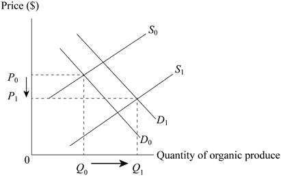
Figure 3 shows the demand and supply curves for the houseplants. The horizontal axis measures the quantity and the vertical axis measures the price of the commodity. The initial increase in the demand for house plants led to the shift of the demand curve from D0 to D1. However, the increase in the number of farmers producing the house plants also increased, leading to an increase in the supply of the product which shifts the supply curve from S0 to S1. The combined effect is that the price of house plants reduces from P0 to P1 as the quantity supplied increases from Q0 to Q1.
Demand curve: A demand curve is a graph which shows the quantities of a commodity that the consumers will buy at different price levels.
Supply curve: A supply curve is a graph which shows the quantities of a commodity that the producers are willing to sell at different price levels.
Want to see more full solutions like this?
Chapter 4 Solutions
Principles of Microeconomics


 Principles of Economics (12th Edition)EconomicsISBN:9780134078779Author:Karl E. Case, Ray C. Fair, Sharon E. OsterPublisher:PEARSON
 Engineering Economy (17th Edition)EconomicsISBN:9780134870069Author:William G. Sullivan, Elin M. Wicks, C. Patrick KoellingPublisher:PEARSON
 Principles of Economics (MindTap Course List)EconomicsISBN:9781305585126Author:N. Gregory MankiwPublisher:Cengage Learning
 Managerial Economics: A Problem Solving ApproachEconomicsISBN:9781337106665Author:Luke M. Froeb, Brian T. McCann, Michael R. Ward, Mike ShorPublisher:Cengage Learning
 Managerial Economics & Business Strategy (Mcgraw-...EconomicsISBN:9781259290619Author:Michael Baye, Jeff PrincePublisher:McGraw-Hill Education