
Concept explainers
Videos
(a)
To find: The value of n and p in the binomial distribution of X.
(a)
Answer to Problem 59E
Solution:
Explanation of Solution
Calculation: The formula of the binomial distributions is:
Here, n is number of trials indefinitely and p is the probability that success.
So, based on the provided information, the success probability is the probability that the person responds in favor of the research question. And the number of independent trails are the randomly selected persons.
So,
Interpretation: The number of success trials
(b)
To find: The probability of each possible outcomes of X, and the histogram for the distribution
(b)
Answer to Problem 59E
Solution: The probability of each possible value of X is:
| X | |
| 0 | |
| 1 | |
| 2 | |
| 3 | |
| 4 |
Explanation of Solution
Calculation: The probability for
Similarly, the probability for
Similarly, the probability for
Similarly, the probability for
Similarly, the probability for
Therefore, the probability of each possible value of X is,
| X | |
| 0 | |
| 1 | |
| 2 | |
| 3 | |
| 4 |
Graph: The graph of the probability histogram makes by use of the follows steps:
Step 1: Put the data in the excel sheet.
| X | |
| 0 | |
| 1 | |
| 2 | |
| 3 | |
| 4 |
Step 2: Select the data set and go to insert and select the option of cluster column under the Recommended Charts. The screenshot is shown below:
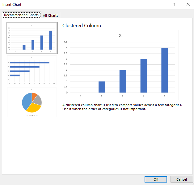
Step 3: Click on OK. The diagram is obtained as:
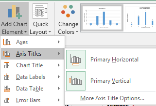
Step 4: Click on the chart area and select the option of “Primary Horizontal” and “Primary Vertical” axis under the “Add Chart Element” to add the axis title. The screenshot is shown below:
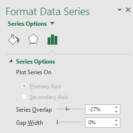
Step 5: Click on the bars of the diagrams and reduce the gap width to zero under the “Format Data Series” tab. The screenshot is shown below:
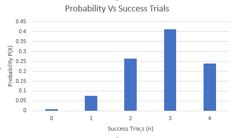
The obtained histogram is:

Interpretation: The probability
(c)
To find: The mean number of positive responders and mark the location of this value on your histogram.
(c)
Answer to Problem 59E
Solution: The mean
Explanation of Solution
Calculation: The number of success trials
So, the mean
Graph: The graph of the probability histogram makes by use of the follows steps:
Step 1: Put the data in the excel sheet.
| X | |
| 0 | |
| 1 | |
| 2 | |
| 3 | |
| 4 |
Step 2: Select the data set and go to insert and select the option of cluster column under the Recommended Charts. The screenshot is shown below:
Step 3: Click on OK. The diagram is obtained as:
Step 4: Click on the chart area and select the option of “Primary Horizontal” and “Primary Vertical” axis under the “Add Chart Element” to add the axis title. The screenshot is shown below:
Step 5: Click on the bars of the diagrams and reduce the gap width to zero under the “Format Data Series” tab. The screenshot is shown below:
Step 6: The mean of 2.8 is marked on the histogram and the obtained histogram is:
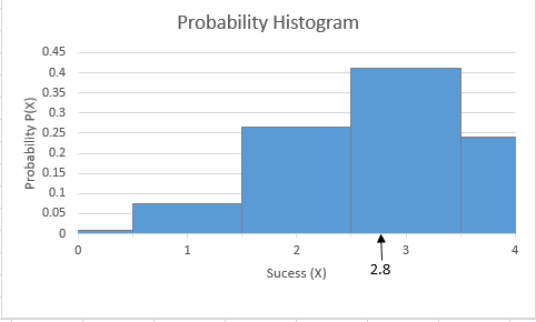
Interpretation: The mean
Want to see more full solutions like this?
Chapter 5 Solutions
LaunchPad for Moore's Introduction to the Practice of Statistics (12 month access)


 Algebra and Trigonometry (MindTap Course List)AlgebraISBN:9781305071742Author:James Stewart, Lothar Redlin, Saleem WatsonPublisher:Cengage Learning
 College Algebra (MindTap Course List)AlgebraISBN:9781305652231Author:R. David Gustafson, Jeff HughesPublisher:Cengage Learning