
Web Development and Design Foundations with HTML5 (9th Edition) (What's New in Computer Science)
9th Edition
ISBN: 9780134801148
Author: Terry Felke-Morris
Publisher: PEARSON
expand_more
expand_more
format_list_bulleted
Question
Chapter 6, Problem 3AYK
Given code:
The given code is used to display a web page contains the style properties for heading, body, id selector and paragraph elements.
Screenshot of the web page
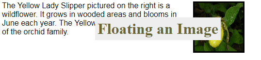
Error in the given code:
In above code, the heading style contains position property for the heading “Floating an Image”. Consider the above output, it not look fair for displaying a web page because each web page needs a good presentation.
- Hence remove the position property from the heading style properties.
Program Plan Intro
Program Plan:
- Include the HTML tag using <html>.
- Include the header tag using <head>.
- Include the style on the webpage using <style> tag.
- Set the style properties for the body elements.
- Set the style properties for the h1 elements.
- Set the style properties for the paragraph elements.
- Set the style properties for an id selector “yls”.
- Include the style on the webpage using <style> tag.
- Close the header tag using </style>.
- Close the header tag using </head>.
- Open the body of the web page using <body> tag.
- Include the heading of the web page using <h1> tag.
- Include the <img> tag and add the image source along with the id selector.
- Include the content to be displayed in the webpage using paragraph <p> tag.
- Close the body using </body> tag.
- Include the header tag using <head>.
- Close the file using </html> tag.
Expert Solution & Answer
Want to see the full answer?
Check out a sample textbook solution
Students have asked these similar questions
Can someone tell me why my footer image isnt covering the whole bottom area and is instead leaving black areas around the perimeter? Also how do I decrease the padding so the header looks closer to the above table?
<!DOCTYPE html>
<html lang="en" xmlns="http://www.w3.org/1999/xhtml"><html> <body> <head> <meta charset="utf-8" /> <title>HTML</title> <link rel="stylesheet" href="style.css"> </head> <body> <header class="header-image"> <img src="Tardis.jpg" alt="Header Image" width="1060" /> </header> <table style="33%"> <tr> <th>Navigation</th> <th>Doctor Profile</th> <th>Image</th> </tr> <tr> <tr> <td> <ul> <li><a…
CSS and HTML
Improve my code to look exactly like the picture.
<!DOCTYPE html><html lang="en"><head><title>The Stuff Shop</title><meta charset="utf-8"></head><body><style>
body { font-family:Verdana, Arial, sans-serif; background-color: #800000; text-align: center;}
#wrapper { background-color: #000000; color: #ffffff; width: 80%; margin: auto; min-width: 960px; max-width: 1200px;} nav { float: left; width: 150px;} main { margin-left: 0px; padding: 200px; background-color: #000000; color: #fffff;} header {
color: #fffff; font-size: 200%; padding: 10px 10px 10px 155px; }h1 { margin-bottom: 20px; }
} #floatright { margin: 10px; float: right;}
footer { font-size:70%; text-align: center; clear: right; padding: 20px; background-color: #869dc7; }nav ul {…
JavaScript
The below HTML code sets up a template for a die. By cloring the dots (dot1,..., dot9)with black or white color, we show any of the 6 sides of the die.
<!DOCTYPE html><html><head> <meta charset="utf-8"> <meta name="viewport" content="width=device-width, initial-scale=1"> <title></title>
<style type="text/css">
table{
border: 2px solid black; border-radius: 5px;
}
td{
width: 20px; height: 20px; background-color: black; border-radius: 50%;
}
</style></head><body>
<div class="container"><div class="dice">
<table>
<tr><td id="dot1"></td><td id="dot2"></td><td id="dot3"></td></tr>
<tr><td id="dot4"></td><td id="dot5"></td><td id="dot6"></td></tr>…
Chapter 6 Solutions
Web Development and Design Foundations with HTML5 (9th Edition) (What's New in Computer Science)
Ch. 6.4 - Prob. 1CPCh. 6.4 - Prob. 2CPCh. 6.4 - Prob. 3CPCh. 6.15 - Prob. 1CPCh. 6.15 - Prob. 2CPCh. 6.15 - Prob. 3CPCh. 6 - Prob. 1MCCh. 6 - Prob. 2MCCh. 6 - Prob. 3MCCh. 6 - Which of the following configures a class called...
Ch. 6 - Prob. 5MCCh. 6 - Prob. 6MCCh. 6 - Prob. 7MCCh. 6 - Prob. 8MCCh. 6 - Prob. 9MCCh. 6 - Prob. 11FIBCh. 6 - Prob. 12FIBCh. 6 - The ____________ is always transparent.Ch. 6 - Prob. 14FIBCh. 6 - Prob. 15FIBCh. 6 - Prob. 1AYKCh. 6 - Prob. 2AYKCh. 6 - Prob. 3AYKCh. 6 - Prob. 1HOECh. 6 - Prob. 2HOECh. 6 - Prob. 3HOECh. 6 - Prob. 4HOECh. 6 - Prob. 5HOECh. 6 - Prob. 6HOECh. 6 - Prob. 7HOECh. 6 - Prob. 8HOECh. 6 - Prob. 9HOECh. 6 - Prob. 10HOE
Knowledge Booster

Similar questions
- How do I add multiple floating images but keep them contained to the layout below like the guide image I have below? I have a floating image but it is just staying in the middle of the page. Also why is my footer image on the right instead of at the bottom where it should be? HTML <html lang="en" xmlns="http://www.w3.org/1999/xhtml"><head> <meta charset="utf-8" /> <title>Flexbox Coding</title></head> <link rel="stylesheet" href="Style.css"> <body> <header class="header-image"> <img src="57mBcYi.jpeg" alt="Header Image"> </header> <div class="flex-container"> <div> <ul> <li><a href="Page1.html">Link to Page 1</a></li> <li><a href="Page2.html">Link to Page 2</a></li> </ul> </div> <div>An country…arrow_forward18.Code HTML and CSS for the following: Place three images inside the display area of your web page. The dimensions of the images areimgA: height = 20%; width = 100pximgB: height = 150px; width = 250remimgC: height = 180vmin; width = 50% Display imgA and have it positioned 100px from the left of its container and 100vmax from the top.Display imgB and have it positioned 120px from the left of its container and 120em from the bottom.Display imgC and have it positioned 200px from the top of its container and centered horizontally. The order of HTML code for displaying the three images are to be imaA code, then imaB code, and finally imaC code. Make sure imgA is displayed on top of imgC and imgC is on top of imgB. Code all mandatory attributes. Given a choice, always use a property instead of an attribute.arrow_forwardWrite an HTML file that creates the following web page. Body: font-family should be Arial First h1: font-family should be Times color should be blueviolet text-transform should be upperletter text-align should be center Second h1: font-family should be sans-serif font-size should be 2em color should be brown text-decoration should be overline In the first paragraph: The “ Web Design” must have a font-size of 2em and it should be strong In the second paragraph: The “development software.” must have letter spaces like 0.5em and it should be strongarrow_forward
- Write down complete HTML + CSS + jQuery code to demonstrate following:a) When you double click a button, show 3 boxes with green, red and yellow color with different border styles.b) Demonstrate with complete jQuery code the functionality of text auto completion by showing suggestions for words typed by user in a search bararrow_forwardHello, I am trying to add a floating image into the middle column below the text. I can someone look at the provided HTML code along with the CSS sheet I have provided to figure out how to get a floating image into it. Thank you! <!DOCTYPE html> <html lang="en" xmlns="http://www.w3.org/1999/xhtml"><head> <meta charset="utf-8" /> <title>Flexbox Coding</title></head> <link rel="stylesheet" href="Style.css"> <body> <header class="header-image"> <img src="57mBcYi.jpeg" alt="Header Image"> </header> <div class="flex-container"> <div> <ul> <li><a href="Page1.html">Link to Page 1</a></li> <li><a href="Page2.html">Link to Page 2</a></li> </ul> </div> <div>An country demesne message it. Bachelor…arrow_forwardUsing HTML and CSS how to make a responsive image need a responsive image inside a column, I am making a 3 column layout need the image in the first column I am unable to position it better my code <!doctype html> <html lang="en"><head><meta charset="utf-8"> <title>flexBox</title><meta name="Phone" content="Number"> <style>#header{background-color:#FF6347;}#col1{background-color:#FFD700 ;width: 30%;float: left;}#col2{background-color:#00BFFF ;width: 50%;float: left;} #col3{background-color:#FF69B4;width: 20%;float: left;}#footer{background-color: #90EE90;clear: left;}ul {display: flex;justify-content: space-between;flex-direction: column;padding-left: 2px;height: 65%;} li {list-style: none;display: inline-block;background: tomato;padding: 5px;width: 170px;height: 75px;margin: 5px;line-height: 70px;color: white;font-size: 3em;text-align: center;}#contaner{display: flex;justify-content: space-between;height:…arrow_forward
- How do I get the result in the image? Here is my code for a weather forecast in php: Here is my code: <!DOCTYPE html> <html> <head> <meta charset="UTF-8"> <title>Forecast Weather using PHP</title> <style> .report-container { border: #E0E0E0 1px solid; padding: 20px 40px 40px 40px; border-radius: 2px; margin: 0 auto; color: #929292; } .weather-icon { vertical-align: middle; margin-right: 20px; } .weather-forecast { color: #212121; font-size: 1.2em; font-weight: bold; margin: 20px 0px; } span.min-temperature { margin-left: 15px; color: #929292; } .time { line-height: 25px; } </style> </head> <body> <div class="report-container"> <?php function getForecast($city) { $country = "US"; $url = "http://api.openweathermap.org/data/2.5/forecast/daily?q=" . $city . "," . $country . "&units=metric&cnt=1&lang=en&appid=c0c4a4b4047b97ebc5948ac9c48c0559"; $json = file_get_contents($url); $data = json_decode($json,…arrow_forwardI need help with making the changes needed in the image I have provided the code this is what I have so far Below please help<!DOCTYPE html><html lang="en"><head> <meta charset="UTF-8"> <meta name="viewport" content="width=device-width, initial-scale=1.0"> <title>homework 14</title></head><body> <div> <h2>Sticky Note Board</h2> <div class="sticky-board"> <div style="display: relative;"> <div class="sticky-note" id="first"> <div class="sticky-note-title"> Transforms </div> <div class="sticky-note-body">CSS transforms change the shape and position of the affected content without disrupting the normal document flow.</div> </div> </div> <div class="sticky-note" id="second"> <div…arrow_forwardI need to split these into grid.html and grid.css and to make I need help because right now my style is not working what I have so far below <html lang="en"><head><meta charset="UTF-8"><meta name="viewport" content="width=device-width, initial-scale=1.0"><title>Grid</title><style type="text/css"> header { text-align: center; font-size: 32px; color: white; background-color: #000000; padding: 29px;} * { box-sizing: border-box; } footer { background-color: #000000; padding: 9px; text-align: center; color: white;}img { float: left; width: 60%; padding: 19px; height: 310px; background: #808080;}main { float: left; width: 40%; padding: 19px; background-color: #800000; height: 310px;}div.image-cell { display: table; clear: both;} </style></head><body><div class="grid-container"><header><h2>Welcome to Grid!</h2></header> <div class="image-cell"> <img…arrow_forward
- <!DOCTYPE html> <!-- Student Name: Jorge Negron Drowne File Name: index.html Date: 09/28/2023 --> <html lang="en"> <head> <title>Gradients</title> <meta charset="utf-8"> <link rel="stylesheet" href="css/styles.css"> <meta name="viewport" content="width=device-width, initial-scale=1"> </head> <body> <div id="container"> <!-- Use the header area for the website name or logo --> <header> <h1>Exploring Gradients</h1> </header> <main> <div class="columns"> <h3>Linear Gradient to right at 25%</h3> <div class="box gradient1"></div> </div> <div class="columns"> <h3>Linear Gradient to left at 90%</h3> <div class="box gradient2"></div>…arrow_forwardPlease fix and improve my HTML and CSS code: First picture is my WRONG output. Second picture is the EXPECTED output. Just use random pictures for photo1. photo2, photo3, photo4, photo1thumb, photo2thumb, photo3thumb, photo4thumb for testing. index.html <!DOCTYPE html><html lang="en"><head><title>Image Gallery</title><meta charset="utf-8"><style> #gallery { position: relative; }#gallery ul { width: 250px; list-style-type: none; }#gallery li { display: inline; float: left; padding: 10px#gallery img { border-style: none; }#gallery a { text-decoration: none; color: #333; font-style: italic; }#gallery span { display: none; }#gallery a:hover span { display: block; position: absolute; top: 10px; left: 300px; text-align: center; } </style></head><body><h1>Image Gallery</h1><div…arrow_forwardI want to make a CSS for this code so the logo is in the center of the page and the text needs to be bigger and fits the page and evenly spaced. I also want to make the background color white and for the body to have a blue border. I also want the footer to have a blue background and centered. <!DOCTYPE html> <html lang="en"> <head> <meta charset="UTF-8"> <meta http-equiv="X-UA-Compatible" content="IE=edge"> <meta name="viewport" content="width=device-width, initial-scale=1.0"> <link rel="stylesheet" href="CSS/index.css"> <title>Video Game History</title> </head> <body> <nav> <a href="index.html">Home</a> <a href="about.html">About Us</a> <a href="contact.html">Contact Us</a> </nav> <h1>Home Page</h1> <article> <img src="Images/Logo.png" alt="Video Game" height="80"> <h2>The Early Ages</h2> <p>Today, video…arrow_forward
arrow_back_ios
SEE MORE QUESTIONS
arrow_forward_ios
Recommended textbooks for you
 New Perspectives on HTML5, CSS3, and JavaScriptComputer ScienceISBN:9781305503922Author:Patrick M. CareyPublisher:Cengage Learning
New Perspectives on HTML5, CSS3, and JavaScript
Computer Science
ISBN:9781305503922
Author:Patrick M. Carey
Publisher:Cengage Learning