
Concept explainers
Videos
(a)
The percentage of the overall population for each age group for the year 1950 and 2050.
(a)
Answer to Problem 20E
Solution: The percentage of the overall population for each age group for the year 1950 and 2050 are obtained as follows:
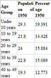
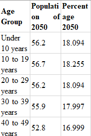
| Age Group | Population of 1950 | Percentage 1950 | Population of 2050 | Percentage 2050 |
| Under 10 years | 29.3 | 19.3911 | 56.2 | 18.0940 |
| 10 to 19 years | 21.8 | 14.4275 | 56.7 | 18.2550 |
| 20 to 29 years | 24.0 | 15.8835 | 56.2 | 18.0940 |
| 30 to 39 years | 22.8 | 15.0893 | 55.9 | 17.9974 |
| 40 to 49 years | 19.3 | 12.7730 | 52.8 | 16.9994 |
| 50 to 59 years | 15.5 | 10.2581 | 49.1 | 15.8081 |
| 60 to 69 years | 11.0 | 7.2799 | 45.0 | 14.4881 |
| 70 to 79 years | 5.5 | 3.6400 | 34.5 | 11.1075 |
| 80 to 89 years | 1.6 | 1.0589 | 23.7 | 7.6304 |
| 90 to 99 years | 0.1 | 0.0662 | 8.1 | 2.6079 |
| 100 years and over | 0.6 | 0.1932 |
Explanation of Solution
Calculation:
The percentage of the total population can be obtained by using the formula
The percentage of the total population can be calculated by using the Minitab software. The below steps are followed to obtained the required percentage for each age group for both the years.
Step 1: Enter the population for both the year 1950 and 2050.
Step 2: Go to Calc
Step 3: Enter the required expression in the “Expression” column and click on OK.
Step 4: Repeat the process for both the years.
The obtained result is shown in the below table:
| Age Group | Population of 1950 | Percentage 1950 | Population of 2050 | Percentage 2050 |
| Under 10 years | 29.3 | 19.3911 | 56.2 | 18.0940 |
| 10 to 19 years | 21.8 | 14.4275 | 56.7 | 18.2550 |
| 20 to 29 years | 24.0 | 15.8835 | 56.2 | 18.0940 |
| 30 to 39 years | 22.8 | 15.0893 | 55.9 | 17.9974 |
| 40 to 49 years | 19.3 | 12.7730 | 52.8 | 16.9994 |
| 50 to 59 years | 15.5 | 10.2581 | 49.1 | 15.8081 |
| 60 to 69 years | 11.0 | 7.2799 | 45.0 | 14.4881 |
| 70 to 79 years | 5.5 | 3.6400 | 34.5 | 11.1075 |
| 80 to 89 years | 1.6 | 1.0589 | 23.7 | 7.6304 |
| 90 to 99 years | 0.1 | 0.0662 | 8.1 | 2.6079 |
| 100 years and over | 0.6 | 0.1932 |
(b)
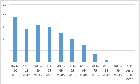
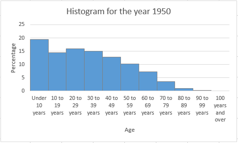
To graph: The histogram for the percentage of the population of the year 1950.
(b)
Explanation of Solution
Graph: To obtain the histogram for the obtained result in previous part, Excel is used. The below steps are followed to obtain the required histogram.
Step 1: The data is entered in the Excel worksheet. The snapshot of the obtained table is shown below:
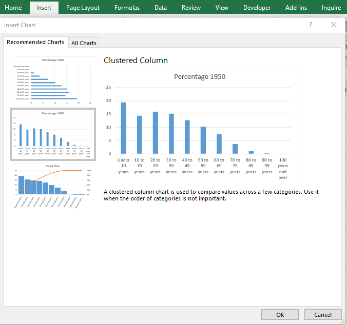
Step 2: Select the data set and go to insert and select the option of cluster column under the Recommended Charts. The screenshot is shown below:

Step 3: Click on OK. The diagram is obtained as follows:
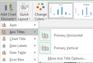
Step 4: Click on the chart area and select the option of “Primary Horizontal” and “Primary Vertical” axis under the “Add Chart Element” to add the axis title. The screenshot is shown below:
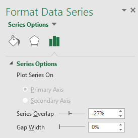
Step 5: Click on the bars of the diagrams and reduce the gap width to zero under the “Format Data Series” tab. The screenshot is shown below:

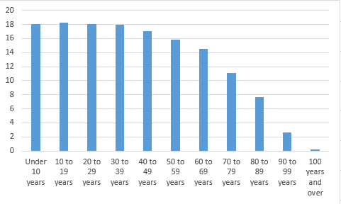
The obtained histogram is as follows:
To explain: The key features of the age distribution.
Answer to Problem 20E
Solution: The age distribution is right-skewed.
Explanation of Solution
(c)
To graph: The histogram for the percentage of the population of the year 2050.
(c)
Explanation of Solution
Graph: To obtain the histogram for the obtained result in previous part, Excel is used. The below steps are followed to obtain the required histogram.
Step 1: The data is entered in the Excel worksheet. The snapshot of the obtained table is shown below:
Step 2: Select the data set and go to insert and select the option of cluster column under the Recommended Charts. The screenshot is shown below:
Step 3: Click on OK. The diagram is obtained as follows:
Step 4: Click on the chart area and select the option of “Primary Horizontal” and “Primary Vertical” axis under the “Add Chart Element” to add the axis title. The screenshot is shown below:

Step 5: Click on the bars of the diagrams and reduce the gap width to zero under the “Format Data Series” tab. The screenshot is shown below:
The obtained histogram is as follows:
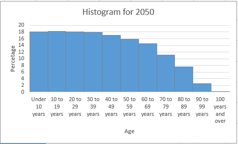
Interpretation: The histogram for the age distribution of the year 2050 shows that percentage of the age groups from under 10 years to 30–39 years are almost equal.
The change between the age distribution of the year 1950 and 2050.
Answer to Problem 20E
Solution: The main change between the age distribution of the year 1950 and the year 2050 is the amount of the skewness.
Explanation of Solution
Want to see more full solutions like this?
Chapter 11 Solutions
Statistics: Concepts and Controversies - WebAssign and eBook Access


 MATLAB: An Introduction with ApplicationsStatisticsISBN:9781119256830Author:Amos GilatPublisher:John Wiley & Sons Inc
 Probability and Statistics for Engineering and th...StatisticsISBN:9781305251809Author:Jay L. DevorePublisher:Cengage Learning
 Statistics for The Behavioral Sciences (MindTap C...StatisticsISBN:9781305504912Author:Frederick J Gravetter, Larry B. WallnauPublisher:Cengage Learning
 Elementary Statistics: Picturing the World (7th E...StatisticsISBN:9780134683416Author:Ron Larson, Betsy FarberPublisher:PEARSON
 The Basic Practice of StatisticsStatisticsISBN:9781319042578Author:David S. Moore, William I. Notz, Michael A. FlignerPublisher:W. H. Freeman
 Introduction to the Practice of StatisticsStatisticsISBN:9781319013387Author:David S. Moore, George P. McCabe, Bruce A. CraigPublisher:W. H. Freeman