
Concept explainers
Videos
(a)
To graph: A
(a)
Explanation of Solution
Given: The data of people who regularly eat five or more serving of fruits and vegetables (FruitVeg5) and people earning a college degree (EdCollege) is provided in the below table.
| State | EdCollege | FruitVeg5 |
| Alabama | 19.7 | 20.3 |
| Alaska | 23.7 | 23.4 |
| Arizona | 23.7 | 24.1 |
| Arkansas | 17.4 | 20.4 |
| California | 27.0 | 27.7 |
| Colorado | 32.6 | 24.8 |
| Connecticut | 32.5 | 28.3 |
| Delaware | 25.3 | 25.0 |
| District of Columbia | 45.2 | 31.5 |
| Florida | 23.8 | 24.4 |
| Georgia | 24.6 | 24.5 |
| Guam | 26.0 | 24.3 |
| Hawaii | 26.7 | 23.5 |
| Idaho | 21.7 | 24.6 |
| Illinois | 27.8 | 22.5 |
| Indiana | 20.5 | 20.6 |
| Iowa | 22.6 | 18.5 |
| Kansas | 26.5 | 18.6 |
| Kentucky | 18.7 | 21.1 |
| Louisiana | 18.9 | 16.9 |
| Maine | 24.5 | 28.0 |
| Maryland | 32.8 | 27.6 |
| Massachusetts | 35.4 | 26.2 |
| Michigan | 22.8 | 22.6 |
| Minnesota | 28.8 | 21.9 |
| Mississippi | 17.5 | 16.8 |
| Missouri | 23.0 | 19.9 |
| Montana | 25.1 | 25.7 |
| Nebraska | 25.2 | 20.9 |
| Nevada | 19.9 | 23.7 |
| New Hampshire | 30.2 | 27.9 |
| New Jersey | 32.3 | 26.4 |
| New Mexico | 22.7 | 23.2 |
| New York | 29.9 | 26.8 |
| North Carolina | 23.8 | 20.6 |
| North Dakota | 23.6 | 22.5 |
| Ohio | 22.3 | 21.0 |
| Oklahoma | 20.4 | 14.6 |
| Oregon | 26.1 | 26.3 |
| Pennsylvania | 24.5 | 24.1 |
| Puerto Rico | 19.4 | 17.7 |
| Rhode Island | 27.5 | 26.1 |
| South Carolina | 21.8 | 17.4 |
| South Dakota | 22.9 | 15.7 |
| Tennessee | 20.9 | 23.3 |
| Texas | 23.1 | 23.8 |
| Utah | 25.4 | 23.3 |
| Vermont | 30.2 | 29.3 |
| Virginia | 30.9 | 27.3 |
| Washington | 28.1 | 28.6 |
| West Virginia | 16.1 | 25.1 |
| Wisconsin | 23.6 | 16.2 |
| Wyoming | 21.2 | 22.7 |
Graph: To draw the scatterplot of the provided data do the following steps in Minitab mentioned below:
Step 1: Enter the data into Minitab worksheet.
Step 2: Go to Graph, select Scatterplot and select simple and click OK.
Step 3: Select the data variable column of “FruitVeg5” for x-axis and column of “EdCollege” for y-axis click on OK.
The obtained scatterplot is as follows:
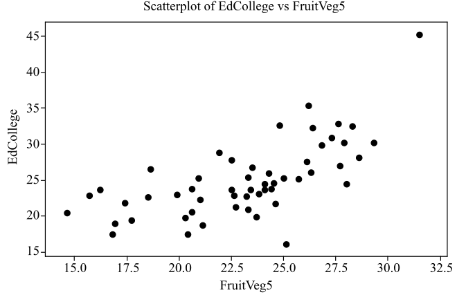
Interpretation: The obtained scatterplot of the data is plotted and it shows that there is moderate, linear, and positive relationship between the variables “FruitVeg5” and “EdCollege”.
(b)
To graph: A regression line to the scatter plot of the data with 5 fruits and vegetables per day and EdCollege.
(b)
Explanation of Solution
Graph: To draw the regression line of the provided data do the following steps in Minitab mentioned below:
Step 1: Enter the data into Minitab worksheet.
Step 2: Go to Graph, select Scatterplot and select with regression and click OK.
Step 3: Select the data variable column of “FruitVeg5” for x-axis and column of “EdCollege” for y-axis click on OK.
The obtained scatterplot is as follows:
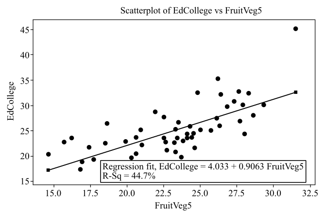
Interpretation: The obtained scatterplot of the data is plotted with regression line and it is observed that the regression line that fits best to the plot is given by
(c)
The position of some states in the scatterplot graph and write a summary on the comparison of these states with other states.
(c)
Answer to Problem 171E
Solution: The states District of Colombia, Massachusetts and West Virginia are away from the regression line whereas the states like Vermont, Rhode Island, Guam and Louisiana lies on the regression line.
Explanation of Solution
The scatterplot and the regression line of the data of the variables “FruitVeg5” and “EdCollege” is as follows:
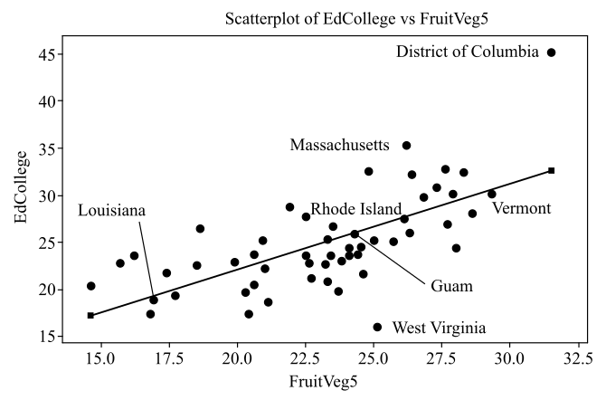
From the graph it can be seen that there is an outlier at the upper right of the scatterplot corresponds to District of Colombia, another outlier at the upper right of the scatterplot corresponds to Massachusetts, outlier at the lower middle of the scatterplot corresponds to West Virginia. These states are away from the regression line whereas the states like Vermont, Rhode Island, Guam and Louisiana lies on the regression line.
(d)
Whether earning a college degree is a cause people eat five servings of fruits and vegetables per day.
(d)
Answer to Problem 171E
Solution: The relationship between the variable cannot be considered as a result of the causation because there is a possibility of the presence of lurking and confounding variable.
Explanation of Solution
The scatterplot and the regression line of the data of the variables “FruitVeg5” and “EdCollege” is shown below and it shows that the relationship between the variables is linear and positive.
Though the diagram shows a positive and linear relationship, but it not indicates the causation. It may be possible that the
Want to see more full solutions like this?
Chapter 2 Solutions
INTRO.TO PRACTICE STATISTICS-ACCESS


- Life Expectancy The following table shows the average life expectancy, in years, of a child born in the given year42 Life expectancy 2005 77.6 2007 78.1 2009 78.5 2011 78.7 2013 78.8 a. Find the equation of the regression line, and explain the meaning of its slope. b. Plot the data points and the regression line. c. Explain in practical terms the meaning of the slope of the regression line. d. Based on the trend of the regression line, what do you predict as the life expectancy of a child born in 2019? e. Based on the trend of the regression line, what do you predict as the life expectancy of a child born in 1580?2300arrow_forward3.4 SKILL BUILDING EXERCISES Getting Regression Lines Only Find the equation of the regression line for the following data set. x 1 2 3 y 3 3 4arrow_forward
 Functions and Change: A Modeling Approach to Coll...AlgebraISBN:9781337111348Author:Bruce Crauder, Benny Evans, Alan NoellPublisher:Cengage Learning
 Big Ideas Math A Bridge To Success Algebra 1: Stu...AlgebraISBN:9781680331141Author:HOUGHTON MIFFLIN HARCOURTPublisher:Houghton Mifflin Harcourt
 Glencoe Algebra 1, Student Edition, 9780079039897...AlgebraISBN:9780079039897Author:CarterPublisher:McGraw Hill