
Videos
The Corruption perceptions Index uses perceptions of the general public, business people, and risk analysts to rate countries by how likely they are to accept bribes. The ratings are on a scale from 0 to 10, where higher scores represent less corruption. The graph shows the corruption ratings for the world's least corrupt and most corrupt countries. (The rating for United States is 7.6.) Use the graph to solve Exercises 99-100.
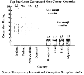
a. Write a set of four ordered pairs in which each of the least corrupt countries corresponds to a corruptions rating. Each ordered pair should be in the form (country, corruption rating).
b. Is the relation in part (a) a function? Explain your answer.
c. Write a set of four ordered pairs in which corruption ratings for the least corrupt countries correspond to countries. Each ordered pair should be in the form (corruption rating, country).
d. Is the relation in part (c) a function? Explain your answer.
Want to see the full answer?
Check out a sample textbook solution
Chapter 2 Solutions
COLLEGE MATH.CUSTOM BDL W/ MML


- In Exercises 49-52, use the bar graph, which shows the receipts of the federal government (in billions of dollars) for selected years from 2008 through 2014. In each exercise, you are given the expenditures of the federal government. Find the magnitude of the surplus or deficit for the year. YearReceipts, R Expenditures, E | RE | 2012$3537.0billionarrow_forwardA researcher is interested in graphing the relationship between amount of debt (mild, moderate, severe) and number of employees. Which is the most appropriate graphical display that would be used to graph this relationship? A. mosaic plot B. histogram C. scatterplot D. side-by-side boxplots E. Pareto chartarrow_forwardPlease help asap :)arrow_forward
- The table below shows a recent graduate's credit card balance each month after graduation. Month 1 2 3 Debt ($) 620.00 761.88 899.80 a) Look at the graph on your calculator. Based on this graph, what type of equation should represent this situation? Explain your answer. b) Use your calculator to find the equation that you feel best fits this data. What is the equation? c) Based on this equation, what is the predicted amount of debt for month 9 after graduation?arrow_forwardMaribel surveyed 55 people to find out their favorite types of music. The results are shown in the bar graph. Favorite Types of Music 18 16 14 12 10 2 Country Jazz Opera Rock Type of Music Based on the information in the graph, which types of music were chosen by 40% of the people surveyed? A Country and opera B Jazz and opera C Jazz, opera, and rock D Country, jazz, and rock Number of Peoplearrow_forwardWhich statement accurately reflects qualitative and quantitative data? a.Height is qualitative and favorite color is qualitative. b.Height is qualitative and favorite color is quantitative. c.Height is quantitative and favorite color is quantitative. d.Height is quantitative and favorite color is qualitative.arrow_forward
- Part c and d? It says it’s wrong.arrow_forwardThe diversity index, from 0 to 100, measures the chance that two randomly selected people are a different race or ethnicity. The diversity index in the United States varies widely from region to region, from as high as 81 in Hawaii to as low as 11 in Vermont. The bar graph shows the national diversity index for the United States for four years in the period from 1980 through 2010.The data in the graph can be modeled by the formulaD = 0.005x2 + 0.55x + 34,where D is the national diversity index in the United States x years after 1980. According to the formula, what was the U.S. diversity index in 2010? How does this compare with the index displayed by the bar graph?arrow_forwardFg. A school psychologist is interested in the effect of violent television programs on a child's aggression depending on if the show is a cartoon or not. Eighty children were recruited and were divided into equal groups. Half of the children watched a violent television program while the other half watched a non-violent program. Half of the children watched a cartoon while the other half watched a show that was not a cartoon. The children were then placed in a small group and the researcher measured the level of aggressiveness of each child. h. A social psychologist wants to know if people are more or less likely to help a person that appears poor. A person driving either a new sports car or an old, beat-up hatchback pulled up to people on a college campus and asked for directions. The number of people that helped in each condition was recorded. l i. A psychiatrist wants to know at what point during treatment does therapy for depression have its greatest effect. 30 people who were…arrow_forward
- Make a bar graph of the data. Compare the number of students in jazz class with the number in ballet class.arrow_forwardAmericans' trust in government and the media has generally been on a downward trend since pollsters first asked questions on these topics in the second half of the twentieth century. Trust in government hit an all-time low of 14% in 2014, while trust in the media bottomed out at 32% in 2016. The bar graph shows the percentage of Americans trusting in the government and the media for five selected years. Use this information to answer parts a-c. MERIT Percentage HHE + 70- 60 50- 40- TOR 30 20- 10 Trust in media Trust in Goverment 54 36 1625 32 47 More 43 20 19 39 a. Use the information in the graph to estimate the yearly loss in the percentage of people trusting in government. The yearly loss in the percentage of people trusting in government is 1.2%. (Round to the nearest tenth as needed.) b. Write a mathematical model that estimates the percentage, P, of people trusting in government x years after 2003. 17 The mathematical model P = estimates the percentage, P, of people trusting in…arrow_forwardThe book The Wall Street Journal. Guide to Information Graphics by Dona M. Wong gives strategies for using graphs and charts to display information effectively. One popular graph discussed is the donut pie chart. The donut pie chart is simply a pie chart with the center removed. A recent Harris Poll asked adults about their opinions regarding whether books should be banned from libraries because of social, language, violent, sexual, or religious content. The responses by education level to the question "Do you think that there are any books which should be banned completely?" are shown in the following donut pie charts. (a) What feature of Keith's graph makes it difficult to visually compare the responses of those with some college to those shown in the other graphs? (Select all that apply.) a)The graphs made by Keith and Ramon compare groups across education level. b)The graphs made by Keith and Ramon are all donut pie charts. c)The graphs do not have data labels showing the…arrow_forward
 Glencoe Algebra 1, Student Edition, 9780079039897...AlgebraISBN:9780079039897Author:CarterPublisher:McGraw Hill
 Trigonometry (MindTap Course List)TrigonometryISBN:9781337278461Author:Ron LarsonPublisher:Cengage Learning
 Holt Mcdougal Larson Pre-algebra: Student Edition...AlgebraISBN:9780547587776Author:HOLT MCDOUGALPublisher:HOLT MCDOUGAL
 Algebra: Structure And Method, Book 1AlgebraISBN:9780395977224Author:Richard G. Brown, Mary P. Dolciani, Robert H. Sorgenfrey, William L. ColePublisher:McDougal Littell
 Big Ideas Math A Bridge To Success Algebra 1: Stu...AlgebraISBN:9781680331141Author:HOUGHTON MIFFLIN HARCOURTPublisher:Houghton Mifflin Harcourt